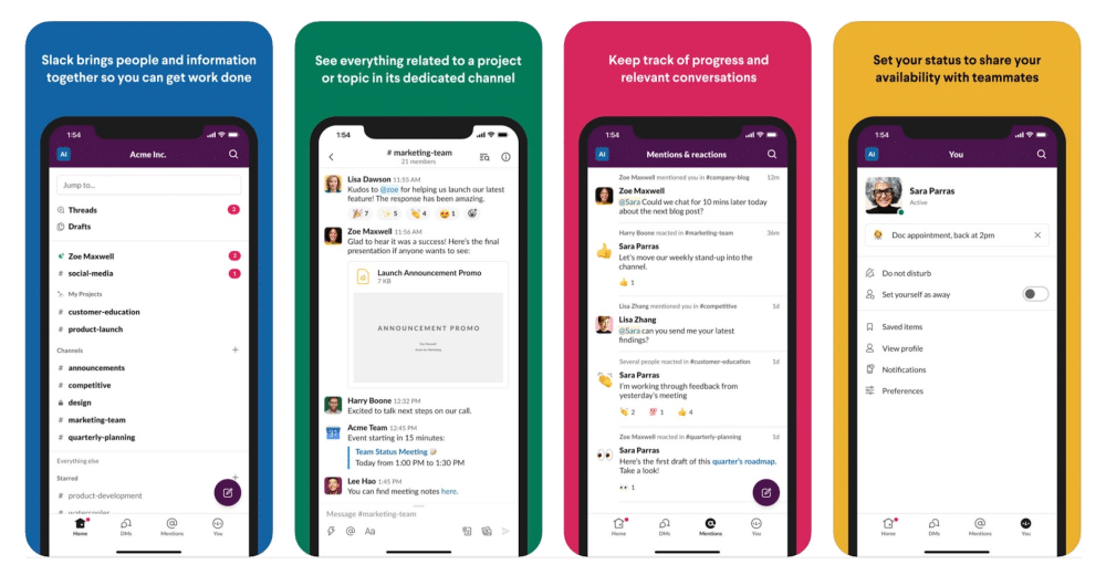
Slack for iOS unveils a radical new user interface -- once it's been switched on

Business communication tool Slack has just released a major new update to its iOS app for iPhone and iPad. Slack 20.05.10 sees the app get ready for more than a simple facelift, with a complete redesign that brings it into line with improvements unveiled back in March on the desktop.
Be warned though: the user interface is actually a server-side update, which means not all users will immediately feel the benefit of updating -- nevertheless, install the app now and when the new UI is switched on, you’ll be able to use it.
The user interface has been completely revamped -- the most visible change is the implementation of a new bottom navigation bar providing users with easy access to the old sidebar (tap Home), direct messages, mentions and user settings/preferences (tap You).
The quick switcher feature has been given more prominence through a redesigned (and allegedly 'smarter') Jump to box -- this has come about because the feature has proved less popular on the mobile platform compared to the desktop. It’s designed to enable users to quickly find channels, messages and files through quick-fire keyword searches.
Swiping has also been simplified -- users now simply swipe right to reveal their workspaces and preferences, or swipe left to return to the previous conversation.
Finally, composing direct messages has become simpler thanks to a new Compose button, while a new Lightning button underneath the message box provides easy access to shortcuts such as setting reminders or creating workflows.
Slack for iOS 20.05.10 is available now for all iPhones and iPads running iOS 11.1 or later. The same changes are due to roll out for Android users in the next stable release (due imminently), so keep an eye out for that. Also available are desktop downloads for Windows, Mac and Linux.
