The Microsoft Store undergoes a dramatic Windows 11 redesign online

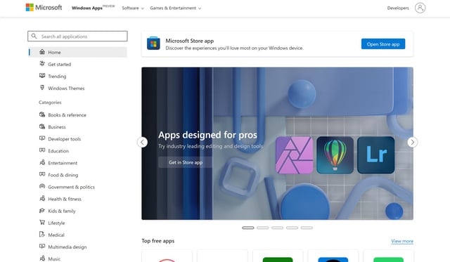
Microsoft is in the process of rolling out a dramatic redesign of the web version of the Microsoft Store, heavily inspired by Windows 11.
The Fluent design makeover brings the Microsoft Store website more closely in line with the look and feel of Windows 11. This means rounded corners, updated typography and new icons, but the app installation process has also been revamped.
See also:
- Microsoft reveals how it is responding to the 'tragic, unlawful and unjustified invasion of Ukraine'
- KB5010414 update for Windows 11 is hiding the Start menu
- Microsoft releases important KB5010415 update for Windows 10 because Windows 11 is not ubiquitous
What is slightly strange about the Microsoft Store redesign is that so little noise has been made about it by the company. And when we say "so little", there has really be nothing said -- possibly because it is still currently classed as a preview.
It was left to Fire Cube to share news of the new look after it was spotted by Twitter user Sapphire Public:
Navigation has been significantly improved in the redesign, and the relocated search bar aids usability. It is not only the store front that has been taken back to the drawing board; individual app listings have also been revamped.
Tabs are gone, and this is something that is unlikely to be mourned by many users. Importantly, in the design preview, it is also possible to install apps directly from the web store without having to switch -- or be switched -- to the Microsoft Store app.
You can check out the new-look store here.
