
Microsoft Security gets a style upgrade that goes beyond the surface to embrace the human
Padlocks, chains, keys, shields: these are all stereotypical images used to represent security. They are also the themes -- tropes, if you will -- that have been avoided in an eye-catching and vibrant rebranding for Microsoft Security.
A team at Koto -- a creative studio also behind design projects for Amazon, Riot Games, FitBit, WhatsApp, and more -- is responsible for a bold new brand identity that sidesteps the obvious. Instead, the new look that is bold yet human, clear and confident.
See also:
- No prizes for guessing what's to blame for the latest problem that stops Windows 11 booting (yep, it's another OS update)
- The launch of Windows Backup for Organizations sees Microsoft making it easier to move to Windows 11
- Get your hands on the new Windows Share feature and try out Click To Do enhancements with the KB5058499 update for Windows 11
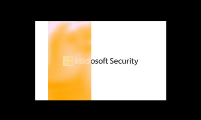
That Koto is behind the brand revamp is little surprise; the creative outfit has also worked on Microsoft’s Copilot branding, the company’s 50th anniversary campaigns and more. The latest Beyond The Surface visual language leans heavily on the idea of scanning, taking a sweeping effect that is complemented by a pleasingly liquid, flowing design.
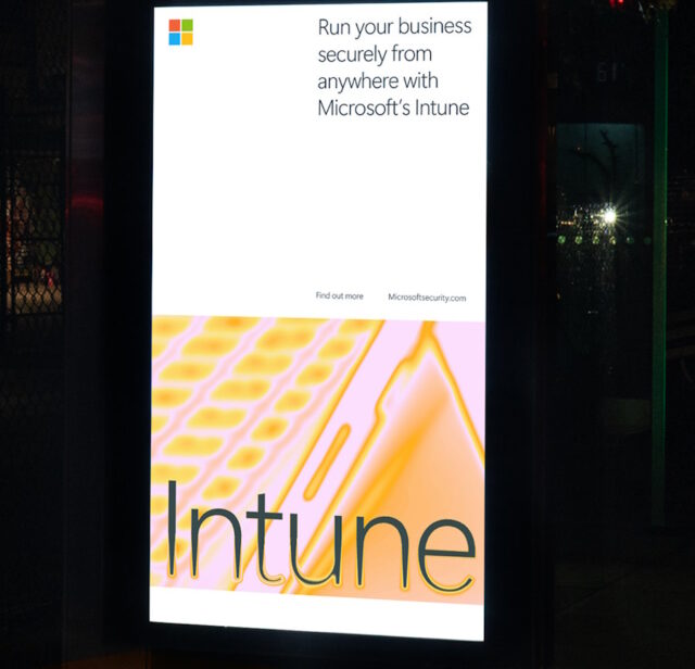
While the color palette is drawn from Microsoft’s existing branding, the implementation using gradients, lights, and movement helps to bring the brand to life. Motion is literal in animated graphics, progress bars and the like, but is strongly implied throughout the visuals.
Koto says of the graphic system:
At the heart of the visual system is a scanning effect inspired by imaging and scanning technology. It represents how Microsoft Security can reveal hidden threats and give users a clear view of potential risks. Using a dynamic colour palette drawn from Microsoft’s core colours, this element is both adaptable and impactful, highlighting important information and creating a rich, engaging experience.
While the look is new and fresh, it remains unmistakably Microsoft through the decision to stick to the company’s signature typeface and color scheme. The end result is something “vibrant, human, and reassuring”, and reflective of Microsoft’s vision of security: “clear, confident, and always one step ahead”.
Check out more of the visuals here.