What we learned from predicting the 2016 US presidential election

As we approach the end of 2016, what feels like a very long election cycle in the US is finally coming to an end, complete with what, for many, was a surprising conclusion based on the pre-election polls (or, more accurately, how those polls were interpreted). Given the pre-election polls and the subsequent critical press coverage, it is natural to wonder whether the data presented in various 2016 presidential election predictions had some "issues".
Four years ago we were interested in how data analytics could be used in pre-election polling to make it statistically more accurate so we created an analytic app that was based on Gallup polling data to predict the winner (Barack Obama or Mitt Romney) of the election. It was a simpler application, but we got some accurate results, predicting 85 percent of the counties correctly.
Heading into the 2016 election season we decided to reinvigorate and improve the app to stretch data analytics to the limits. While it appears we over estimated Hillary Clinton's lead in the popular vote share (the national polling averages placed the difference at 3.9 percentage points, while it appears that the true difference was 2.0 percentage points in Clinton's favor), our predictions at the county level were correct for over 96 percent of counties based on the election returns data available at the time of analysis. As such, here is my breakdown of how using data analytics helped us to accurately predict the election and whether the current model is stacking up well enough.
We have comparison data for 3,111 counties including all states except Alaska, which does not report data at the county level. Even though the predicted values are numeric values, we can declare a winner in each county based on the candidate that received the greatest number of predicted votes, allowing for a categorization of the results for each candidate into predicted won/lost groups.
The accuracy figures indicate that the model was able to very accurately predict the counties that both Hillary Clinton (at 94 percent accuracy) and Donald Trump (at nearly 97 percent accuracy) won. The correlation between fitted and actual values is nearly 0.95, which is very good. The root mean square error of just under 0.06 is very reasonable, as is the mean absolute error of 0.045 (this suggests the predictions were off on average by about 4.5 percentage points across counties).
The mean absolute percentage error is low, but higher than would be preferred (at around 20 percent), but this is likely due to a known issue with this metric associated with errors in cases where the actual values are low. Overall, the summary measures indicate that the two-part model predicted the actual county-level results very well, and, as a result, the projections contained in the 2016 Presidential Election App appear to have a high degree of accuracy.
Comparing the Predicted County-Level Map With the Actual County-Level Map

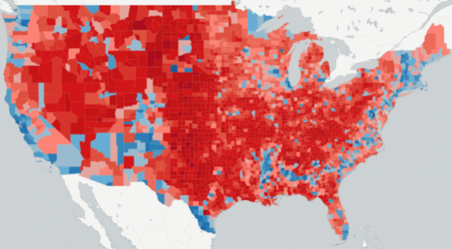
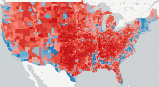
Figure 1 above provides the actual county-level results map, while Figure 2, shown below, provides the final map of county-level predictions from the 2016 Presidential Election app. An examination of these two maps indicate some differences, but the maps themselves are fundamentally very similar. The one thing that is noticeable is that hue of red is somewhat darker in the Great Plains and the northern portions of the Intermountain West in the actual map compared to the final predicted values.

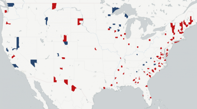
Figure 3, shown below, shows the counties that are incorrectly predicted, with the color indicating the party of the candidate that actually won (blue for Clinton, red for Trump). While the vast majority of counties were predicted correctly the thing that really stands out is the number of counties in upstate New York and northern New England that went to Donald Trump, but were predicted to go to Hillary Clinton.

Interestingly, Clinton still won all of these states, albeit, Trump did receive an electoral vote from Maine's second congressional district. The Southeast also shows a tendency to have a concentration of counties that went for Trump that were expected to go to Clinton, while the far western states have more counties that went to Clinton than the model predicted. However, these patterns are not strong.
What we don't see are systematic incorrect predictions in the states that voted for Trump, but were thought to be part of Clinton's "blue wall". Specifically, Wisconsin has three counties that were expected to go to Clinton, but instead went to Trump, and three counties that were expected to go to Trump, but went to Clinton. In Michigan there is only one county that was not predicted correctly, and that county went to Clinton. Finally, Pennsylvania also only had one county incorrectly predicted, albeit, it did go for Trump.
The relative lack of spatially grouped errors in the predictions of the 2016 Presidential Election App is in marked contrast to the 2012 Presidential Election App. This reflects improvements in the data and methodology used in this year’s election compared to 2012.
Comparing the Accuracy in the 2016 Presidential Election App With the 2012 Presidential Election App
Using data to predict the presidential election has come a long way since the 2012 election, and there are some substantial differences in both the data and the models used between the two elections.
Given the substantial change in the data and predictor variables used, comparing the accuracy of the 2012 predictions to this year’s results is a bit of an apples and oranges comparison. However, it should indicate the extent to which the data and methodology used has improved between this election and the last presidential election. In the 2012 Presidential Election App, we correctly predicted 85 percent of counties correctly, which is good, but not nearly as good as the 96 percent we achieved this year. In terms of the major party candidates, we correctly predicted 84 percent of the counties Barack Obama won (compared to 94 percent for Hillary Clinton), and 86 percent of the counties Mitt Romney won (compared to 97 percent for Donald Trump).
The correlation between the fitted and actual values for the Democratic major party share in 2012 is 0.80, compared with 0.95 in 2016. Based on this, the improvements that have been made in the data and methods between the two elections has been substantial, and looking at the data over time can only help us get more insights.
Dan Putler, chief scientist, Alteryx, Inc.
Published under license from ITProPortal.com, a Future plc Publication. All rights reserved.
Photo Credit: Carsten Reisinger/Shutterstock
