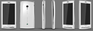
Sony Ericsson's Android UI leaks
To accompany the shots purported to be Sony Ericsson's first Android phone, a powerful 1 GHz Snapdragon-equipped touchscreen device code-named "Rachael," a video claiming to be the device's custom Android UI has emerged.

Like the Sense UI debuting on HTC's Hero in Europe this month, Rachael's UI retains the three-panel "shade and drawer" Android layout, but completely overhauls the graphics and widgets.
Chief among the design innovations is the card-style layout where call records, SMS/MMS, e-mail, Twitter, and Facebook feeds are arranged as sub-headings under a contact's "card." Also included in the video are icons for "TimeScape," and "MediaScape," which are currently unknown commodities. The icon for TimeScape looks somewhat like the contact layout, so the two could be related.
The device itself is still unannounced, so a launch date, price, and exact specs are still uncertain. However, the shots and video are of similar quality and design to others on the Sony Ericsson Web site, so the device could soon make an official debut there.
