A case study in improving software: What Office 2010 can learn from Notion 3

Lesson 2: Build the user experience down
A more complex piece of software tends to become used in a more complex fashion. Years ago, CorelDraw was a miracle of software design, incorporating as many functions as possible into mouse gestures and shortcuts, enabling illustrators to develop streamlined methodologies for complex operations into natural, everyday practices. But in recent years, the need to tack features onto the side of the box or the Web site resulted in that product suffering from the "feature bloat" that has afflicted so much of installed software prior to the advent of Web apps. Dialog boxes have never been conducive to creativity.
Part of the inspiration for Microsoft's ribbon feature, which premiered in Office 2007 (and which nobody really calls the "Fluent UI" anymore), was the need to get complicated menus out of the user's way, and bring choices forward. That having been done, Office 2010 Beta 1 has a revised ribbon that contains palettes of choices occupying just as much space, if not more, than the old drop-down menus. And while the 2007 edition was focused around keeping you focused on your page, the new File menu (the new name for the BackStage button, which replaced the Office button, which replaced the File menu) completely encompasses the entire open window.
Maybe these features truly are improvements in some senses, but they are not exactly true to the original spirit of the Office 2007 redesign, and in some respects are actually backsliding towards Office 2003.
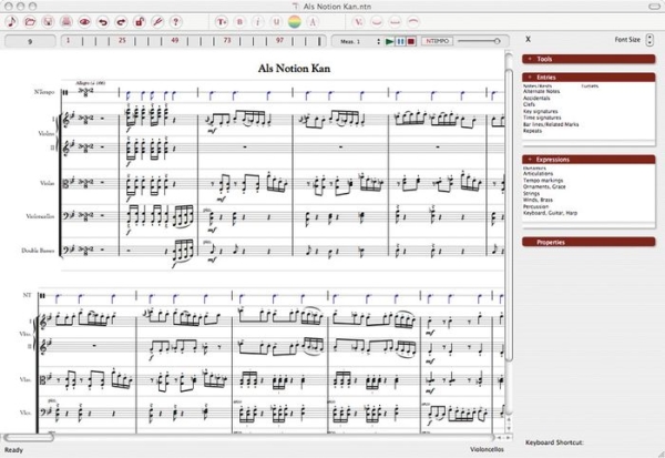
The original Notion UX was based on a well-received graphical feature called the Sidebar, which was positioned like sidebars in Office apps and Web browsers today. Here, the original Jack Jarrett design was clever for its time, gathering together only the tools necessary to change and develop the score (the active document) into categories, while keeping functions related to managing the program relegated to the menu bar and classic toolbars. Sidebar categories were not intuitive (Tools, Entries, Expressions, Properties), but their clusters were operated independently of one another so that you found yourself able to combine these functions like open pots of paint. "Tools" usually referred to things you do to or with notes, while "Entries" referred to things you do to the staff or to a measure. "Expressions" contained the articulations and accents you place on existing notes, especially with regard to particular sections of the orchestra; while "Properties" let you make adjustments to existing elements (and it was here that you converted notes in time with the current signature, into tuplets that were timed in thirds rather than halves or quarters).

The tried and tested user front-end of Notion 2, which was completely replaced in September 2009.
On paper, it was simple, direct, and effective. By no means did the Notion 2 sidebar feel outdated or outmoded, and in many ways, it actually achieved one of Office 2007's original objectives: getting clutter out of the way of the open document. But it wasn't always consistent -- for example, I never quite got the hang of time and key signatures being "Entries" but tempo markings being "Expressions." And when a score became complex, the steps one took to get things under control took way too long.
"In Notion 2, if the user wanted to insert an element into the score, he would go and navigate this tree structure, choose his element, and put it in. But what we realized was that, while that's certainly easy to do, it's also time consuming," explained Notion 3 product manager Lubo Astinov. "You basically have to take your eye away from the spot on the score that you were working on, move your eye towards the sidebar, choose the element there, then go back and find that place. It may not seem like a lot, but it really is a time-consuming, frustrating thing to do."

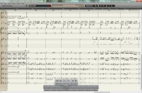
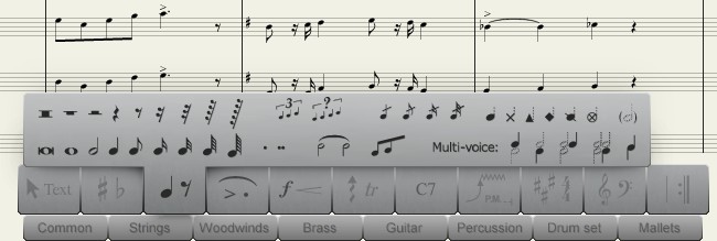
In Notion 3, the sidebar is completely gone. In its place is a unique, symbolic palette along the bottom, where categories of score elements are represented by the symbols themselves. Now, you have to know pretty much what these symbols mean, especially in the context of the other symbols around them. For example, that dot in the fourth category from the left doesn't mean "extend the duration of a note by one-half," but rather "apply a staccato to a note" to make it play more briskly; and that sweeping arc is a slur, not a tie -- although it looks exactly like a tie. But the division of palette categories is indeed more consistent: Notes and rests (including alternate notations) appear together, tremolos and arpeggios and glissandos are all together, and the accents you give an electric guitar (more on that later) are gathered together.
All of this does not immediately spell "easy." What it does is spill onto the table all of the elements of scoring in a one-level menu rather than a nested tree structure, like tokens in an old board game. The learning curve, as a result, is higher for a novice user, especially one who will find himself hovering over all the symbols and learning what they're called through their tooltips.
For most applications in the last decade, getting over the learning difficulties of configuring documents has been accomplished through wizards (series of dialogs which lead users by the hand through choices) and templates (blank documents whose styles are pre-set). Notion 2 was conventional in that regard. But the plethora of templates shipped with Notion 2 were replaced with just seven in Notion 3.
Removing this truckload of templates, Astinov told us, was a carefully reasoned design decision -- a counter-intuitive one reached after the team studied how composers of various levels of acumen used the product.
"We went through several notation applications, and we had user tests with people setting up a score," he said, "and what we realized was that while it certainly is aggressive to have 300 templates in your score wizard, it actually adds to the clutter and makes things far more difficult to navigate, search for, and create...than if you simply create a score from scratch the way we have it, the graphical way, in Notion 3."
Notion's designers tested two groups of users: professional musicians with notation software experience, and folks with no prior experience in any music application. Both groups were observed using Finale, Sibelius, and a beta of Notion 3. They were asked to set up a score for a small chamber orchestra, and both groups were twice as fast in accomplishing their goal in Notion 3 without any templates or wizards at all, than they were with Finale and Sibelius.
Their discovery was this: In the interest of making the program seem easier, wizards and templates and other hand-holding tools have the side-effect of making users slower. They also fail to teach the user anything about the typical use of the product, by bypassing it the long way around. So even though the Notion 3 palette seemed steeper, climbing to that level and staying there was actually much faster and more productive.
Lesson 3: PC games are UX prototypes
If only applications were more like games. Seriously, the most innovative user input experiences have always come from games -- as time goes on, games only grow more and more ahead of the curve.
"Game interfaces were on the forefront of our discussion here, when we were designing things like the palette, for example," said Astinov. "We really liked some of the novel menu systems that some of the game designers were implementing in their games, and certainly that feel of one element controlling their menu inspired us to think about the main entry palette."
One of the design iterations considered by the team was circular, where the mouse movement zipped through a Rolodex-like presentation of options. "We didn't go with that because it turned out not to work very well on corners. Game design was one of the things that we considered...because oftentimes in games, people are trying to concentrate a lot of usage into one small area."

The designers eventually settled upon a simpler, perhaps less cool, but certainly functional palette design. It does achieve its objective of keeping your eyes focused on the score, the way a dashboard of a car keeps your attention fixed upon the road ahead. In practice, I've noticed some small difficulties, especially the palette's ability to obstruct the bottom-most staff of an open composition. I've also noticed a bit of a "dead zone" that exists just around the perimeter of the palette -- something that might not be so noticeable in a game where you're controlling troop movements, but certainly a hassle if you're programming those bass instruments that typically fall in the bottom of a grouping.
But while Notion 2's design was based around looking like a conventional application in the interest of not confusing users, Notion 3 went completely off the board, noting that games intentionally advance new designs in the interest of fun all the time, and players embrace them for doing so.
Next: Users' expectations change the nature of an application...
