Google+ gets a BIG profile makeover

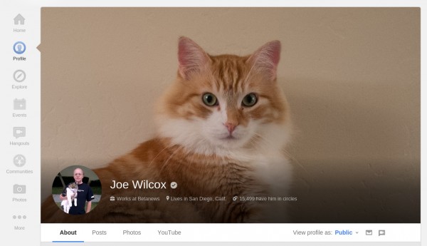
Funny how little things matter to people. Today Google announced some minor changes to profile pages on its social network, which include much bigger cover photos -- up to 2120 by 1192 pixels and displayed in 16:9 format. The search giant is rolling out this and other tweaks, gradually. If you don't see them already, you will soon.
Visually, Google+ Profiles lay out information in card-like fashion, which starkly remind of those Google Now presents on smartphones and tablets. The motif is particularly striking in new tab, Reviews, which doesn't appear in my Profile. Perhaps because I've written none.
"In addition to your photos, +1's and YouTube videos, there's now a place for all your Local reviews. Highlight your favorite restaurants, or hide the tab completely via settings -- it's completely up to you", Sarah McKinley, Google+ product manager, explains. Reviews is checked (by default) in my settings.
Other changes include "an easier way to edit your info", she says. "The 'About' tab now consists of separate cards (like Story, Places, and Links) -- each with its own prominent edit link. As always: you can share specific fields with specific circles, or keep them just for you". There are few really new features, but rather improvements to the overall appearance. Google+ looks better, and anyone who says visuals don't matter should stay at cluttered Facebook.
I'm still exploring all the changes, and there are many nips and tucks to Profile presentation, including a new, more-pleasing, basic-info pop-up box when hovering over anyone's picture or name in the main stream.
Google's challenge expanding and better presenting anything on the social network is daunting. Facebook wasn't always as complicated to use as it is today. Complication creep is an evil that accompanies new features. So far, Google has done well holding back the clutter. That said, the social network redesigns are rather frequent, particularly on mobile, where the look and feel dramatically changed more than a few times over the last 12 months.
 Reaction is fairly positive. Josh Hurst: "Holy cow, the new cover photos are huge. HUGE, I say". Thomas Aschemann: "The new profile layout looks awesome!"
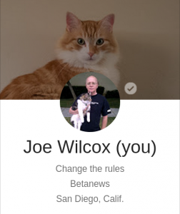
"I love what they’ve done with the profile avatar and adding a new top banner for profiles", Peg Fitzpatrick says. "They’ve cropped the avatars to a circle. This is what you see at the top in a fixed positive when you are looking at someone’s Google+ personal wall. The avatar resizes to a smaller version".
But watch your settings. Rahul Raghavan: "The 'Show your Google+ communities' posts on your profile' setting could have been automatically turned on. Mine was. So, go uncheck it if you want to, because some of you will end up getting embarrassed". Mine is checked, but I don't know that it wasn't before.
I believe not. I see the option as more benefit than embarrassment. Google+ doesn't yet provide a utility for posting to the Public stream and to Communities. That's a feature I would find beneficial, rather than spamming people by posting the same thing both places.
