Colorblinding shows how websites look to the color blind

You can spend a very long time choosing your website color scheme, finding a starting shade, then a matching palette, shuffling and rearranging until you find something that appeals.
This isn’t all about you, though -- it’s also vital to understand how your design will be seen by anyone with a color vision deficiency.
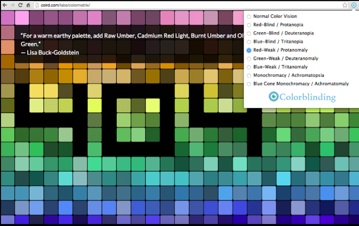
Colorblinding is a Chrome extension which can simulate seven types of color blindness: Red-Blind / Protanopia, Green-Blind / Deuteranopia, Blue-Blind / Tritanopia, Red-Weak / Protanomaly, Green-Weak / Deuteranomaly, Blue-Weak/ Tritanomaly Monochromacy/ Achromatopsia and Blue Cone Monochromacy.
To try this out, just install the extension, click the Colorblinding button in the address bar and choose a condition from the menu.
Whatever you select, Colorblinding applies an SVG filter to alter the appearance of your page and all of its elements, including images and videos.
The menu remains open, too, so you can click each option in the list to quickly see if there are any problems.
We found Colorblinding had no effect on some of our test pages -- including its own Chrome Store entry, ironically -- but it mostly worked well for a first release and is worth a try.
