#GoogleSoWhite

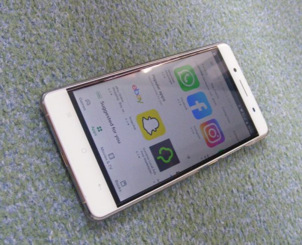
Google has a diversity problem. Whereas the company's mobile app offerings were once colorful and full of highlights, more recent iterations -- like the newly released version 16 of the Google Play Store -- have been thoroughly and deliberately "whitewashed." Gone is the inclusive rainbow of headers that delineated each app type. In its place, a monochromatic sea of pure whiteness.
The transition is jarring -- and a bit intimidating. As someone who is married to a "person of color" I find the loss of background hue to be disquieting. The notion that it is better to suppress diversity of content in the name of "consistency" or "visual clarity" strikes me as downright bigoted. By ignoring the unique contributions that categories like "Movies" and "Games" have made to the overall Google landscape, you slight those behind the content that drives them.
And don't get me started on Google Play Music. We all owe a debt of gratitude to the racially and culturally diverse set of pioneers who inspired so much of today’s greatest music. Yet, instead of honoring their contributions, Google is ignoring their very existence by sunsetting the Play Music app in favor of a fresh start with the thoroughly whitewashed YouTube Music. Talk about dis-r.e.s.p.e.c.t!
Now, some will argue that these changes are in fact a net positive for diversity, that a switch to a more monochromatic UI will make it easier for Google to introduce a "dark mode" option for users who prefer a less "tidy-whitey" motif. However, by lumping everyone who doesn’t identify with the new whitewashing theme under a sinister sounding "dark mode user" category, Google is reinforcing racial stereotypes about human behavior and the supposed predilection of non-whites towards themes and environments that eschew sunlight (a racially insensitive trope if there ever was one).
Never mind the fact that providing only two theme options -- light or dark -- assumes a binary world with just two classes of individuals: Those who identify with and embrace pure whiteness, and everyone else. In reality, the world’s majority non-white population is a beautiful tapestry of skin tone gradation, with mixed-race and even albino persons further blurring the lines of just who is and isn’t considered "white." For Google to assume that user theme selection is a binary decision is to bring into question the company’s views on other "non-binary" societal norms (something my transgender friends will no doubt find very disturbing).
To quote the late, great US President George Herbert Walker Bush, "This aggression will not stand!" It's time for the Android user community to say, "enough with the whitewashing!" We demand an operating system user experience that more accurately represents the amazing diversity of human racial and cultural heritage, not one that pigeon-holes us into a single, generic -- and some would say, racially charged -- category called "dark."
Remember, Google, over three quarters of the world's population lives in countries where "whiteness" is the extreme exception (I know this from personal experience). To foist this change upon us, and then to pay lip service to diversity by expanding “dark mode” options for certain apps, is to risk alienating the fastest growing segment of your customer base. You have been warned. -- Randall C. Kennedy
