Microsoft reveals a new Windows logo and scores of redesigned icons
![]()
Aesthetics are an important part of app design and branding, and change is not something that is undertaken lightly -- particularly when it comes to big names. Following on from revealing a new-look icon for its Chromium-based Edge browser, Microsoft has now taken the wraps off more than 100 redesigned icons.
This is not a minor undertaking. Here Microsoft is introducing new colors, materials and finishes as the company goes all-in with its Fluent design language.
See also:
- Microsoft now lets you make calls from your PC
- Chromium-based Microsoft Edge has a new logo. Is it enough to distance it from the horrors of Internet Explorer?
- Microsoft is about to start aggressively advertising Windows 10 to Windows 7 stragglers
Jon Friedman, corporate vice president of design and research at Microsoft, explains that there were various obstacles and considerations when approaching the redesign of icons and logos that are so familiar to so many people:
"With the newest wave of icon redesigns, we faced two major creative challenges. We needed to signal innovation and change while maintaining familiarity for customers. We also had to develop a flexible and open design system to span a range of contexts while still being true to Microsoft".
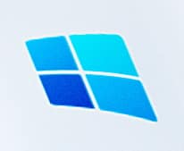
 To the left, you can see the new Windows logo. Its look is very much in line with the recently redesigned icons we've seen for Office, as well as the icon for Chromium-based Edge.
It, like the vast majority of the newly revealed icons -- which you can see in more detail in this Medium post -- features hues of a single colour.
It is only when the icon collection is considered as a whole that you can appreciate how the full color palette has been utilized -- as you can see in the main image, and in the one below:
![]()
Friedman explains that:
Our Fluent Design System was instrumental in helping us navigate both these challenges. Fluent emphasizes building off the familiar -- designing for what our customers already understand, not asking them to develop new habits or learn something new. Fluent is also about creating space for a diverse yet connected system. To account for such a breadth of contexts and experiences, we expanded our initial library of icon colors, materials, and finishes.
He goes on to say:
People spend most of their working time using Microsoft Edge and Office to get things done, and the teams were excited to experiment with the new materials on these popular products. We know how important these experiences are to our customers, so the icons needed to fit in and stand out at the same time. Based on extensive testing and customer feedback, we introduced rich gradients, broadened our spectrum of colors, and implemented a dynamic motion with ribbon-like qualities.
Our customers are also beginning to use mixed reality to accomplish goals in a completely new way. Blending the physical and digital worlds in our icons helped us think beyond traditional manifestations of colors, finishes, and materials. We needed to consider the third dimension, so we chose new materials that reflected light and depth and felt more tactile.
Take a look at Friedman's post to see more of the icon designs which will start to roll out soon.
