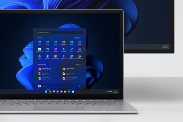
Ex director of UX at Microsoft is 'shocked' at the confusing Start menu experience in Windows 11

There is a lot to like, even love, about Windows 11, but there are also plenty of things which are very divisive. Wading into the debate about the direction in which Microsoft has taken its operating system is Jensen Harris, former Director of User Experience at the company, who takes aim at the Start menu and what he describes as a "confusing" experience.
In a series of tweets, Harris lambasts Microsoft for including banner ads in the Start menu, for placing obstacles in the way of completing simple tasks, and makes various complaints about design choices. It makes for extremely interesting reading.
See also:
- Microsoft explains the SMB compression changes introduced by Windows Server 2022 KB5016693 and Windows 11 KB5016691 updates
- How to enable the amazing animation effects Microsoft has hidden in Windows 11
- Microsoft releases KB5016691 update for Windows 11, fixing printing and Bluetooth problems, and adding admin options
Harris starts off by pointing out the obvious: that Microsoft is famous for the Start menu and as such it should be the pinnacle of the company's design work. But he finds himself disappointed when he searches for Chrome.
Zooming in on the interface, he goes on to point out issues with poorly aligned text and design inconsistencies:
Complaints about ads are next in the firing line:
Harris goes on to point out weird design choices, as well as mistakes:
And if you are curious about what a former UX designer at Microsoft thinks of the decision to move the Start menu to the center of the taskbar, Harris is happy to share his opinion:
It's worth taking a look at the full thread of tweets which you can find here.
What's interesting to see is that Microsoft appears to be taking notice. In a matter of hours, Harris tweeted to say that the company had taken steps to address one of his complaints:

Pingback: Ex director of UX at Microsoft is 'shocked' at the confusing Start menu experience in Windows 11 - Wikistadia
Pingback: Ex director of UX at Microsoft is 'shocked' at the confusing Start menu experience in Windows 11 – BetaNews – Money Matters