
Google Calendar gets a dark mode option and a welcome interface refresh
Google has announced sweeping changes to the look and feel of the web-based version of Google Calendar.
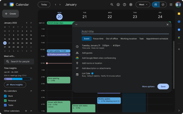
The headline change is the introduction of a much-requested dark mode option, but there is much more. Google Calendar on the web is being given an interface refresh to bring it in line with Google Material Design 3 and there is a focus on accessibility.
See also:
- Microsoft creates a new reason to buy an AI-powered Copilot+ PC -- image upscaling in Microsoft Photos
- Adding contacts to WhatsApp just got a whole lot easier
- Microsoft releases Windows 11 update with revamped Start menu, printer fixes, and new Copilot button remapping
Google describes the arrival of dark mode as a way to reduce battery consumption on laptops, but for many people it will be a simple matter of improved aesthetics. The option is rolling out right now, and you can check to see whether it has hit your account by heading to the Appearance section of settings and selecting Light, Dark, or Device default.
This new option is likely to be the first thing that users seek out, but Google shares details of the other changes which make small but important improvements to the overall experience:
- Controls (like buttons, dialogs, and sidebars) that are more modern and accessible
- Interface typography that uses Google’s custom-designed and highly-legible typefaces
- Iconography that is legible and crisp, with a fresh feel
The rollout is underway now, but Google says that it could take a couple of weeks for the new features and design revamp to reach everyone.