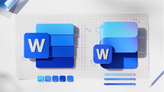
Microsoft is giving its icons a sleek and smooth makeover

Microsoft has officially announced a subtle revamp of its Microsoft 365 icons. Taking something of a cue from Google, the redesign is subtle and sees a switch towards using gradients and flowing colors.
The update is the first for Office icons since 2018, and this latest change is a gentle revisiting and dialling up of the changes that were introduced then. This is not a rebrand or a major change, but a pleasing evolution.
Jon Friedman, CVP of Design and Research for Microsoft 365, says that the update is a “subtle refresh”. But for all the subtlety of the appearance, the impact feels greater, and there is much emotion behind the design:
The new icons emanate a sense of fluidity and play, while also being simpler, more intuitive, and highly accessible. Their metaphor, shape, color, and letter have been redefined to create a cohesive, discoverable, and navigable system, crafted with gradients and gestures woven into Microsoft’s AI expression and experiences.
The gentle changes see Microsoft moving away from brutal design and sweeping flips of direction. The company says:
Delightfully simple: to maintain familiarity while streamlining the visual experience, we graphically simplified the icons for clarity and reduced visual noise. Whereas Word’s icon previously used four horizontal bars, the new version uses just three, improving legibility at small sizes and creating more visual concision.
Fluid shapes: We’ve moved away from bold, static solidity to embrace softer, more fluid forms. Sharp edges and crisp lines are replaced by smooth folds and curves, giving the icons a sense of playful motion and approachability.
Rich and colorful: The color palette has been dramatically refined. Where gradients were once subtle, they’re now richer and more vibrant, featuring exaggerated analogous transitions that improve contrast and accessibility. This shift makes the icons feel brighter, punchier, and more dynamic.
Instantly recognizable: Letter plates were much debated because they’re valuable real estate and icons following the core 10 Office ones no longer use them. Their brand equity is so strong, however, that we decided to keep them—maintaining our heritage while also modernizing them through a more cohesive visual integration with the overall design.
We have already seen something of a hint of where Microsoft was planning to take its design language when it revamped the Copilot icon. This wider refresh is very much from the same school of thinking, and the team behind the new look are clearly – and justifiably – proud of their work.
Find out more here.
