Google testing a radical Gmail redesign

Although a lot of people don’t really like Gmail’s web interface, I’ve never had a problem with it. Once you’ve learned your way around, the UI is functional and you can customize the look with themes, and even your own images.
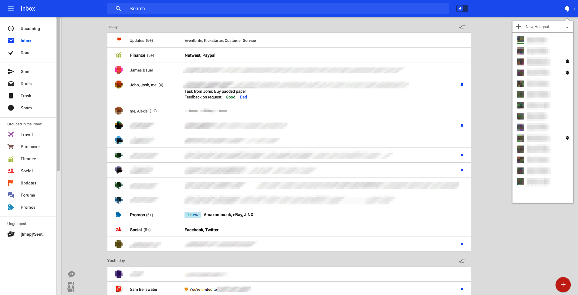
However, according to Geek.com Google is testing a redesigned interface for its web-based Gmail service. As with all tests, it’s possible the new look won’t see the light of day, but the design appears very polished, and barring a few cosmetic tweaks I think there’s a very good chance it will replace the current UI at some point in the future.
The screenshots show a very different interface, which is designed for any size of screen. Geek.com says there’s a fly-in menu system on the left, with the tabs that were introduced last year (including Social, Promos and Updates) displayed there. Other groups include Travel, Purchases, Finance, and Forums.
Hangouts are in a collapsible pane on the opposite side and there are email and reminder creation bubbles at the bottom right, and an over-sized search box at the top.
Stars look to be replaced with a pin system, so you can pin important messages.
The new UI has a more modern feel to it, and I really like it. You can read more and see additional screenshots over at Geek.com.
