Mozilla experiments more with 'New Tab' in Firefox 3.1
The engineer behind the ambitious Ubiquity project, Mozilla Labs' Aza Raskin, is already on record as not being too keen on the completely blank "New Tab" feature in current production editions of Firefox 3.0.
"Right now, when you open a new tab, you get a blank screen," Raskin wrote on his laboratory's blog last August. "While clean, it has a 100% probability of not getting you where what you want to be. While it's good to not intimidate with an explosion of information, we can get a much more streamlined workflow -- thereby saving huge amounts of aggregate time-- by showing something. The question is, 'What?'"
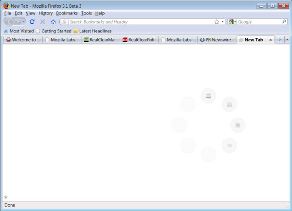
Yesterday, Raskin posted his first public effort at coming up with a genuine answer, but one which satisfies his personal desire for sensibility. Today, IE8 answers the question with another question -- specifically, a huge heading that reads, "What do you want to do next?" that looks like a '90s ad for Microsoft -- and Chrome tackles the issue with a gallery of thumbnails. But Raskin's team is envisioning a kind of eight-way speed dial: a cluster of eight circles bearing icons from most visited Web sites so far, with a name that only Aza Raskin could have conceived, the cognitive shield.
"No matter where we put the links to your most visited sites (and their latest news), it always seemed to be a distraction, based upon our own perception and the feedback from thousands of testers," Raskin wrote yesterday. "Given that the bulk of those testers are multi-tasking-adept early adopters, we'd expect that feedback to be even stronger from more mainstream users. Our original thought was to place the links along the bottom of the page -- outside your foveal vision. In practice, the peripheral vision proved too strong, and the links still drew your eye and interrupted your cognitive flow."
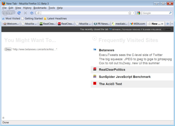
So his strategy is to come up with a system that doesn't interrupt your train of thought unless that train appears to stop long enough to give it an opening to squeeze in. The theory is that users may not want to be inundated with a long list of frequented Web sites unless it can be certain that the user wants to see that list in the first place. The New Tab functionality can draw that assumption if the user is moving the mouse down toward the right, where such a list would appear. Then and only then would that list fade in. Otherwise, the screen shows this otherwise unobtrusive speed dialer with eight icons and no text.
Mozilla Labs is distributing an experimental About:Tab plug-in, designed specifically for the latest betas of Firefox 3.1. In Betanews tests this morning, we were eventually able to get the new plug-in to work as advertised, but only after significant wrestling with the controls; this was also the case with our initial tests of Ubiquity, although we eventually were able to make progress. From time to time, the list fades in and the cluster fades out whether we move the mouse or not, which doesn't appear to correspond to Raskin's description.

An asterisk in the lower left corner turns on and off the New Tab functionality; and by "off," I mean that the fresh tab returns to its native blankness (except for the asterisk). I'm not all too sure that's actually helpful; there's never a time in my memory when my cognition requires such a shield that I would want my tab to be blank. If I want blankness, I'll turn the computer off.
Also in our initial tests, the grey-on-grey speed dialer -- which Raskin described as a "personal watermark" -- is not only very hard to read, but impossible to operate. Whenever I move the mouse pointer towards it, it fades out and becomes the list that Raskin said the cluster was put there to shield me from. If the tab I'm looking for isn't on the list, I can click on a (+) button which enables me to type something instead. But if what I'm typing doesn't appear on the list someplace (which I should know, since I'm looking at it), then not only do I not see the item I'm typing on the list, but I don't see what I'm typing in the field. Consider this "direct feedback."
Of course, if what I was looking for wasn't on this list anyway, the question becomes, why wouldn't I type what I'm looking for in Firefox's address bar in the first place? And if I really wanted to shield myself from too much cognition, suppose the functionality were to exist where I could simply have typed what I wanted, clicked on a button, and created a new tab containing that resource...rather than creating a semi-empty resource that I must then populate with something?
Well...actually, it does. With Firefox 3.0 right now -- not even with the beta -- I can bypass the blank New Tab entirely, type what I want into the address bar, and press Alt-Enter rather than Enter to generate a populated new tab.

One feature I do like, and which may grow legs at some point, is a predictive one that checks whether the system clipboard contains a URL. If it does, then when I create a new (blank) tab, the task that produces a page with that URL appears at the top of a task list headed, "You Might Want To..." Now, I might also have wanted to paste that in the address bar and press Alt-Enter, though in fairness, that process may not always be obvious to every user. Still, we can assume that if the URL got to the clipboard in the first place, that this wasn't an accident; the user at least had enough wherewithal to select it from someplace and probably press Ctrl-C.
So some people see what can be and ask, "What?" Unfortunately, others among us can still see what already is, and ask, "Why?"
