Will the ribbon work in Mac? Design clues from the Office 2011 screenshot
Microsoft was under no obligation to build a ribbon component, similar to the one premiered in Office for Windows, for the Mac. That's especially true given the fact that the menu bar is such a prominent element of the Mac user experience. Ever since System 7, the menu bar -- which remains fixed to the top of the screen -- indicates which application is active. In Windows, applications have their own menu bars, if they have them at all; and starting with Office 2007, the ribbon replaced the menu bar.
In Windows, the replacement of the menu bar for Office apps was one of its design goals: a way to reduce screen clutter and minimize the steps or clicks required for a user to find a function. At least that's how Microsoft presented the original idea back at PDC in September 2005. In MacOS, you can't replace the menu bar, so a ribbon would have to find some way of complementing it, sharing the workload with it, in a way that makes sense to the user.
And that's the problem: Judging from the one screenshot Microsoft released yesterday of an early development build of Word 2011 for Mac, it's not obvious how its implementation of the ribbon will complement, and coexist with, the menu bar. Perhaps one screenshot isn't a good enough clue, but that screen does show the new Home tab of Word, as it's currently being envisioned. If a new user, unfamiliar with the word processor, were to sit down to this screen and try to ascertain how to use this program on her own, it seems more likely she'd start by perusing the menu bar than the ribbon tabs.
For three decades now, the most skilled developers have embraced and extended the principle that menus in a bar should have consistent categories whose divisions are simple for someone to intuit without a manual. When asked to give my advice on the matter, I've always maintained that menus should distinguish between actions and things, the same way a sentence clearly distinguishes between verbs and objects. For instance, "Insert" is a very straightforward menu name that implies the creation of something new, typically a visual component rather than just text. "Insert" is the name of a ribbon tab in Office 2007 and 2010 for Windows. "Edit," meanwhile, implies the changing of something already present. It has been the second menu category of nearly all applications ever created that follow the Common User Access principles, for both Mac and Windows; and it remains the second menu category in the Office 2011 screenshot.
On the other hand, things can be both edited and inserted. So you can see how the confusion over what function does what action, can begin. Several years ago, I commented to Microsoft developers about how the Word menu bar contained "Edit" (an action) and "Table" (something that can be edited). A reasonable novice user might ask, "If I want to edit a table, which menu should I pull down?" Depending upon whom I was speaking with at the time, the response I got was, "Well obviously, 'Edit,'" or "Well obviously, 'Table.'"
It didn't help that the menu selection for inserting a table fell under the "Table" menu rather than the "Insert" menu -- technically, it was under a submenu: Table > Insert > Table. How intuitive is that, really? The explanation I usually got was, "Well, the 'Table' menu is for tables that already exist." "Then why isn't the 'View' menu for views that already exist?" I responded.
This was one of the quandaries Microsoft designers specifically addressed in the creation of the ribbon for Office 2007. When it was first demonstrated to me at PDC 2005, developers said that the most reasonable thing to expect a novice user to do when editing a table, was to click on the table. The ribbon should then respond with the features that pertain to changing or doing stuff to the table. That's when the design principles clicked for me, and I started really liking where the ribbon was going.
![Microsoft's screenshot of an early build of Office 2011 for Mac, now featuring the ribbon. [Courtesy Microsoft.] Microsoft's screenshot of an early build of Office 2011 for Mac, now featuring the ribbon. [Courtesy Microsoft.]](https://betanews.com/wp-content/uploads/media/45/4522.jpg)
Microsoft's screenshot of an early build of Office 2011 for Mac, now featuring the ribbon. Click here for the full-size image.
So I'm wondering why these same principles appear not to have been referenced in the initial design of Word 2011. Here, the ribbon contents we're looking at are from the Home tab, where the general character and paragraph editing features are most often found -- the contents of the regular toolbars in earlier versions of the product. What Word 2010 for Windows calls the File tab is represented here in the Word menu, which is alongside the File menu.
Inside the Home tab, one finds the Insert frame. Now, suppose you're a new user and you want to insert a table. There's a big Insert frame in the Home tab, but it only gives you Text Box, Shape, and Picture. So you don't go there. Perhaps a table is one of the Document Elements represented by that tab. (We won't know from just this one screenshot.) Assuming that's wrong, the user gets sent back to the menu bar. And we're back at square one; do we try the Insert menu or the Table menu?
It appears from this glance that the Word for Mac designers weren't trying to solve any of the same problems the Word for Windows designers were working on. Instead, they concentrated on the sole problem of getting a ribbon-like something into a Mac window. To do that, they didn't even bother to borrow the more refined elements of Office 2010; they went instead to the five-year-old drawing board of the "Office 12" project.

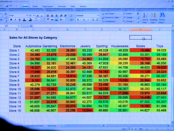
From PDC 2005, a screenshot of the premiere public showing of the ribbon in an early beta build of Excel 2007, in what was then code-named 'Office 12.'
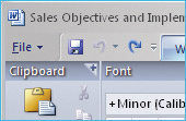
 The idea of making the ribbon subdivisions into tabs came after the initial design was shown off to the public. In this 2005 screenshot from Excel above, as well as in this blow-up from Word at left, you see how the frame categories (at one time, folks experimented with calling them "drawers," but thankfully that never caught on) were printed on top of the frame. The user clicked the little plus sign that pointed up, to pull up a dialog box with expanded options below -- which didn't make sense.
Granted, on the Mac, the system clipboard is a sacrosanct Apple property. Still, it is the tool with which one cuts, copies, and pastes, even if she's accustomed to typing Command-X, Command-C, or Command-V to do it. Ever since the beginning of the ribbon project in Office 12 for Windows, designers had the objective of making cut, copy, and paste more obvious.
So where are they in Word for Mac? Probably under the File menu where they've always been. Possibly a user could customize what Office 2011 designers are calling the "Standard Toolbar" by adding cut, copy, and paste to it (thereby making it non-standard). The counterpart for this device in Office for Windows, the "Quick Access Toolbar," takes up just the left corner of the title bar by default, though it can be scooted down below the ribbon. On MacOS, since the title bar is Apple property, the Standard Toolbar must be displayed as a full-size stripe below the title bar, although I imagine there's a way to turn it off.
In almost every sense, the addition of the ribbon to this rendition of Word 2011 for Mac distributes the application's functionality to a bunch of various on-screen devices -- perhaps a ribbon, perhaps a menu, perhaps a toolbar -- rather than consolidating them in one place, which was the ribbon's original design goal. Marketing this implementation using trendy phraseology, doesn't mask this choice to the user.
Nevertheless, Microsoft is wont to try anyway: "Together, the menu bar, standard toolbar, and ribbon complement each other seamlessly," wrote developer Han-Yi Shaw for the company's blog yesterday. "The standard toolbar hosts the most highly used controls -- such as New, Open, Print, Save -- so if you've seen an Standard Toolbar in Office sometime in the past twenty years, you'll know where and what to expect. The Office for Mac ribbon hosts the most highly used formatting and creation tools that were previously evenly distributed between the Formatting Palette and Elements Gallery in Office 2008. With the new Office for Mac ribbon, you know [sic] longer have to travel between these two user elements, but instead just focus on a single, unified, tab-based design."
Put together with the existing menu bar, this design can't possibly regain lost screen real estate in exactly the same way as for Office 2007. But perhaps if we just say it does anyway: "You'll also be pleased learn that the combined height of the standard toolbar and ribbon is noticeably less tall than the standard toolbar and Elements Gallery in Office 2008 for Mac. So you actually regain screen real estate when you switch over to Office 2011...For the remaining least used 20 percent of functionality, it doesn't clutter up the user interface and you can simply access them via the Mac OS X menu bar during that rare occasion when you them."
I used to write about Macintosh two decades ago for Computer Shopper. One thing that has never changed about people who use the Mac, is that it's because they want to use a Mac. So they want to use the menu bar at the top of the screen because that's what they prefer. It works for them. The problem Microsoft is trying to solve by grafting the Windows Vista/Windows 7-style ribbon onto Office for Mac is not so much a functionality problem as a perception problem: If Office for Mac can work well the old-fashioned way, then one might possibly ask why Microsoft developers didn't leave Office for Windows the way it was, or at least give them an option to switch back to the old menu bar.
But something which perhaps has never occurred to the company's developers to believe is the sheer possibility that maybe, just maybe, some people use Windows because they want to use Windows. Don't laugh. Why not envision a time when that's possible, and build Windows apps to suit the needs of Windows customers? And then for Mac customers, make Mac applications that run like they belong on Macs. If both groups were equally pleased with good design choices that appeal to them individually, there would be no perception problem for Microsoft to solve.