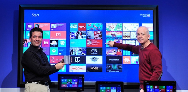
Windows 8 'Metro' is revolutionary

February 29 is the day I waited for for a long time. I downloaded the Windows 8 Consumer Preview to test out the work Microsoft has done so far, and I am very impressed. There are still some rough edges, though, but I like what Microsoft is doing. Strangely, I seem to be one of the few people that actually "get it".
As a designer, I am perfectly on board with anything that allows print and digital to come together in interesting ways. Mike Kruzeniski, who is a Creative Director at Microsoft, gave presentation "How Print Design is the Future of Interaction" at SXSW 2011 discussing this convergence. In interactive, content is important. We are quickly moving to a time where the lines between print and interactive content are blurring. And herein lies the problem with Windows 8. I refer to Metro, Windows 8's new motif that is receiving mixed reaction from testers.
Metro as a design language takes its cues from print: clear sense of hierarchy, reduction of elements (simplicity), generous use of white space and the use of imagery to convey meaning and important information. My point is this: White space scares a lot of people when it comes to applications because for far too long we have been led to believe that the only way to design an application is to add lots of chrome and other interface elements that tend to distract from actual content.
Microsoft is blazing a bold new path into a future where chrome is used when appropriate (Office, Visual Studio, etc.) and when it's not necessary (Metro apps). This is why so many people don't like Metro. The don't like the apps. They don't like the start screen. It's way too different from what they're used to.
But I can't help but think that regardless of how many of us go kicking and screaming into the future of software interaction, Microsoft is on the right track. I believe they should forge ahead with Metro and not look back. Those who don't like it will either switch to another platform or stick with Windows 7. Those of us who are okay with changing our computing habits to adapt to a new way of interacting with our devices will push forward.
One of the biggest challenges I face everyday in designing interfaces is how learnable to make them. In other words, how much do we require the user to learn the interface in order to use the application. The more discoverable features are, the easier an app is to learn and users will potentially use it more. I say potentially because it's easy to believe that the easy discoverability results in an app users love.
Windows interface designers at Microsoft deal with this challenge everyday. As I started navigating my way though the Preview using my mouse and keyboard, I felt many of the interactions were not quite intuitive. But this is not a bad thing! Although they were not intuitive, they were eventually discovered, and once discovered I never forgot them.
The learnability of the Metro interface will be high for some. Some gestures may not be all that intuitive but once you learn them, you don't forget them, and that is what makes an interface a joy to use: content at the forefront and functional/navigational elements hidden but easy to access.
Overall, I am excited about the work I see so far. The fact that is only going to get better makes me as giddy as a virgin on prom night! The Windows user experience team has paid extreme attention to detail and should be applauded. Many of the apps are stunning to look at. Typography is clean. Content is king. Imagery is beautiful and as a co-worker of mine commented while playing with it on a tablet for the first time, "Everything just seems so fluid!"
Metro will be a challenge for those of us used to Windows 7. So what. I'll get over it, just like I did with the changes from XP to Vista. Microsoft should listen to feedback, ignore most of it, and not make any drastic changes. Metro is the right way to go.
 Robert Johnson is a user interface developer specializing in the user experience (UX) of .NET-based web applications. He has been working in some form of web development and graphic design for 14 years. He loves technology in general, particularly that of Apple, Google and Microsoft. He is a Betanews reader.
