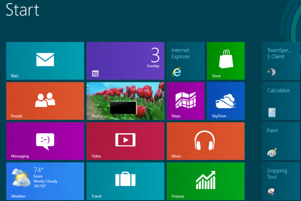
Imagine what Metro could have been...

Fundamentally, the Metro user interface is not bad. It’s a good idea to change the interface of an operating system from time to time. Microsoft did the right thing with Aero back when Windows Vista was introduced. It was definitely a step forward and made Windows XP look old and ugly by comparison.
The fact that Windows Vista had so many problems that some considered it the worst operating system to come from Redmond is another story. Comparisons with Windows Me didn’t help either.
But that’s what happens when you change the fundamentals: you’re bound to make a mistake and be criticized by your users.
Change is a very cold mistress. For every successful change, there seem to be at least twice as many failures. And it’s very difficult to follow success without doing something exceptional. If the next product isn’t at least 150% as good as the previous product, people are sure to point out that it’s not that special.
With that said, Metro is not that special.
The old desktop still beats Metro
The WIMP-style Windows desktop interface is old and still with us for a big reason: it works.
You can’t beat a simple recipe with even the most well-engineered solutions. Simplicity always has its fans and is always associated with reliability. The Windows desktop is like a numerical keyboard: you never know how much you miss it until you don’t have it. Accountants can attest to this.
There is a fine line that they should have thought of before rushing into telling the world that they will have no chance to choose between the classic desktop or Metro. That line is the familiar versus the controversial. There are ways to circumvent this forced choice but it would have just been better for it to come through official channels.
Metro misses the mark by offering an experience completely separate from the old desktop. This has created a reluctance toward it, and it is going to be the root of a lot of problems. It would have been ideal if Microsoft provided a smooth transition between them without any visual or psychological discomfort.
Redesigning Metro
Microsoft should have blended the two into an unique interface that would have combined the benefit of ease of use that the desktop has with the unique visual impact that Metro creates. It could have been done, and it could have changed our perception of the old desktop. Improving on that would have netted a formidable result.
It would be easy to do, too, as the desktop could be split in half, allowing for tiles on the right side (20% of the screen would be enough,) and on the left side the reliable desktop could reign in peace. It would have combined the Windows Phone 7.5 interface that so many people are fond of and also eliminate the "antiquated" Start button. What about transitions? To make transitions between screens easier you only have to move the cursor to the right.
Mission accomplished, you've got the best of both worlds, both at a touch of the mouse.
Imagine what that would have looked like, and how interesting it would have been to have all the tiles in a distinct part of the screen instead of occupying the whole thing. The interface of Windows Phone 7.5 is beloved because it works easily and it creates no interruption in the flow of action. Live tiles provide a clear benefit through their live updates, and they look great while they're at it. You’re moving from one screen to another with fluid ease, something that no one else actually seemed to get quite right.
I see this as a very plausible scenario and one that could have a great success. Maybe there’s even a talented developer that could make all of this happen. Microsoft, you can steal my idea.
How do you envision Metro?