I'm sick of being a Google+ lab rat
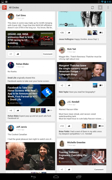 Complexity creep is ruining Google's social network, much like Facebook before the recent, and quite exciting, redesign. I use G+ mainly on mobile devices, and that experience is in the outhouse -- and, whew, does it stink -- following this week's app update. Just four days ago. It seems like four years. My use of the service has collapsed. There is too much clutter, too much distraction. The user experience on Nexus 10 is analogous to going from a vast, wide-open forest to thicket and bramble.
But the larger problem is change, change, change. Google constantly modifies the Plus user interface -- experiments really -- and users are lab rats.
I tweeted three days ago: "I'm sick of being a Google+ beta tester. How many more times will the mobile app design change? I love new things, but this..." To which Adam Hall (who works for Microsoft) replied: "What's the foot traffic like now? Population growth? I took a peek early on but was a ghost town so gave up". I answered: "There is plenty of foot traffic. But Google keeps rearranging rooms and putting up new walls. Is that a door or closet?" He suggested "maze". I answered: "LOL. Yes! Lab rats running the maze. So is it some quirky Google intelligence test?"
Google geeks gone wild -- that's how the situation looks to me. Maybe the constant redesigns are an IQ test from the math whizzes in Mountain View, Calif. Worse, maybe the people building this thing can't make up their minds -- or there's a committee somewhere, essentially a group mind, that can't decide anything. Can you say "Borg", baby? Perhaps Google takes too much community feedback or, worse, there is no plan at all, which wouldn't be uncommon in Silicon Valley. Big brains think up little feature enhancements and throw them in the pot without considering how they might affect the stew's taste.
Cha-cha-cha-changes
Maze is apt analogy, because the path keeps changing. I'm amazed at the radical makeovers taking place every few months -- that's to the website, too, but mobile is far more dramatic.
In December, when reviewing Nexus 10, I boasted: "I much prefer Google+ on a tablet to the service running in a PC browser". I sure as hell can't say that now. Take a look at the screenshot above, captured this morning. There is a whole lot of clutter, more posts per page and distracting movement from comments that flash by underneath post images.
Consider the May 2012 update, for which Google's Vic Gundotra posted screenshots from a smartphone and compare to images of the newest design here. (There are also two screenshots below -- darker is the older and lighter is newer.) These are quite different designs in less than a year, and I simply single them out. The dramatic changeovers are more frequent.
The big, December Google+ update isn't so radical (screenshots here and here) from this week's, on smartphones. The bigger change came months earlier. Little more than a month after the May 2012 Android update, Google radically redesigned the mobile app.
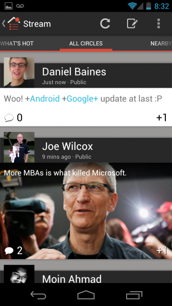
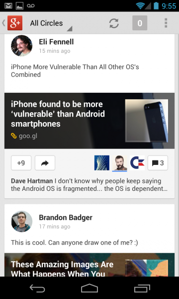
The screenshot left is how Google+ for Android looked in May 2012. The one right is the appearance following the big, March 2013 update.
Google+ clutter creep comes to the website, too. Consider how the user Profile looked in April 2012 compared to major changes Google made earlier this month.
I'm a big supporter of change and have past praised Google for improving the social network, regularly. But there is a whole lot more clutter and distraction today than a year ago. Much of that is more tolerable on the web, but, in my view, unacceptable on mobile. Google asks too much of the eyes.
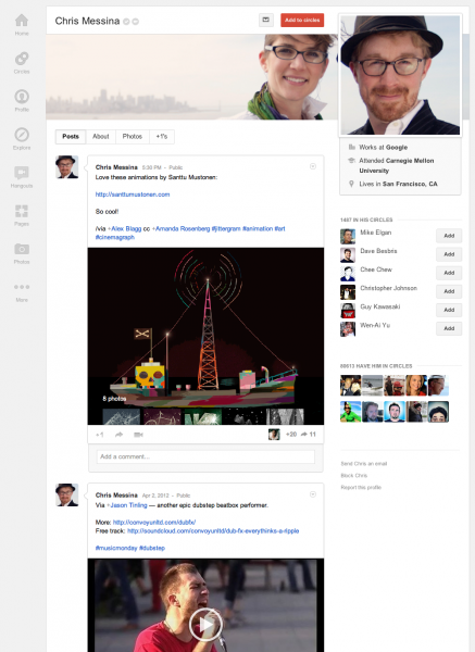
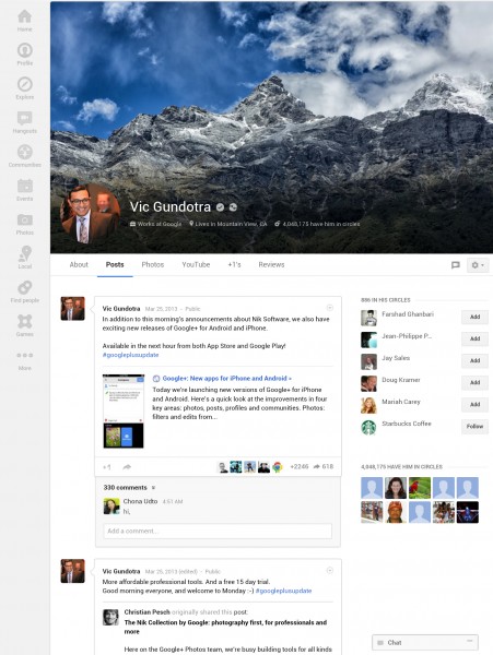
Image left is the Google+ profile in April 2012 and the right March 2013, as viewed on the web.
The problem is bigger, and this goes back to the idea of the ever-changing maze. There are very good reasons why smart companies think through and implement user motifs they keep for years. Most people balk at change, finding comfort in familiar motifs around which they develop habits that speed interaction. Facebook is the criminal of constant, cluttered redesigns. Social network street punk Google is little better.
For me, realization of my lab rat status and seeing no spoils in the new maze ahead is actually liberating. I will start spending more time on other social networks in the coming weeks, and less on Google+. I'm not abandoning or boycotting, just reallocating my time.
Change is good, right?
