MultiPLX is latest RSS alternative to dance on Reader's grave [review]

I am long done with rattling on about Google's decision to kill Reader. I get it. RSS is popular with our crowd -- the tech writers and those who follow multiple blogs and wish for an easy way to keep up. That is where the service excels. But, let's face it -- the vast majority of people do not use this technology. My wife and kids, savvy computer users, would not know what RSS was if I asked.
However, the software has a niche, and sometimes a niche is all that is needed for a successful business. We have alternatives in Feedly, The Old Reader, Feedspot and Digg, which has bun in the oven. There are lesser-known options as well, but most users seem to be destined for one of these already established programs. Several have had to beef up server capacity and bandwidth to cope with new-found popularity.
New Kid on the Block
This brings us to MultiPLX -- the latest web app to step into the game. Do not expect to try it out right away -- it is in private beta for now, but you can enter your email and wait for an invitation -- there is a work-around that I will get to, though. The app calls itself "the real Google Reader alternative", but is it?
"MultiPLX is a visual RSS Reader and works as a full web service, designed from ground-up to be as scalable and fast as Google Reader", the Walnut Creek, Cal-based startup tells us. "Although there are many variants that are trying to imitate Google Reader at the moment, most of them are desktop clients or mobile apps that depend on Google Reader engine. MultiPLX is a full web based service with a back-end that can scale-up to serve millions of users, and billions of feed posts each day with a speed that is unmatched even in desktop clients", Emre Kosmaz MultiPLX founder says.
That is a lot of hype to live up to. Can the service handle the pressure? To find out I got a hands-on look at what it has to offer, though bear in mind that it is still in the early stages of development.
The Default Interface
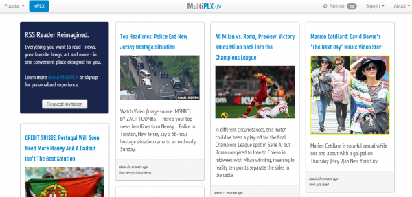
By default, and you can see this even if you do not have an invite, MultiPLX has a modern look. There is a newspaper style layout going on here. Four columns grace the screen in an endless scroll -- much like Bing image search uses. This is a far cry from Google Reader and many of the alternatives.

Perhaps you will love it, embrace the modern styling, the magazine look with the newspaper layout. Images are large enough to be recognizable and and the beginnings of posts can be easily read. If you just want Google Reader back, though, fear not. MultiPLX has not left you behind in favor of this.
Bring Back My Reader!
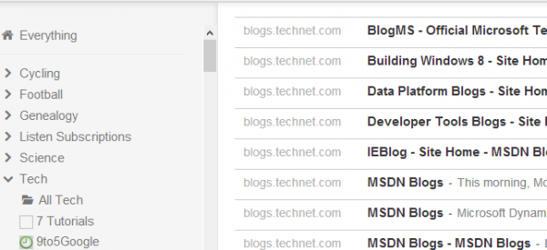
If you are like me, then you may be here because you just want Google Reader functionality. This is only a mouse-click away. Note the bar across the bottom of the screen -- large red letters will tell you "Google Reader users can now use MultiPLX in list view. Click here to see how it works".
Voila! Transportation to throwback nirvana. But hey, we all liked Reader and few embrace change -- just ask those who rail against Windows 8! The list view transforms your screen into a Reader-like look, no questions asked, no settings to fiddle with.

Settings
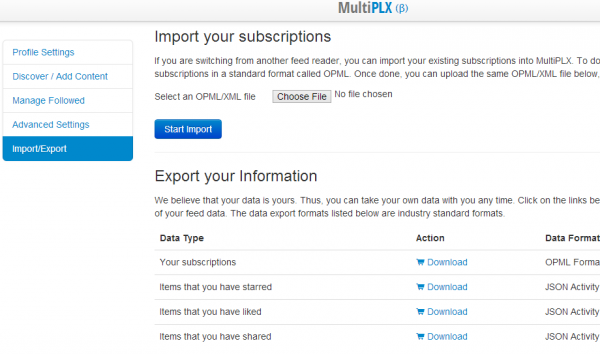
The settings page consists of several options displayed down the left column -- Profile Settings, Discover / Add Content, Manage Followed, Advanced Settings and Import / Export.
The last will be your first stop because this is only useful after you have imported your feeds. Google Takeout makes it easy to grab an XML file of all your data. However, if you are coming from Feedly then I am afraid you are out of luck -- the service inexplicably contains no export ability.

Manage Followed allows you to change names of feeds and add and remove categories to keep everything organized. Advanced Settings provides the usual array, while the others in the list are mostly self-explanatory.
The Verdict
MultiPLX makes a decent alternative for disenfranchised Reader customers, but the web app still has a ways to go. Having an export option is certainly a plus -- hint to Feedly. The option to use a Reader-style view is also nice. However, the left column has a bit of jumbled look, thanks to feeds with longer names being wrapped around, making it more difficult to find something at a glance.
Oh, and as for that hint about getting into the service now without having to await an invitation? You can use the promotion code GOOGLEREADER to get your invitation email right away.
Photo Credit: Blade Dancer/Shutterstock
