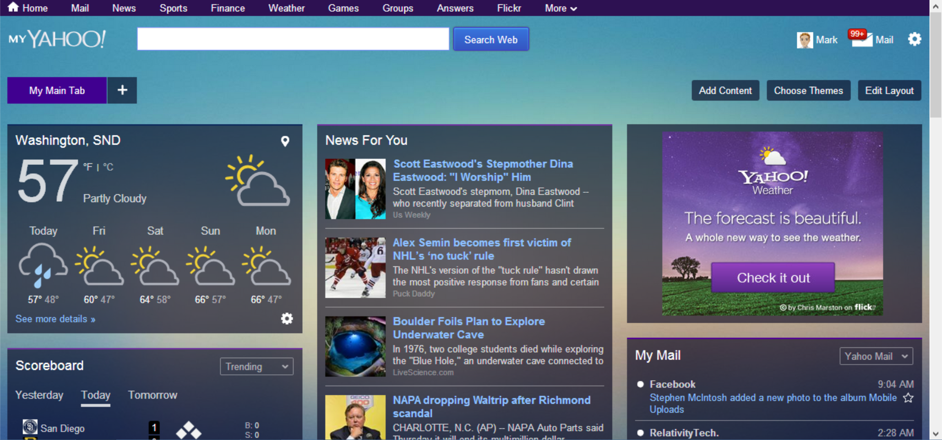
New My Yahoo aims to make the internet personal again

Not content with its new logo, Yahoo is now pushing the personal homepage with the relaunch of My Yahoo. It's a blast from the past in many ways. The personalized portal is something that had virtually died off, but Yahoo is keen to dust it off, give it a polish and entice people back into using it.
If you’re the kind of person who likes to be able to access everything in one place, the resurrected My Yahoo just may well appeal. "Resurrected" might not be the right word. My Yahoo never really went away, it just faded into obscurity and everyone forgot about it. But now it's back with knobs on -- and quite a lot of purple.
Google may have dropped iGoogle, but Yahoo has its arms open wide to receive anyone looking for a new home for their online widget. And widgets are what it's all about -- widgets to display email, news, weather, news feeds, headlines and more. There's nothing new to shout about, just a new look that Yahoo is keen to share on its blog.
My Yahoo is great if you like to get your data in snippets or bite-sized chunks. Want to see a few of the tweets from people you follow but don’t fancy visiting Twitter? There's a widget for that. Like the idea of seeing a tiny portion of the unread email waiting for you in your inbox? Ditto. Things not feeling quite commercial enough? Why not change the look of your own My Yahoo with a theme from your favorite band (or brand)?
Still need convincing? Let Yahoo's video work its magic on you:
Do you feel the need for a personalized introductory page to access the web or are you more comfortable with a selection of tabs?
