Windows 8.1 Update 1 -- A Frankenstein product stitched together with compromises

Microsoft’s tiled operating system has always divided the Windows community. There are those who love or at least like it, and those who tolerate, or outright hate it. I tried really hard to like Windows 8, but never did. Windows 8.1 is much more usable for me, and I’m a fan of it now (even though I probably wouldn’t have switched in the first place if my job didn't require me to be running it). But let’s be honest here. "New Windows" was a massive gamble for Microsoft, and it’s one that simply hasn’t paid off.
The devices and services giant bet big on touch screen devices and Windows tablets flying off the shelves, and they haven’t. The PC market has imploded, users haven’t really taken to expensive touch enabled computers, and Windows tablets are nowhere near as popular as iPads or the numerous Android powered alternatives. Users are sticking firmly to older versions of Microsoft’s OS -- Windows 7 and even XP are showing more growth than Windows 8.x. With the forthcoming Windows 8.1 Update 1 Microsoft has rolled over and admitted defeat. Keyboard and mouse users are here to stay, and finally the tiled OS has something to offer them.
There’s no classic Start button and menu in Update 1, but that’s the only thing that’s really missing from the next big update. When the OS runs it will automatically detect the hardware it’s on (something that should have always been the case) and adjust its behavior accordingly. If it’s running on a tablet, or a touch enabled PC, Windows 8.1 will boot straight to the Start screen -- unless you set it not to. If, however, it’s running on a computer with mouse and keyboard, it will boot straight to the desktop.
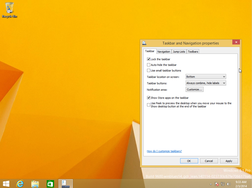
Yes, that’s right, with Update 1 the fabled Start screen is no longer the default interface for users. Instead, it’s been relegated to the role of a full screen Start menu. And other changes, such as the ability to pin Windows Store apps to the taskbar alongside standard desktop programs, means many users will hardly ever need to see it.
Windows Store apps will behave more like desktop programs too, thanks to the addition of a menu bar at the top of the screen that lets you minimize and close apps and split them left and right. The taskbar is visible the whole time too, even on the Start screen.
Right-clicking on app tiles with the mouse will bring up a context menu, so you’ll be able to customize the Start screen that way (if you’re still using it), avoiding having to drag the mouse all the way to the bottom of the screen to make changes.
The Apps screen gains a new Alphabetical view in Update 1 and you’ll be able to adjust the settings so more apps appear on screen -- useful for anyone with a large monitor or running in a high resolution.
The update will also add new buttons for search and shutdown on the main screen, which again are very much designed for mouse and keyboard users.
The changes in the forthcoming release continue the clear U-turn that Windows 8.1 started. With that update Microsoft added a Start button (of sorts), an Apps view, the ability to have the same wallpaper on the Start screen as on your desktop (to make the transition between modes less jarring), a boot to desktop option and lots of other tweaks that improved the OS immeasurably.
With the next update, expected in April now, Microsoft is finally transforming Windows 8.1 into an operating system that users of Windows 7 or XP could upgrade to without hating it or being totally confused. But will the changes alter public opinion? I’m not convinced. When I covered a leaked early build of Update 1, one comment really summed things up for me.
 Derekaw said: "The Windows 8 experiment continues. It's like being part of a beta program". And he’s right, it is. Every iteration of the OS moves further and further away from the original release. It feels as if Microsoft is now just trying features out in the hope of finally coming up with something that appeals to everyone.
Don’t get me wrong, having used a leaked early build of Update 1 I really like the changes it offers. As a keyboard and mouse user, it’s a definite step in the right direction and they make the OS easier to use. Although, as was the case when Windows 8.1 landed, users will once again be faced with having to relearn how to use certain elements of the OS.
Windows 8 was always a weird hybrid, a touch interface and a desktop trying -- and just about succeeding -- to coexist. Windows 8.1 Update 1 on a desktop PC looks to be an even weirder hybrid -- a cut and shut. It’s two parts tightly welded together and given a new coat of paint and go faster stripes in the hope of disguising the joins. Maybe I’m just being overly negative here but with all the changes Microsoft has made along the way, Windows 8.x feels like it’s becoming a Frankenstein product stitched together with compromises.
That said, I’m looking forward to the update, but I hope in the next full version of its operating system Microsoft takes everything it’s learned from the very public "New Windows" experiment, and rolls out a fully formed OS from day one.
Photo Credit: Antthony Paul Taylor/Shutterstock
