Windows 8.1 Update 1 lacks the one thing that could save the troubled OS -- a Start menu
 Yesterday I wrote about the forthcoming Windows 8.1 Update 1 and called it a "Frankenstein product stitched together with compromises". My view was based on my experiences with a leaked build of the OS. I didn’t realize, at the time of writing, that others were saying the same things, or that the update was being so roundly criticized online (I try to form my own opinions based on experience rather than get them second-hand).
Since then I’ve read numerous articles on the subject, and ploughed through hundreds of comments, and the general consensus of opinion is that Windows 8.1 Update 1 is, at best pointless, and at worst, a disaster. That seems a little unfair, seeing as the finished version isn’t even out yet, but that’s been the story of the tiled OS since the very beginning -- people haven’t been willing to give it a chance.
With Windows 8.1 Microsoft took the rough, rather half-baked Windows 8, and improved it. With Update 1, the purpose seems to make the OS more appealing to keyboard and mouse users, albeit by providing features no one ever asked for.
I’m fine with inclusion of search and shutdown buttons on the Start screen, although I probably won’t use them. The automatic boot to desktop default on non-touch systems is good, and the ability to show Windows Store apps on the taskbar is fine by me too, but I could live without them. The menu bar at the top of apps -- making them easier for first time users to close -- is okay as well, I guess. The inclusion of a hidden taskbar on the Start screen (I said yesterday it was visible at all times, but it isn’t), and right-click context menus on tiles just feel unnecessary, however.
I am looking forward to Update 1 rolling out, so I can try the finished version properly, but I’m not sure how much the changes will actually benefit me, or other Windows 8.x users, and similarly I’m not sure how appealing they’ll be to users of older versions of Windows.
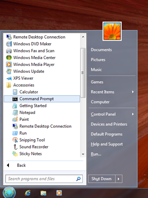
In trying to woo the mouse and keyboard brigade, Microsoft has made various changes to its OS -- some welcome, others less so -- yet stubbornly hasn’t delivered the one thing that people have been asking for since the tiled OS first debuted -- a traditional Start menu.
As a Windows 8.1 user I’m happy to just use the Apps screen, but I know plenty of people who won’t switch to the new OS because it lacks a Start menu, and there are lots of third party Start menus available, catering to the clear demand. I know it’s an old, tired argument but it seems weird to me that Microsoft has accepted that a large portion of users don’t use the Start screen, and has decided to make the desktop view the default on keyboard and mouse systems, yet not gone that extra mile and added the Start menu that has been demanded across the internet since day one.
It’s like the Start menu is viewed as the ultimate admission of failure at Microsoft, and the company will do anything, customize everything, so long as it doesn’t have to go back to that. And as a result, we have Update 1 that will introduce several slightly odd, frankly unnecessary changes, but not the one that perhaps might have persuaded a decent number of Windows 7 (or XP) users to finally make the switch.
