Surface Pro 3 first impressions -- hands-on with Microsoft's new hybrid PC

When I boarded the train earlier this morning to go to the Surface Event in NYC, I had small expectations. Let me clarify -- small but not low. In other words, I was expecting a Surface Mini. Truth be told, I wasn't overly excited about yet another small tablet (manufacturers are already doing a good job with them). However, despite my trepidation about a small tablet, I was excited because it would have been a Surface, which is known for high quality. Plus, there were rumors about a new Surface Pro 3, and that had me giddy.
Imagine my surprise, when internet rumors about the Surface Pro turned out to be true and the Surface Mini was vaporware. I was front row today while watching Satya Nadella and Panos Panay unveil the Surface Pro 3 and I was smiling ear to ear the entire time. Not only was the tablet amazing, but so too was the presentation. It was very Steve Jobs-esque, which is rather appropriate. Today, Microsoft is finally a step ahead of Apple with devices. The magic has left California and gone to Washington. Here are some of my first impressions of the game-changing laptop/tablet PC hybrid.
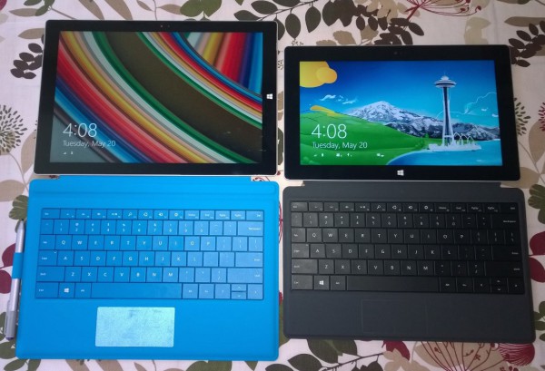
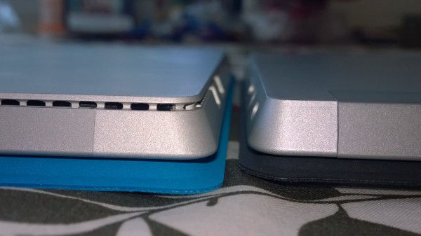
Many are probably thinking the tablet is an unwieldy brick. Well, I am here to tell you that it is not true. While the tablet is larger due to the bigger, 12-inch screen, the device is extremely thin. So thin in fact, that it is pretty much equal to the ARM-powered Surface 2.
While the display is bigger, it is also better too, going from 1080p to 2,160 x 1,440 resolution. Microsoft has even coined a term for the screen technology, "Pixel Free". While the name is gimmicky, reminiscent of Apple's "Retina" propaganda, there is something to the name, as I cannot see any pixels in normal use -- it's that good.

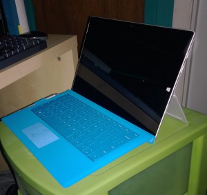
The kickstand has also been improved, going from a two-stage movement to essentially an infinite-stage. Microsoft has implemented a special hinge, that allows you to position it in any angle that you want. It is kind of scary to use, as you feel like it could break. But no, it is very solid and seems to take the abuse. Only time can tell though, if the mechanism will last.
As far as ports, it is as to be expected -- a single USB 3.0, a mini DisplayPort and a microSD card slot. Sadly, I was hoping Microsoft would have offered a full-sized SD card slot, but it is not a deal-breaker at all. The power port luckily has been redesigned and is fantastic. While the plug still attaches magnetically, there is no fiddling required -- you can do it half-asleep.
 I have been a huge proponent of OneNote and a heavy user of the service. Two months ago, I said "Make no mistake, this will be a huge part of Microsoft's future". Well, not to toot my own horn (toot-toot), but it seems that I was correct. The Surface Pro 3 comes with a redesigned stylus that heavily integrates with OneNote. There is even a bright "OneNote-purple" colored button (yes, I am coining that color) on it. This button, when pressed, will turn on the tablet's display and launch OneNote. From here, the user can quickly jot down ideas or reminders. Based on today's presentation, it is clear that OneNote has a big future.
The new stylus, or pen as Microsoft is calling it, has new technology that reduces lag. Ultimately, the user can write on the screen without thinking about it. This is a huge win for pen-users, as that lag can be a killer.
The real question though, is how does it feel? Pretty darn good, I must say. While using it, at no point does my arm get fatigued, nor do I feel it is too large. It is solidly built -- tank-like if you will. During today's presentation, it was dropped onto a floor with nary a scratch or ding. While I will not be torture testing it in this way, it's nice to know that it is built to last.
 Many pundits will consider it too expensive, but I think it is important to look at the big picture. The least expensive unit starts at $799 and people pay more than that for iPads, which are arguably less useful. The particular unit I am testing is priced at $1299, but has a Core i5, 8GB of RAM and 256GB of onboard storage. This is more than enough power for most users and I can definitely see it replacing the laptop for some.
Quite frankly, with the new dock, it can replace some desktops too. Did I mention that the docked Surface Pro 3 can output 4K? Yup! Imagine replacing a desktop, laptop and tablet with a single, powerful device. If you think of it that way, it is not unreasonable.
Sadly, the Type Keyboard attachment is still a separate purchase, but it is immensely improved. Typing feels about the same, but it has a new trick. By folding it up ever so slightly against the screen, it attaches magnetically in such a way as to tilt for better typing. This also has the added benefit of making it more secure for lap use (Microsoft calls it "lapability"). The touchpad truly shines though -- gone is the friction and frustration. Fingers glide well and two-finger scroll is a dream. It is night and day better.
While Microsoft has been one move behind the competition for many years now, things are starting to change. Windows Phone 8.1 is immensely improved and Windows 8.x is maturing through updates, into an OS that people actually love. Finally, with the Surface Pro 3, Microsoft is at last ahead of the competition.
