Google finally gets around to revamping Contacts, but not without complicating things in the process
Compared to other Google products, Contacts feels like an afterthought. Since its introduction, it has received little attention, as the search giant focused on its more prominent and more promising services. Do you remember the last time an update was announced? I sure don't. It's still as ugly, awkward to use and slow as you've always remembered it to be.
But not for long. Google has announced that Contacts will finally get its much-needed revamp, showcasing the improvements via a preview that's available now. The new Contacts features some pretty big changes, starting with a look that feels modern enough for a Google product unveiled in 2015.
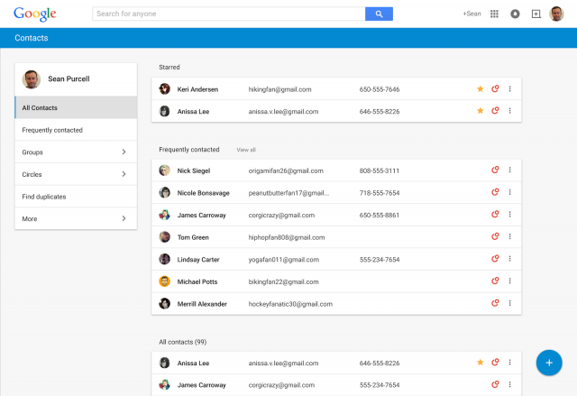
The layout has been changed to make it easier and faster for users to access their contacts' information. Click on a contact and instead of being taken to a dedicated page, as is the case with the current design, Contacts will show a card with all the available information. It pops up in the foreground, and you never lose track of where you were when browsing the contacts list. It also shows your conversations with that contact.
A list of your frequently-contacted and starred contacts takes center-stage, at the top of the contacts list. It's easier to find duplicates, as the option now resides in the menu to the left of the page.
The new Contacts still pulls information from Google+. When that's available, there's a Google+ circles icon in the right side of the contact's row. This ensures that you always have the latest contact information available, which saves you the trouble of updating it yourself.
Hover the mouse cursor around the far right side of a contact's row and you're given options to edit, star and manage the contact's presence in your circles. There's a three-dot button on the far right, which, at least so far, only exposes the delete option.
A button that exposes a single option feels unnecessary. I have a similar problem with the More button that's on the main menu to the left of the page. You have to click on it to get more options, when there's more than enough screen estate in my case to show every single one of those options without adding this unnecessary step.
It feels like Google is trying too much to achieve a simple-looking design in the new Contacts, and it's sacrificing usability to do it. The same thing happens in the new Gmail app on Android 5.0 Lollipop, by the way, when used in portrait mode on a tablet -- some options require a tap on a button to be displayed, when there's enough room vertically for this step to be unnecessary.
As we have come to expect from Google, there's also less information visible on the screen. The layout is not as condensed as before, meaning that instead of the 26 contacts I could see previously in the browser there are only 19 shown in the new Contacts without scrolling. Good if you have bad eyesight, bad for everything else.
You can check out the new Contacts preview by hitting this link. Google says that it'll be available through Gmail in the coming weeks (you'll have to use that link every time you wish to access the preview), and that it's working on making it available to Google Apps users as well.