50 shades of gray -- hands on with Windows 10 Build 10049, the dullest Windows ever

We might have waited ages for a new build of Windows 10, but a mere fortnight later and Microsoft has rolled out yet another update, again initially only to Windows Insiders on the Fast ring.
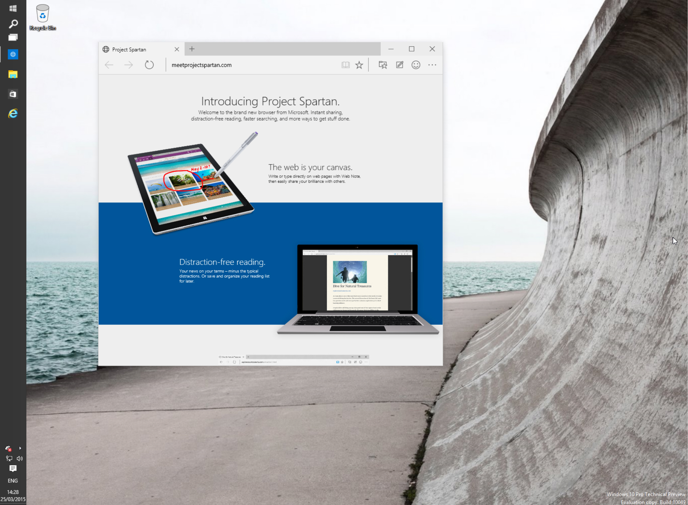
The star of this build is Project Spartan, Microsoft’s new web browser. It’s an early version, but it’s a good look at what the tech giant has been working on, and of course it comes with the new rendering engine. That’s not all that’s new in this latest OS build, however. Let’s take a more detailed look.
Since Spartan is the main (almost only) addition in Build 10049, let’s look at that first. The browser looks much as you might expect it to, with big square tabs at the top, and the address/search bar just underneath. To the right is a button for reading view (displays just the story, removing any distractions from around it) and a star so you can add a page to favorites or reading list. There’s a button for accessing favorites, reading list, history and downloads, one for making web notes, and another for providing feedback. As you use the browser, you’ll be asked questions, such as how easy it was to find certain features.
A More button gives you access to additional options, including Settings, which lets you customize the browser. Unlike Internet Explorer, Spartan is pretty basic which, it could be argued, is no bad thing in a browser. It does what you want it to, and it’s easy to use. Do I see myself using Spartan as the default browser? No, but it has potential and it’s not (in my opinion at least) awful like the Modern version of IE found stinking up Windows 8.x. That said, while the browser’s project name is quite exciting, Spartan looks as boring as hell.
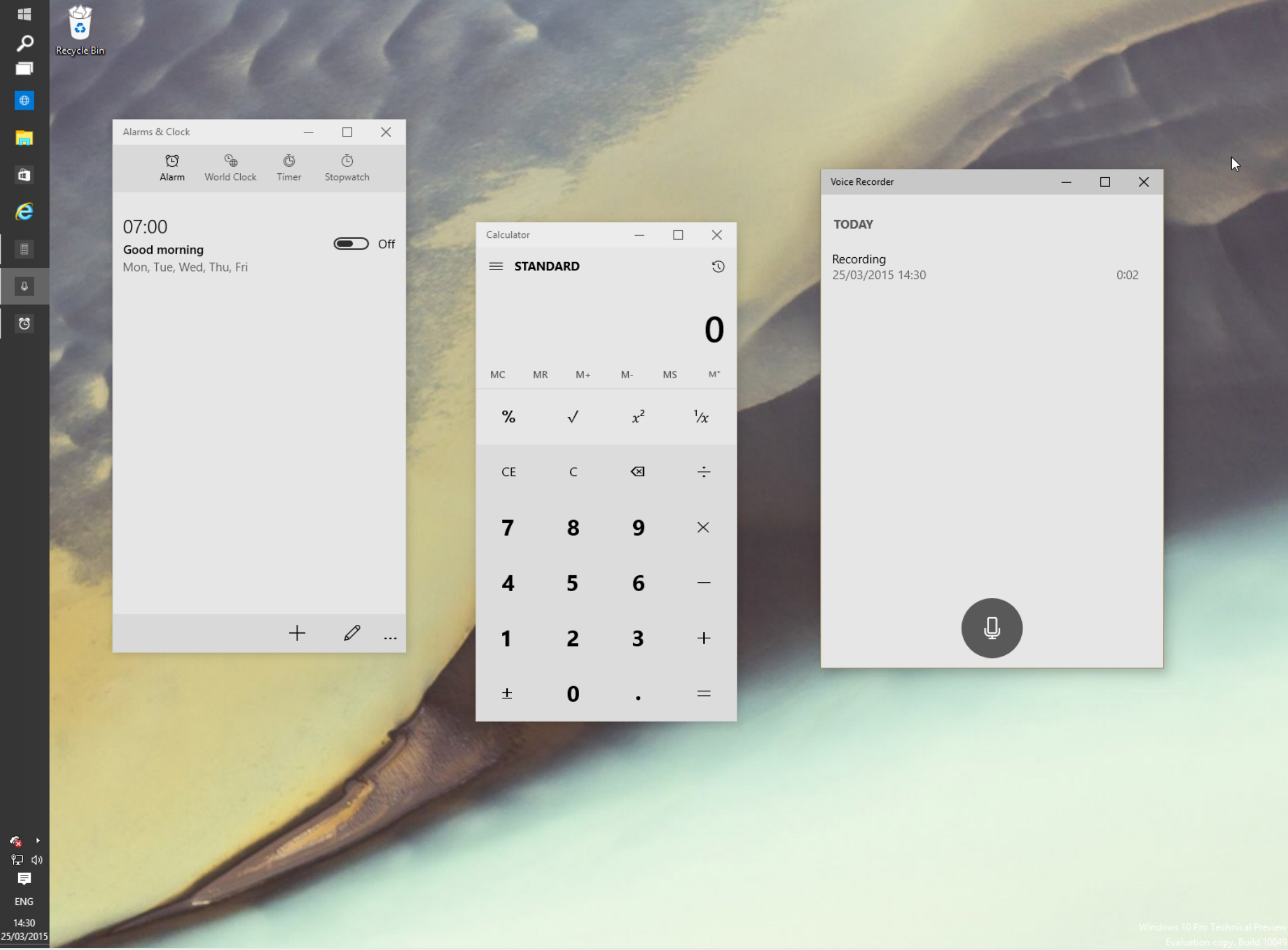
So what else has changed in build 10049? Well some of the included apps have had a makeover and now appear in white and gray, rather than dark as they did previously. Calculator, Alarms & Clock, and Voice Recorder all sport the lighter look, and frankly it’s dull, dull, dull. Microsoft might be shooting for classy here, but the end result is just bland. A few color accents would make a massive difference. Would it hurt to make the record button in the Voice Recorder red, rather than gray?

Windows XP was, at launch, described as a Fisher Price operating system with its bright, colorful (and child-like) buttons. Windows 10 seems to be the flip side of that, with each new version becoming more boring, and depressing -- visuals wise -- than the last.
There’s no option to switch between the light and dark themes in the apps, but hopefully that will be introduced in a later build.
And the option to make everything look and feel a lot happier would be good too!
Have you tried Build 10049 yet? What’s your view of it, and Spartan? Do you think it’s classy, or 50 shades of bland? Comments below.
