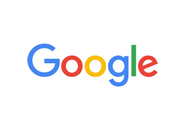
Google unveils a new, simple, sans serif logo

Google has come a long way over the years, but one thing has remain remarkably simple: its logo. There have been various designs for the six, colorful letters and today the company has taken the wraps off the latest version... complete with an uppercase G!
It's going to take a while for some people to get used to, but the clean, sans serif look of the new logo is simultaneously modern and retro. But today's announcement is about more than the main logo -- this is the launch of a new 'identity family'. In addition to the main logo, there's also a new four-color G icon, as well as similarly-colored imagery for other elements.
Introducing the new look, Google says that the change of direction comes as a result of the increased range of devices people use to access the internet. The new typeface and icons have been designed to work on screens of all sizes. The new design can be seen in searches, Google Maps, Chrome, and it will roll out to a range of other products too. As the company says:
It doesn’t simply tell you that you're using Google, but also shows you how Google is working for you. For example, new elements like a colorful Google mic help you identify and interact with Google whether you’re talking, tapping or typing. Meanwhile, we're bidding adieu to the little blue "g" icon and replacing it with a four-color "G" that matches the logo.

There's an animation that showcases the new logo and identity family that you'll be seeing a great deal more of in the coming months, and Google has put together a video that shows what the company has achieved, and what it has brought us over the last 17 years:
What do you think of the new look?