Google+ gets a refresh -- you should actually use it now
Google+ is a big joke, right? No one uses it, right? Wrong and wrong. The search-giant's social network is actually quite good and has many active users. I would argue that it is the best such network, superior to both Facebook and Twitter, but I digress. True, it does not have as many active users as the aforementioned competitors, but its focused purpose arguably makes it a better resource. It is brilliant for meeting like-minded individuals by using the "Communities" feature.
With all of that said, the Google+ interface was a bit clunky and confusing. Heck, it was very heavy too, causing web browsers -- in my experience -- to use a lot of resources. Today, Google announces that it is refreshing the service -- a new coat of paint and improved interface. Will this lead to increased usage?
"We've spent a lot of time listening to what people using Google+ had to say. There were two features they kept coming back to: Communities, which now average 1.2 million new joins per day, and Collections, which launched just five months ago and is growing even faster. Whether it’s the Nonfiction Addiction Community, where people can be found discussing the best in Crime or Travel storytelling, or the Watch Project Collection, where more than 40,000 people are following an antique watch hobbyist, these are the places on Google+ where people around the world are spending their time discovering and sharing things they love", says Eddie Kessler, Director of Streams, Google.
Kessler further says, "and so we've reimagined Google+ to help them do that. Today, we’re starting to introduce a fully redesigned Google+ that puts Communities and Collections front and center. Now focused around interests, the new Google+ is much simpler. And it’s more mobile-friendly—we’ve rebuilt it across web, Android and iOS so that you’ll have a fast and consistent experience whether you are on a big screen or small one".
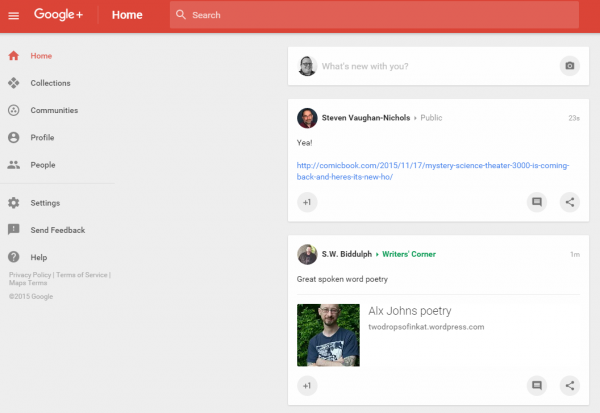
While I am able to try the new web interface as seen above, I have not yet seen an app update for iOS -- my iPhone and iPad will have to endure the old version for now. For the most part, I like the web version -- it certainly feels less resource intensive -- but there is still a lot of wasted space. See the screenshot I took above? Yuck. Overall, it is an improvement, however.
The Android version, based on the top picture, does seem to have a UI faux pas. Cassidy James, Cofounder and UX architect for the elementary OS Linux distro says:
Bottom tabs on Android is not cool. System-wide navigation goes there, and putting app-wide controls right up against the back, home, and multitasking button is just asking for trouble. C'mon Google
That is a damn-good observation. Google has seemingly made a poor design choice. Users could potentially hit the system controls in error when trying to navigate the new Google+ Android app. Well, this won't be a problem for users of Samsung-made Android devices which do not utilize the on-screen buttons, opting for a combination of dedicated physical and capacitive buttons instead.
Google definitely has opportunities to improve, but as wise people say, you should not let perfect get in the way of better. The social network is on the right track, and is better today. The question, however, is will you finally use it? Tell me in the comments.