Windows 10 Anniversary Update is shaping up to be something really special

Windows 10 has been the subject of a lot of criticism since it launched, including quite a lot from me. But at the same time, Microsoft reports that the latest version of its operating system is installed on a staggering quarter of a billion devices. The company must be doing something right. Where Windows 10 succeeds -- particularly for Windows Insiders -- is that it is constantly evolving.
Windows 10 Insider Preview Build 14328 is the latest build out of the door and it shows great signs of improvement. It might be a little early to call it, but if this massive update is anything to go by, the summer release of Windows 10 Anniversary Edition (or Windows 10 Anniversary Update) could be the real turning point for Windows 10 when it manages to win over the doubters and jump to justified -- rather than forced -- dominance. Build 14328 is a big update, and there's a lot to love.
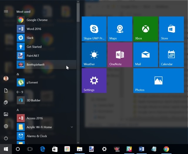
Actually, the redesigned Start menu is a little strange to start with... but love will almost certainly follow. Perhaps it's just the fact that we've had a year to get used to Windows 10's way of doing things, but when you first fire it up, it certainly feels weird. But while it took a little while to become accustomed to the changes that were implemented between Windows 8.1 and Windows 10, the anniversary version of the Start menu quickly begins to feel as though it has been thought out.
To start with, apps are brought right to the front -- that's precisely what the Start menu is used to access, after all. The six little icons to the left provide easy, and space-saving access to key things such as Settings, Network and Documents, and you can pay as much or as little attention to the tiles to the right as you want. Everything is much neater this time around; it's what the Windows 10 Start menu should have been from the very beginning.

The anniversary update isn't just about improvements and refinements -- although we’ll return to these shortly -- it's also about introducing new things. One of the biggest new features, designed with stylus-wielding tablet owners in mind is Windows Ink. Accessible via a taskbar icon, this provides a number of stylus-ready tools in one handy place. It provides easy access to all of the pen-enabled tools you have installed, as well as a sketchpad, stickynotes and screen annotation. The Ink Workspace is not something that everyone will be enamored with, but if you're a demon with the stylus it brings plenty of handy tools to your fingertips. Or pen tip.
At Build, Microsoft announced that badging was coming to Windows 10 -- something that will be familiar to iOS and Android users. The first place we get to see this in action is in the redesigned Action Center. So significant does Microsoft see the redesign that it has gone as far as moving the notification icon to the far right of the taskbar, to the right even of the clock. The badging means you can now see how many notifications are vying for your attention before you even click the icon.
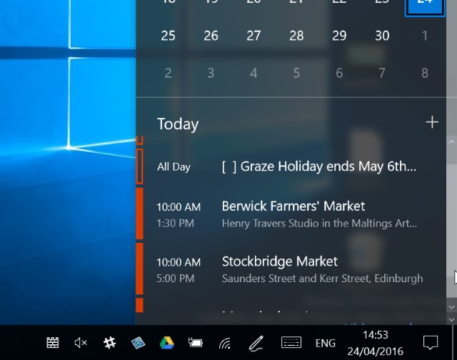
Sticking with the taskbar, when you click the clock you can now also see your calendar -- and it doesn’t have to be an Outlook calendar! It’s something that seems so obvious that you wonder why it wasn’t included from the very beginning, but the good news is that Microsoft has now seen sense and turned the clock shortcut into something genuinely useful.

Other tweaks, such as the addition of media playback controls to the lock screen shows that Microsoft is both thinking about how people use Windows 10, and listening to the feedback that has been provided. As someone who is far from shy about putting the boot in when I feel it's deserved, this is great to see.
These are just some of the bigger changes to be found in the latest build of Windows 10, but there are plenty of other neat little touches here and there that make all the difference. A more refined animation that sees things sliding gently into view in the Start meu may seem like a minor thing, but it's an example of a new level of attention to detail that has been previously lacking from Windows 10.
Other nice aesthetic touches are the style of the badge overlays and a redesigned, not-quite-monochrome icon for File Explorer (although the design to unpin this from the taskbar is an odd -- albeit an easily fixed -- one). There's a lot of care an attention being poured into Windows 10 these days.
It has been a busy year for Microsoft in general and for Windows 10 specifically. I've been quick to complain about what I see as Windows 10's failing, but now it feels as though issues are being addressed. It may have taken a year, but things are really starting to take shape. For anyone who isn’t part of the Insider program, there's a real treat in store later this year when the Anniversary Update is released. In the meantime, us Insiders can keep an eye on how things develop and evolve in the run-up to the big launch.
Photo credit: graletta / Shutterstock
