Get started with Windows 10 Anniversary Update's revamped Start menu

Windows 10 Anniversary Update is starting to roll out to users globally. There are lots of changes and improvements to the operating system but one of the biggest is to the Start menu.
If you had gripes about how Microsoft implemented it originally, the new version should go some way to appeasing you. If you liked the original approach, you'll likely be very happy with the changes. Here’s what’s new:
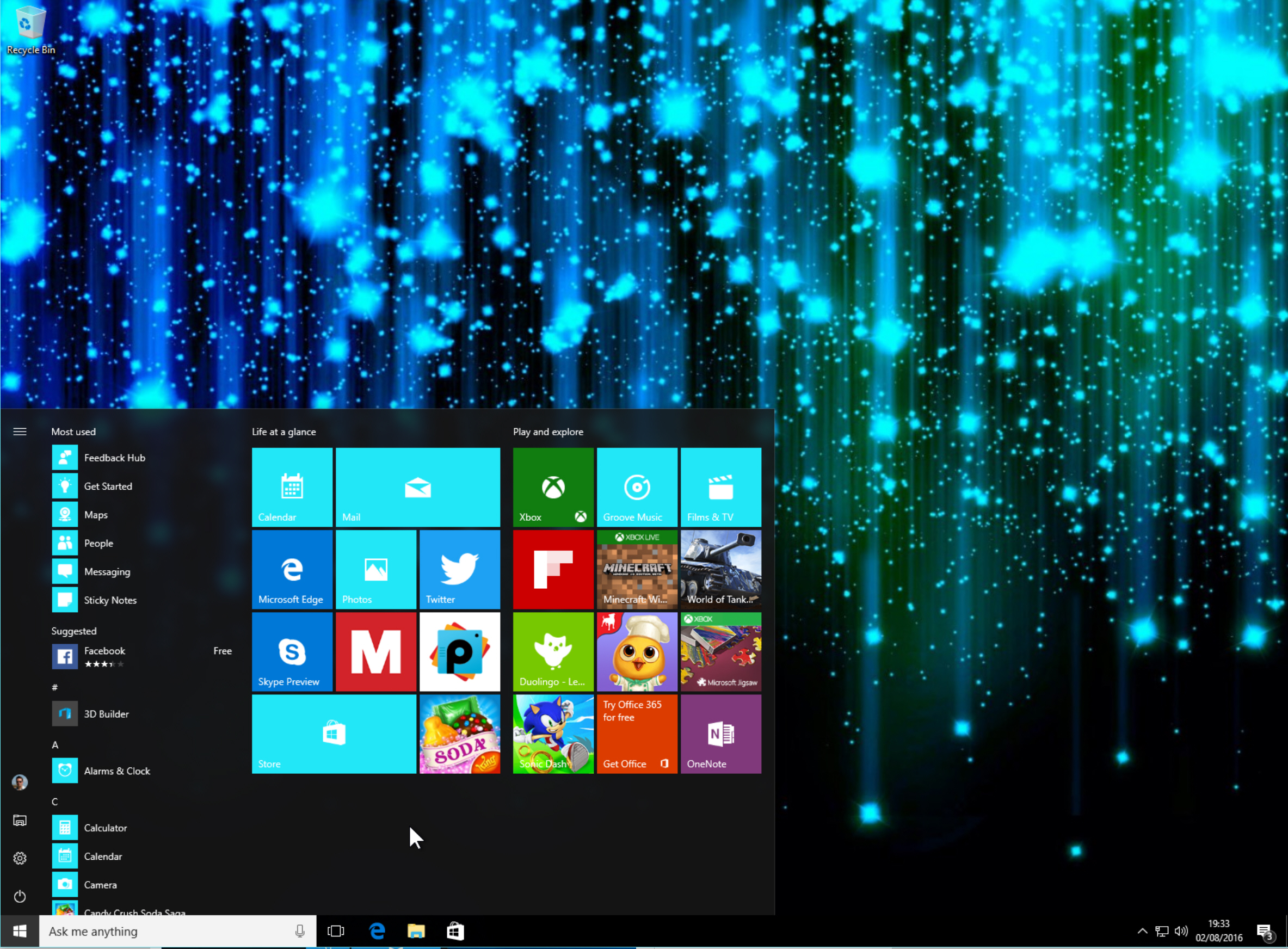
The first thing you’ll notice when you click the Start button is installed apps have been moved front and center. No more having to click on All Apps to find a particular item (personally I always prefer to search for an app, rather than use the menu, but this might change now).
The list of apps is presented alphabetically, and you can scroll down to find the one you want.
Alternatively, if you have a lot of apps installed, you can just click on any of the menu headings (such as one of the letters or Recently added) and jump straight to a particular section using the A-Z view.
Right-clicking an app you use regularly will let you pin it to the tiled section on the right.
Above the apps list, at the very top, is a Most used section, which to begin with includes Get Started, Sway, Maps, People, Calculator, and Alarms & Clock.
Underneath that is Recently added. This shows the last app you installed, but can now display up to three new items.
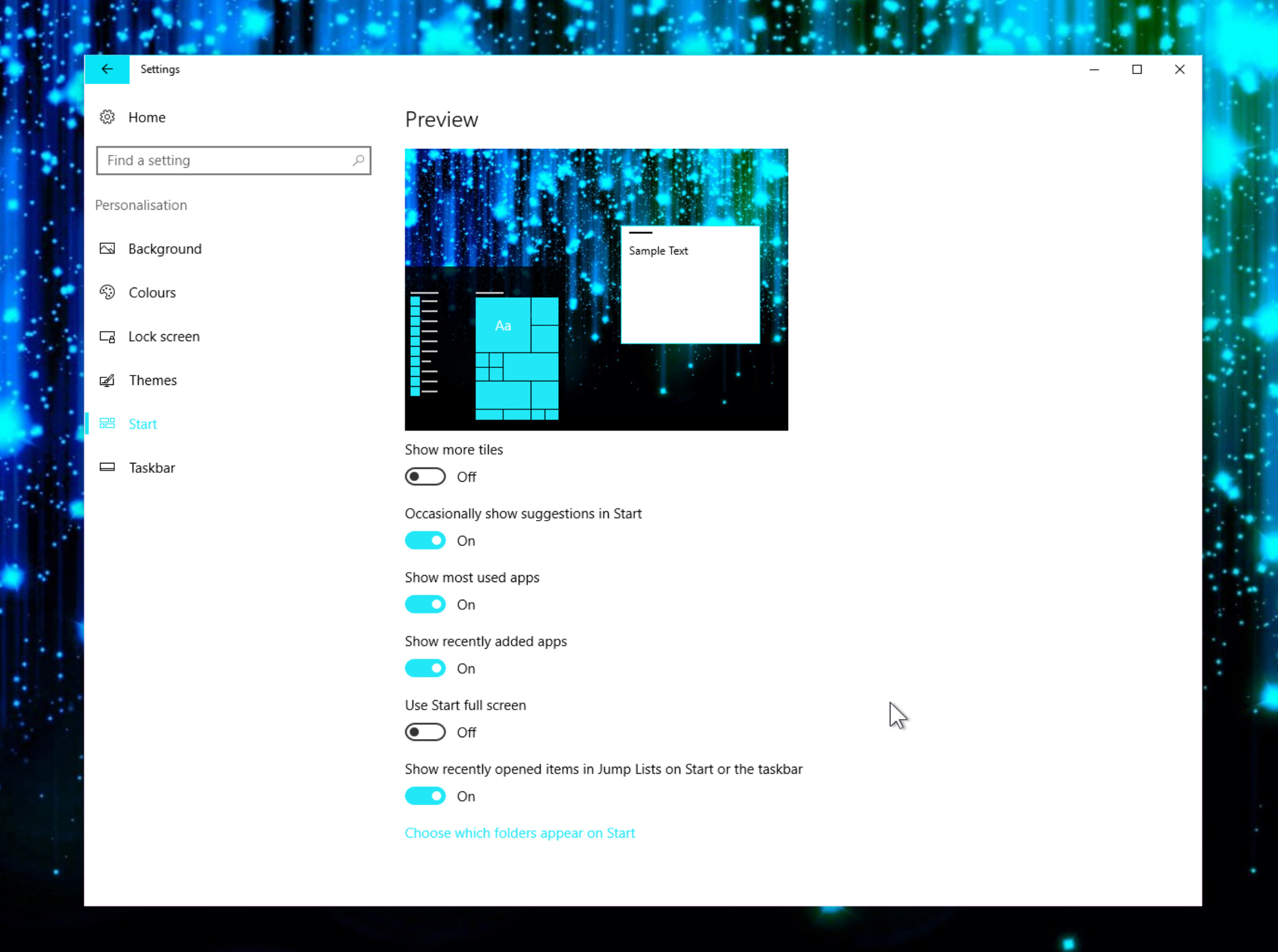
The little sidebar to the left of the menu gives you quick access to your account (you can change account settings, Lock and sign out from there), File Explorer (which has been removed from the Taskbar for space reasons) and Settings. The Shutdown button has also been moved to here, and clicking it will let you choose the action you require. This little bar stays visible at all times and you can customize it through Settings > Personalization > Start. Scroll down to the bottom and click Choose which folders appear on Start. You can add Documents, Downloads, Music, Pictures, Videos, HomeGroup, Network, and Personal folder.
The Settings menu also lets you choose to toggle various options on or off, including
- Show more tiles
- Occasionally show suggestions in Start
- Show most used apps
- Show recently added apps
- Use Start full screen
- Show recently opened items in Jump Lists on Start or the taskbar

Tiles on the right of the Start menu can be reordered, resized and removed as before, and of course you can resize/reshape the menu itself by clicking and dragging. If you prefer a long list of apps, extend the menu downwards.
Personally I think these changes really help to improve the Start menu, but you may disagree. Let me know what you think in the comments below.
