Irony alert: the BBC has designed its own font to avoid paying license fees
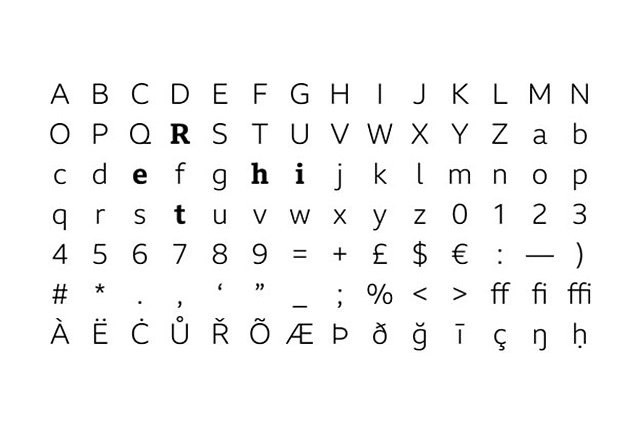
The BBC has announced plans to roll out a new font across its network of websites in a cost-saving measure. The corporation has designed a new font called BBC Reith, named after Lord Reith, the founder of the BBC.
The beeb says that it will be able to save an undisclosed sum of money by ditching the fonts it currently uses as it will no longer have to pay license fees for them. That sound you can hear is the shrill ring of irony as a corporation that charges a license fee tries to avoid paying a license fee...
But the change is not just about saving money. The BBC thought it was time for a refresh to take into account the fact that fonts originally designed for use in print are not necessarily best suited for use on monitors and mobile screens.
The BBC's Chief Design Officer, Colin Burns, says:
The existing fonts that the BBC uses were developed last century and work well in print -- but they're not always clear enough when they appear in small, digital, spaces, and we’re all reading and watching far more on screens and mobiles these days.
So the new font -- which we’ll gradually roll out, starting with sport today -- will be easier to read and clearer, especially on small devices.
We also expect it to save us a significant amount of money. We have to pay for licenses to use other fonts at the moment, but we won't have to do this for BBC Reith -- so it's better value as well.
BBC Reith is making its first appearance on the BBC Sport website, but the plan is to roll it out across the corporation's sites.