Google is testing Material Design in Google Calendar for the desktop

Despite the age of its Material Design, Google is being surprisingly slow in rolling out the look to its products. While the UI is found pretty much universally in Android apps, the appearance on the desktop is happening at a rather more leisurely pace.
Chrome 59 sees the appearance of Material Design, and now Google is testing the look in the desktop version of Google Calendar. The design is undergoing testing through Google's Trusted Tester program, but images have leaked out giving us a glimpse of what's to come.
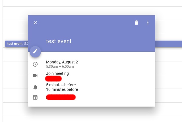
Over on Reddit, a user called xDawnut has shared a series of images showing the makeover that's coming to Google Calendar -- or will if tests prove positive, presumably. As we have become used to the Material Design in Android apps, there are few surprises here in terms of appearance, but the changes also make a difference to the UX in addition to the UI.
An overlay for event creation and editing is a far neater solution than the mess that currently exists. The reaction over on Reddit is somewhat mixed at the moment, and there's no hint of quite when the redesign might see a wider rollout just yet.
You can check out the series of eight images over on Reddit.
