GNOME 3.26 'Manchester' desktop environment is here, Linux fans!

When people think of Linux-based operating systems, they often imagine people typing in a terminal or coding in a basement while drinking Mountain Dew -- yeah, those stupid old stereotypes still exist, sadly. While that is surely part of the user base, other users choose an open source operating system for nothing more than using their computer as a tool. In other words, some folks use Ubuntu, Fedora, or other distros just to get normal stuff done -- word processing, web surfing, and more. No terminal. No coding. No religious-like experiences.
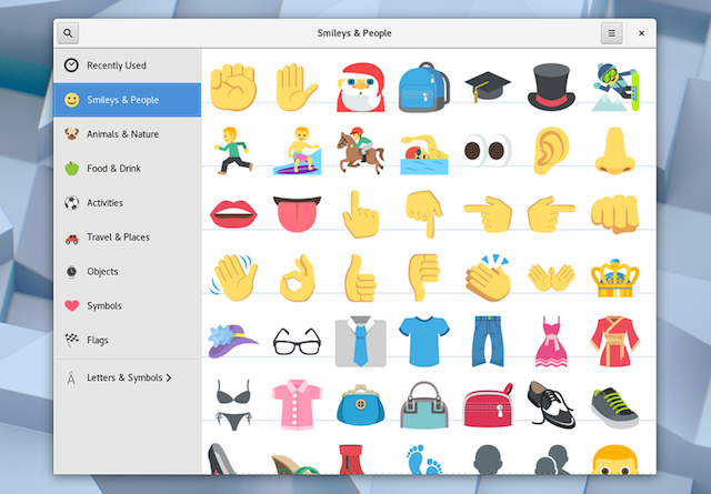
For these Linux users, and others, the desktop environment sort of is the operating system. It is how they interact with their computer and launch their apps -- what's under the hood doesn't necessarily matter. For many, GNOME 3 is their preferred environment, and for good reason -- it is beautiful, intuitive, and getting better all the time. Today, GNOME 3.26 codenamed 'Manchester' sees release. It is chock full of improvements, such as a much-needed refreshed settings menu, enhanced search, and color emoji! Yes, Linux users like using the silly symbols too!
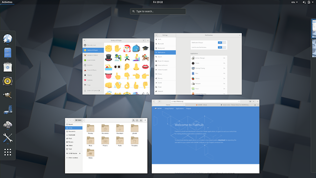
"System search has been improved for GNOME 3.26. Results have an updated layout which makes them easier to read and shows more items at once. Additionally, it's now possible to search for system actions, including power off, suspend, lock screen, log out, switch user and orientation lock. (Log out and switch user only appear if there’s more than one user. Orientation lock is only available if the device supports automatic screen rotation.) These search features can be accessed in the usual way: click Activities and type into the search box, or simply press 'super' and start typing," says the GNOME Project.
ALSO READ: GNOME desktop environment for Linux and BSD is 20 years old today
The project further says, "GNOME 3.26 introduces a new layout to the Settings application. The previous grid of icons is gone and, in its place, a sidebar allows switching between different areas. The new sidebar makes it much easier and quicker to navigate the settings application and places the most commonly used settings within easy reach. It also means that the Settings window is now bigger and can be resized, which is more comfortable in a lot of situations. GNOME's network settings have been improved as part of this work: Wi-Fi now has its own dedicated settings area and network settings dialogs have been reworked, so that they are neater, clearer and easier to use."

GNOME 3.26 has many other changes (24,105 actually!), with just some listed below. You can read the full release notes here.
- Windows now smoothly transition when they are maximized, unmaximized or snapped to one half of the screen. As well as looking good, this makes it easier to track what’s happening on screen.
- The size of window thumbnails has been increased in the Activities Overview, making it easier to pick the window you want.
- The top bar now becomes transparent when there aren’t any maximized windows. This is more attractive and gives a better sense of space.
- The dialogs which inform you when an application isn’t responding have a new style, making them look more integrated and refined.Boxes, the GNOME application for virtual and remote machines, now allows folders to be shared between a virtual machine and your computer. To use this feature, just select which folders you want to share from the box settings, and they will appear as network locations in the guest.
- In Software, updates are now grouped by type and provide more accurate progress information when being installed.
- Simple Scan, the GNOME application for scanning images and documents, has had some interface improvements for 3.26. A new start screen provides some useful guidance, editing tools are easier to identify and preferences can be accessed from the header bar.
- Logs now groups similar messages together, which makes the history much shorter, making it easier to find what you’re looking for.
- Polari — the IRC application — has a new initial setup assistant, which makes it easy to get connected and start chatting.
- When you resize a file system in Disks it’s now possible to also resize its partition, which often saves an extra task.
- Maps has a collection of small improvements: there are new keyboard shortcuts, more information is shown about places and the last transportation method is remembered when plotting routes.
- GNOME’s calendaring, contacts, to do and mail applications now perform better offline — many items can now be edited when you don’t have an internet connection, and any changes will be uploaded the next time you are online.
- Photos has new controls for zooming.
- It’s now possible to add and edit reoccurring events in Calendar.
- Terminal now highlights and makes it easy to open hyperlinks.
- In Evolution, the new To Do bar allows you to view a list of upcoming events and tasks. Also, it’s now possible to use Evolution without having a mail account.
- Tweak Tool has been renamed to Tweaks and has gained three new settings: a switch to move window buttons to the left or right, a Disable While Typing option for touchpads and an option to show the battery percentage in the top bar. There has also been a good amount of clean up and refinement.
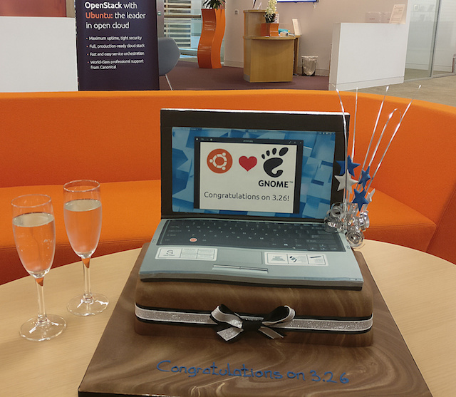
The easiest way to try GNOME 3.26 is to wait for the desktop environment to become available for your favorite Linux distribution. Ubuntu users, for instance, won't have to wait long; GNOME 3.26 will be the default DE for version 17.10 which is due next month. Users of other Linux-based operating systems might have a longer wait, unfortunately.
Are you excited for GNOME 3.26? Tell me why in the comments below.

