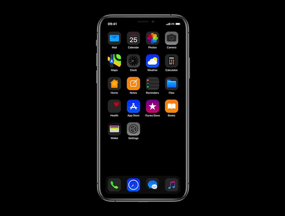
Feast your eyes on how Apple's iOS 13 should look

With iOS 12, much of Apple’s focus was on performance, but there were also updates to Siri, key apps, ARKit 2, Animoji, Memoji and much more. We won’t get our first official look at its successor, iOS 13, for a few months yet, but if you’d like to see how it should look, we’ve got this stunning video to wow you.
It takes everything we like about iOS 12, but improves on it.
This concept video comes from YouTuber Kamer Kaan Avdan, who has previously created similar videos for updated versions of Windows 95, Windows XP and Windows 7, among others, and most recently released a brand new video showcasing his vision of Windows 11. This isn't the first time Avdan has turned his design skills to iOS. He previously created a concept video for iOS 12 and re-imagined iOS 6 for modern devices.
In his vision of iOS 13, Avdan has created new, dynamic icons, an all new Apple Music, Cover Flow, split mode on iPhone, and of course -- with this being 2019 -- there's a stylish Dark Mode too. He also gives us an "always-on" mode and multiple user accounts with easy switching.
Watch the video below and tell us what you think of his iOS 13 concept. Do you prefer it to iOS 12?
