Microsoft teases a new look for Office and Microsoft 365

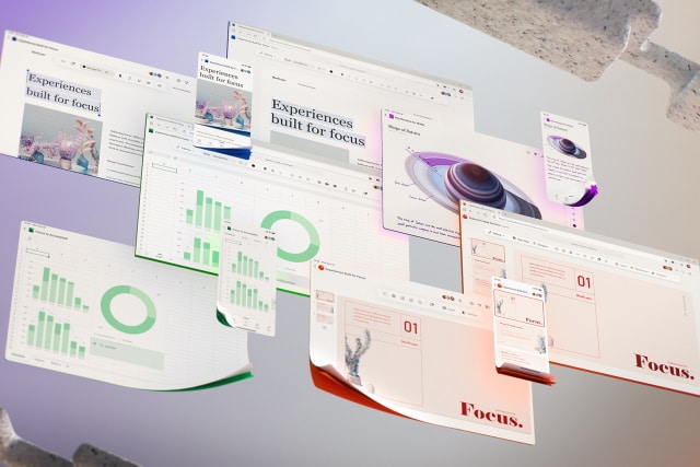
Microsoft has given us a sneaky glimpse into the future, showing off some of the design changes that are coming to its Office apps. The company has revealed the updated UX that Microsoft 365 users can expect to see.
In addition to introducing a more muted color palette and fully embracing the Fluent Design language, Microsoft is also making some key changes to the ribbon. Part of this involves incorporating AI into the software so that a more flexible ribbon can contextually adapt to what you are doing.
See also:
- Microsoft is bringing some important new features to Edge, including browsing history syncing
- Microsoft releases KB4559003 and KB4559004 to fix problems with File Explorer, LTE connectivity and more
- Windows 10 May 2020 Update may falsely report that there is no internet connection
The revelations about Microsoft 365 changes come in a post from Microsoft's corporate vice president of design and research, Jon Friedman. He says: "The next wave of Microsoft 365 UX changes will go even further by fading brand colors from app headers and exploring adaptive commanding. A flexible ribbon that progressively discloses contextually relevant commands at the right time just where you need them".
You can get an idea of some of the visual changes that are coming from the image above, but this is about more than just a new coat of paint.
Friedman goes on to say:
We'll further advance our seamless, cross-suite Search to bring relevant information to your fingertips, and myriad forthcoming experiences will leverage Fluid Frameworks. Microsoft 365 will bring the power of Office to wherever you are, ensuring you won't need to interrupt your creative process to open a different tool.
Throughout, we're grounding everything we build in deep research about the nuances of attention. We're often presented with a false dichotomy -- you're either focused and in flow or distracted and unproductive -- but we traverse a broad attentional spectrum while achieving our goals. Some moments call for lengthy, sustained concentration. Others, such as many mobile scenarios, are optimal for microtasking. By designing for multiple cognitive states, focused experiences throughout the Microsoft 365 ecosystem minimize external distractions, lessen self-interruptions, and jumpstart flow.

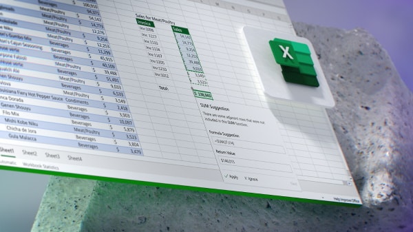
Over the coming months and years -- not all of the changes are just around the corner -- Excel will be able to spot formula errors as you type, Planner will be able to predict when tasks should be completed, and there will be tighter integration across the Microsoft 365 suite of tools.

Friedman also:
We’ll also be adding more asynchronous abilities throughout Microsoft 365 so you can connect when and how it works best for you. This reduces meeting fatigue, and when you can use video in async scenarios (imagine commenting via a quick video response), sides of you shine through that people might overlook in written chats or live meetings with complex group dynamics.
Our tools have long supported the expression of your ideas, but as work and life converge, you may want to communicate who you are beyond an avatar photo. From more artful themes and backgrounds to exploratory UX around how someone might express their gender, culture, or hobbies, we’re designing for more authentic and inclusive connections between people.
You can read more in the post on Medium.
