Windows 8 logo is a disaster

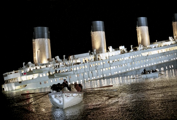
There's something poetic about Microsoft changing Windows' logo during the centennial anniversary of Titanic's tragic sinking. Many people involved in the great streamliner's design and building -- and surely those buying into publicity about it -- regarded Titanic as unsinkable. There's similar pervasive view about Windows, that nothing can sink its market leadership. Uh-oh, someone only put the watertight doors as high as E deck.
Microsoft's flagship operating system will sail on its maiden voyage, so to speak, with the Consumer Preview coming in less than two weeks (if not sooner). Windows 8 will take a northerly course through ice-infested waters as Microsoft "re-imagines" the platform in ways that will stress customers', developers' and other partners' commitments. Execution will be key, and every detail planning the course matters. That's right down to the logo, which significance is much bigger than Windows.
Bland Branding
Microsoft has no corporate logo. The name is the brand, but it's not brand enough. That's one reason why Microsoft long ago adopted the four-color Windows flag as major identifier and why prominent sub-brands -- Office most notably, even Microsoft Store -- use similar color motif. The new Windows logo washes away the familiar color scheme and any resemblance to earlier variations. It's a rectangle cut vertically and horizontally by two lines. The logo lacks dimension, depth or distinction.
During group chat earlier this afternoon, I opined about the new logo: "From a branding perspective it's questionable" because "Microsoft has no corporate logo. Nothing to identify it with. Closest thing is that four color flag. Essentially, Microsoft has changed its core, corporate brand logo". It's a branding disaster.
I'm not alone in that opinion. To our news story that posted later, Reader Orean Keels comments:
Far too generic. To remove the four-color design from Windows is a really bad brand direction, and in my opinion, so is Metro. But just like always, Microsoft isn't going to listen to the loud voices complaining. They've already set this dud in motion. A year to year and a half from now, we'll be listening to Microsoft apologizing, just like they (indirectly) have with Vista, while Windows 9 will be the version that 8 should have been. They never learn.
Course Correction
The new logo is a mistake and one Microsoft could and should correct before Windows 8 ships in the autumn (well, presumably). Yes, Windows 8 may sell about as well as Vista (meaning not very). But that's to be expected. Microsoft is making major changes to the operating system and how applications are developed for it.
 One developer told me recently about hearing 40 percent of the code has changed since the Windows 8 Developer Preview released in September. I find that hard to fathom (or believe) but even 10 percent would be trouble enough for developers trying to nail down a software strategy for Metro.
Timing is sensible for platform reinvention, given that most businesses (Microsoft's core customers) will have just completed or will soon finish Windows 7 deployments from XP about the time v8 ships. They won't be ready for Windows 8, so it's right time to hit them with changes now. Windows 8 is really about what comes next, when core customers are ready to buy again. The point: I wouldn't call Windows Vista-like sales necessarily a disaster.
On the other hand, Microsoft needn't create obstacles where they are unnecessary. There are icebergs enough ahead. Logos are not insignificant. Many top brands are recognized by their logos, which significance increase in making flash impressions as people skip commercials on shows they recorded or breeze past banner ads or road-side billboards. Apple's logo is iconic, and the four-color Windows flag is as close as Microsoft will get. Microsoft's name as brand, unlike, say, Coca-Cola, simply isn't memorable or marketable enough.
Willowed Windows
I can understand some of the rationale behind changing the logo, which looks more like a tile -- the fundamental characteristic of the Metro UI. The new color scheme also matches one prominently used in the UI's tiles. Additionally, fresh logo could evoke fresh approach, something new -- and granted many people will find Windows 8 to be it. But the logo also isn't distinctive, and I don't see how it will stand out stickered to new PCs, tablets and other Windows 8-powered devices.
The logo matters. Everything matters about Windows 8, because so much change comes with it. There's the risk. That unsinkable Windows is anything but. Who would have said in December 2004, when Firefox launched, that Internet Explorer's usage share would fall from more than 90 percent to 52.96 percent in January 2012 (according to Net Applications)? Or that Google would release Chrome in December 2008 and see its usage share rise to 19.11 percent three years later?
IE's mighty fall foreshadows what can happen to Microsoft's OS. Windows PC sales dramatically declined during fourth quarter, while Mac sales rose. Windows and Windows Live revenue fell by 6 percent year over year and profits by 11 percent. Meanwhile, iPad has sapped Windows PC sales for several quarters. Given these circumstances, Microsoft should look to "re-imagine" Windows.
Steering the right course is essential, however. Customers will be confused enough without brand changes. Microsoft, consider this post your iceberg warning. Will you sail ahead like Captain Smith did Titanic or slow down and go around the ice?
