The curmudgeon's guide to Microsoft's embryonic Windows 10
It's only a matter of days since Microsoft officially revealed the Windows 10 Technical Preview. This was a revelation with a lot riding on it but it was really something of a tease -- Microsoft didn’t give too much away. We rushed to grab the download, and Wayne showed how to get it up and running in VirtualBox (interestingly, I had to opt for VMware Player, as VirtualBox refused to install the 64-bit version of Windows 10 on my Surface Pro. It ran away from the ISO as though it was infected with ebola). I've had a few days to play about with this release -- I've stuck with a virtual machine for now rather than going all-in with dual-boot -- and I've already had a chance to write a little about the Start menu and the command prompt, but now it's time to delve a little deeper and see what else there is to discover.
Spoiler alert: despite the headline, and indeed my reputation, I don’t hate Windows 10. It just about goes without saying that I'm not head-over-heels in love with it, and there's a great deal I dislike about it, but it does feel... well, just 'nice' really. It's comfortable, familiar, and feels a bit snappier than Windows 8 -- even when running in a virtual machine.
Start as you mean to go on
There's no getting away from the fact that the most immediate and noticeable change in Windows 10 is the Start menu. The Start screen now takes more of a backseat by default and it has been replaced with a somewhat familiar Start menu. As this is one of the first things encountered, it seems like a sensible place to start. If you were hoping for a return to the Start menu of yore, prepare to be disappointed. Rather than reinstating the Start menu from Windows 7, Microsoft has instead created a bizarre amalgam of the Start screen and Start menu. It's a Start menu with Live Tiles. To many people this simply is not going to make sense. The right hand port of the Start menu looks just like a miniature version of the Start screen.
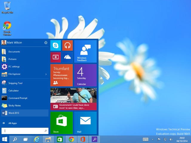
It is possible to remove the right hand section that is populated with Live Tiles to produce something that looks more like the Start menu of old. But don’t be fooled; this is not what it appears. Gone (still) are the fly-out menus that made the Start menu so quick and easy to navigate, replaced instead by a version that re-uses space. You're initially presented with a list of recently used apps, and when you click All Apps (yep -- it's Apps, regardless of modern or desktop status), this list is replaced by the folders of the Start menu. Submenu (like Start All > Apps > Microsoft Office 2013) still don't fly out, but expand in place.
This might seem like a sensible use of space, there is a serious downside. Should you accidentally select the wrong folder, you then need to use the scrollbar (a scrollbar in the Start menu?) to access the right one. It all just seems awkward and I sincerely hope that there are some improvements made here.
Edit: Comments have questioned my references to fly-out menus. Readers have correctly pointed out that these were also not present in Windows 7 -- well... not quite, at least. I blame a slightly failing memeory and the fact that I tweaked my Windows 7 Start menu to display elements such as Control Panel, My Documents, etc as menus rather than links. Excuses aside, I stand by my ascertion that the Start menu is awkward, clumsy, and will fail to please many of those who missed it so desperately in Windows 8.
One of the finest new additions to the Start menu is the permanent power buttons. It’s now much easier and natural to restart and shut down. But overall, the Start menu disappoints, and this sets something of a trend for Windows 10.
More new features
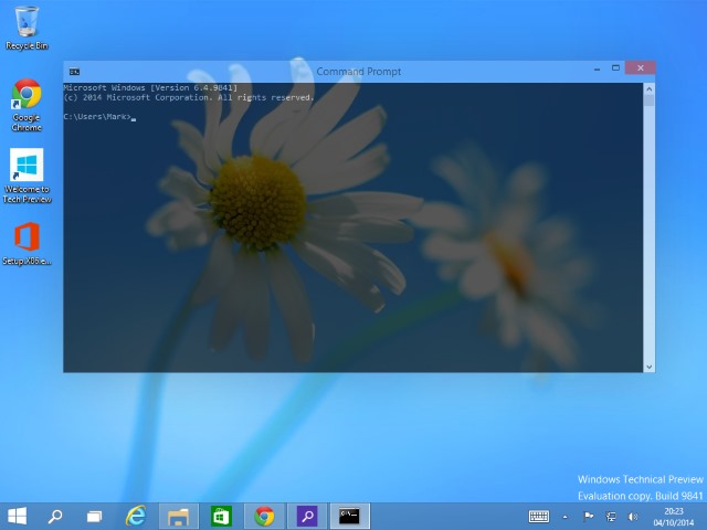
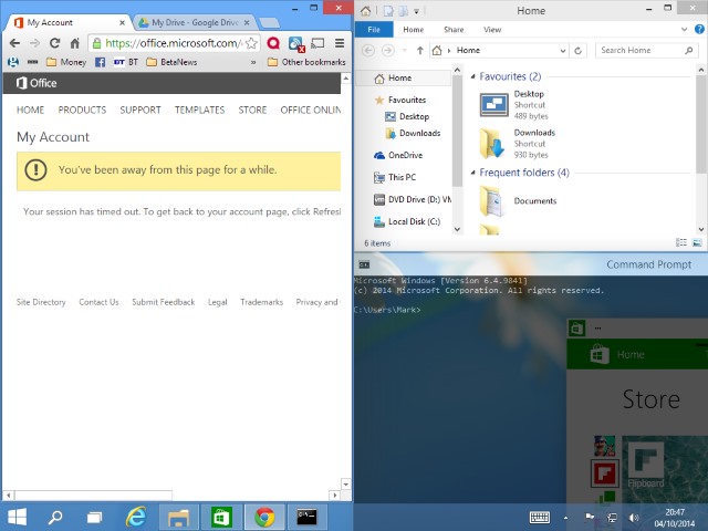
I've already talked about the Command Prompt where there are number of 'experimental' features to play with. It's interesting that such an old feature of Windows is not only still present, but that it has received such attention. With the ability to copy and paste, new window resizing and transparency options, and more besides, it could almost be argued that the Command Prompt has been given more of a makeover than the Start menu. More Microsoft weirdness.
Talking of weirdness, let's look in the taskbar. Next to the Start button, there are two new buttons, the first of which features a magnifying glass. No prizes for guessing that this is a search tool. A dedicated search button. In the taskbar. Forget the fact that whether you are using the Start screen or the Start menu and you could just hit the Windows keys to 'Search everywhere', Microsoft felt the need to add another way to access search. One that is not only right next to the Start button but also cannot be removed or even moved. Don’t like the search button? Tough. You're stuck with it. It will just sit there, glaring at you as it wastes space.
Close, but no cigar
Of slightly more use is the Task View button. On the face of it this is little more than an Alt-tab style task switcher (which it is), but it also gives you access to one of the biggest features of Windows 10 -- virtual desktops.
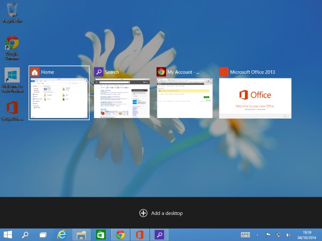
Virtual desktops have been around for a long time as third party add-ons for Windows, and Microsoft has finally cottoned on to the idea that people find them useful. So now you can set up one desktop for folders and another for apps. Or you can set one for personal and one for business. And so on. At this stage, it's a basic tool. Switching between desktops is a little awkward. You can use keyboard shortcuts or the dedicated Task View button. But there's no overview icon visible at all times that lets you know how many desktops you've set up, or lets you quickly jump to a particular desktop that houses a particular window. It feels like a token effort. Microsoft decided the virtual desktops were needed. Bugger it… that'll do.
Cleaning windows
It looks as if Windows 10 borrows from OS X in a number of areas. This is no bad thing, and contributes partly to the operating system feeling just that little bit nicer than Windows 8 -- although it's hard to say just why it does. Little touches such as tweaks to window shadows, coupled with a slightly more muted palette, give a more professional look to things.
Managing the arrangement of windows has been made a little easier with simple changes to snapping. The screen is now divided up in to four quadrants rather than the previous two panes and this is something that will prove particularly useful on larger monitors.
I've made no secret of the fact that I'm not a fan of Modern apps. I hate, loathe, detest, and abhor them. But if you do feel inclined to use them -- and the Store app is one that just about everyone will have to visit at some point -- there is a slightly less jarring experience. Modern apps can be run in windowed mode, expanding on the ideas brought into Windows 8.1 Update, and allowing for windows to be resized just like any other. A small touch, but one that is likely to please.
Redefined direction
The decision to put such a focus on the touch capabilities of Windows 8 was a mistake. While touch devices are increasingly popular, non-touch computers are still very much the norm. In bringing the desktop back into sharper focus, we see Microsoft admitting that it jumped the gun and tried to push users into a new way of working too quickly. But if Windows 8 was too much of a departure from the norm, Windows 10 sees Microsoft treading water. Yes, this is an early build, but we can’t pretend that Microsoft hasn’t been working on this for quite some time. The company knows that people are expecting something great and, at the moment, Windows 10 is not great. It's OK, but it's certainly not great.
It's fair to say that Microsoft is pitching Windows 10 at Windows 7 users who did not see the point in jumping to Windows 8. Despite protestations to the contrary, this is not a ground-breaking operating system. It's better than Windows 8.x, that's for sure, and there is rather less of jarring jump for anyone who is making the move from Windows 7. It is difficult to understand quite why the Windows 9 moniker was skipped. The decision to just miss out a version number is obviously going to raise questions, and Microsoft has itself implied that this is just too big a release to have a single digital number increase. Is this justified? At this stage, it's a resounding no. There's nothing particularly wrong with Windows 10, but it's not mind-blowing by any stretch of the imagination.
Rather than wheeling in a raft of new features, Microsoft has chosen to focus on making refinements to what was already there while ushering in a couple of headline-grabbers. Far from justifying a jump from Windows 8.1 to Windows 10 as a name, what we seeing at the moment would just about warrant being called Windows 8.2 or Windows 8.1 Update 2. There have been suggestions that the version number came about simply because of potential confusion if other software performs a search for Windows 9*, but this could almost certainly have been worked around.
Of course the comeback to any criticism levelled at Windows 10 is that it is the Technical Preview. Windows 10 will not be released until the second half of 2015, which means we could still have a year to wait -- and an awful lot can happen in 12 months. We're already at build number 9841, and it's fairly safe to assume that we're working up to 10,000 to be the final build. Considering Windows 8.1 Update is build number 9600, we've already jumped 241 to get to where we are with the Technical Preview. If 10,000 is the gold number for the Windows 10 gold master, there are only another 159 builds to go. Considering how little has been achieved so far, it's unlikely there will be any major surprises pulled out of the bag.
Baby steps
But Windows 10 is undoubtedly an improvement over Windows 8.x. In many ways it could, maybe should, be seen as what Windows 8 should have been -- or at least what one of the updates should have made it. As there are definite improvements over both Windows 7 and Windows 8, it's difficult to be too hard on what we find in Windows 10 at this stage, but feelings of disappointment and being underwhelmed abound. A switch in focus to the desktop is very welcome, but after spending a few days working with Windows 10, I can't help but feel it's nothing more than a bit of spit and polish, with an element of style over substance thrown in for good measure.
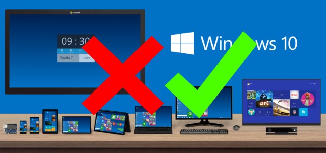
There is no hint of how this will translate into a cross-device operating system. It has been suggested that Windows 10 will be the OS for desktop, laptop, touch, mobile, and console. For now it feels very much like a desktop operating system and it's difficult to see many changes that will be of interest to users of touch driven computers.
It seems obvious to say that this feels like a work in progress, but Microsoft took the decision to make this release public. Considering the number of complaints there have been about Windows 8, we really should have come further by now. Microsoft has had a long time to work on the successor to Windows 8, and this is what it has come up with; it's disappointing to say the least. We need to see a lot of progress over the coming year -- which will require a massive acceleration in development based on what we've seen so far -- or Windows 10 will fall just as flat as Windows 8, and that would be a huge shame.