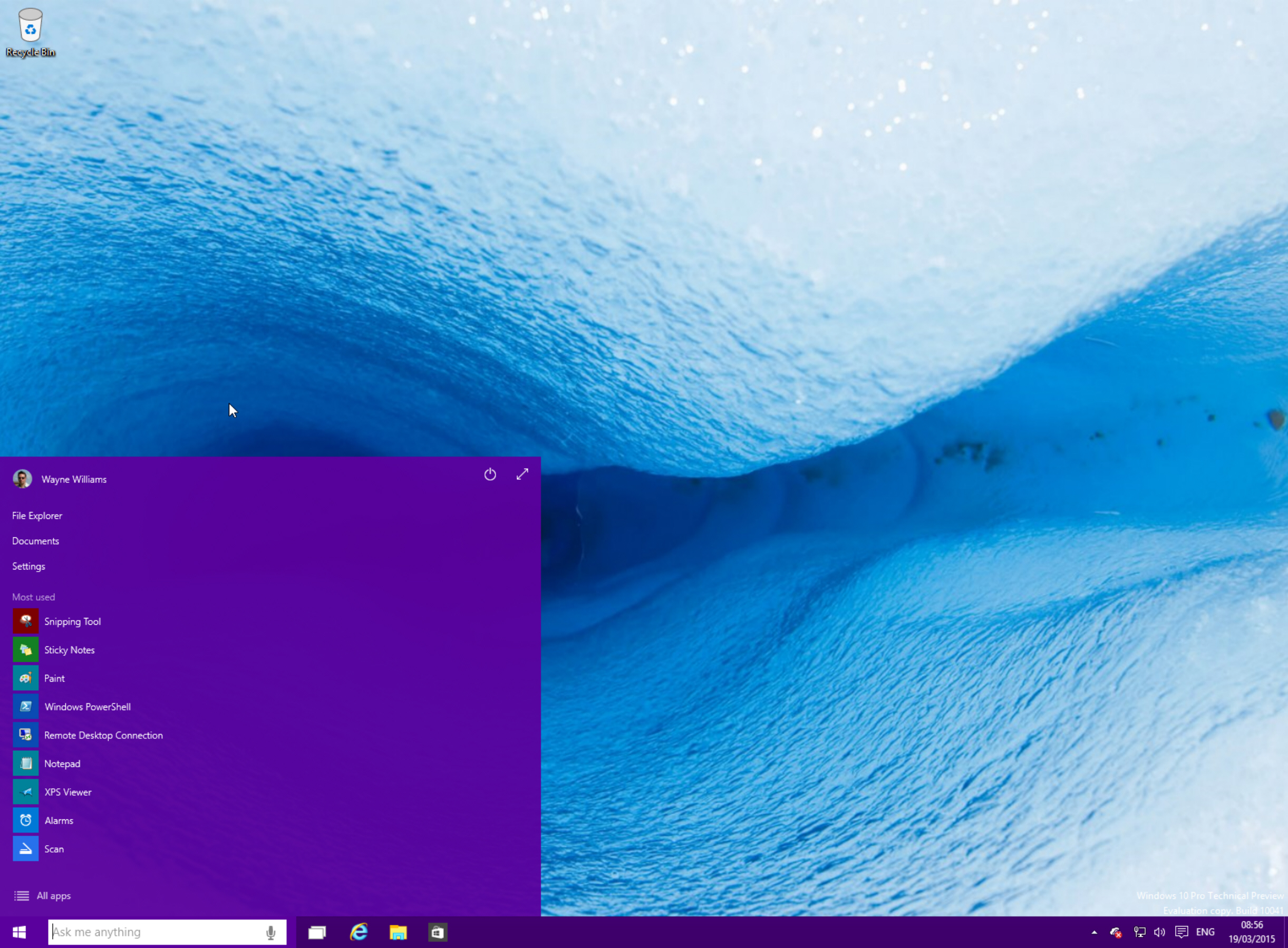
Windows 10 won't be the operating system I was hoping for

It could be argued that with Windows 10 still a work in progress it’s too early to express disappointment and dissatisfaction with Microsoft’s forthcoming operating system. But with a summer launch announced, the truth is we’re probably not likely to see too many major changes in the coming months. What’s on show in Build 10041 is probably quite close to what we’ll get in the finished thing, albeit with some spit and polish.
When Microsoft announced it would be listening to users and implementing changes based on feedback, I was excited. Sure, a camel is a horse created by a committee, too many cooks spoil the broth and all that, but at least it meant that the sort of blatant usability problems Microsoft managed to somehow miss in Windows 8 wouldn’t occur in Windows 10. However, as time has ticked past I've started to doubt that Microsoft is listening as closely to Windows Insiders as it claims to be.
Remember when then-Windows division CFO Tami Reller said of the demand for a Start button, "We've really tried to understand what people are really asking for when they're asking for that", and the end result was the introduction of a Start button in Windows 8.1 that was not -- in the slightest -- like anything anyone had asked for? Windows 10 seems a bit like that.
In Build 9841 we actually had a decent Start menu. I liked it. I found it to be the perfect blend of old (Start menu) and new (Start screen). We still have that menu, right? Well yes and no. With the original version, the tiled area on the right expanded or contracted as you added or removed tiles. So if you like apps, it would spread right across the desktop. If you hate tiles, just unpinning them all would give you a standard old school Start menu. Not now. Unpin every app and you end up with a giant blank space on the right. The original Start menu could be resized by clicking and dragging on the top edge. Now you have the choice between large and full screen, and that’s it.
I can’t imagine Windows testers shouted for that change. That’s pure Microsoft just not wanting to let go of the Start screen concept.
It’s possible in a future build Microsoft might add more customization options to the Start menu. I hope it does, but I suspect it won’t.
And changing the subject, but what the hell are those icons all about? Did a child wander in and draw them for Microsoft? It certainly looks that way. Now it appears this is an area where Microsoft is listening as a choice of different icons are being shown to panelists in the Feedback Lab, so there’s every chance the current ones won’t make the cut. Unless the panelists say they prefer the horrible icons... but provided they have eyes there's little chance of that.
The whole new Settings menus just feel a bit simplistic to me, but I guess I’ll get used to them, and I’m not a fan of some of the design choices, but there’s still time for those to be changed. Or again, I’ll get used to them.
Now don’t get me wrong -- I don’t hate Windows 10, far from it. I think it’s a good operating system, and while I doubt I’ll be using Cortana on a desktop PC, and virtual desktops are similarly of little use to me on my three monitor set up, I appreciate their inclusion. I just would have liked to have seen more advanced customization options and some more ground breaking features. Microsoft skipped a whole version number to distance Windows 10 from its predecessor, but the changes I’m seeing -- on the surface at least -- don’t really justify that. Yes, the whole scaling architecture and universal apps approach means Windows 10 has life away from the PC, which is good -- for Microsoft -- and unlike in Windows 8, the tech giant hasn’t thrown its existing user base under the bus in a rush to get to the "future". But if the upgrade price wasn’t free, free, free, I’m not convinced Windows 10 would be enticing enough to make Windows 7 users switch in great numbers, which is what Microsoft desperately needs them to do.