Microsoft making Outlook.com prettier and more useful

I am a hardcore Gmail user, as many people are, but I am not necessarily happy about it. Why? Google's Gmail.com user interface is horrid. Sure, it is functional, but it is outdated and hardly pleasing for the eyes. It is baffling as to why Google does not update such a popular service.
Conversely, Outlook.com is a treat to use, as not only is it more functional, but prettier too. Heck, you can even use your Gmail account with the site. Today, Microsoft announces a refresh of the Outlook.com website. Not only will it be more attractive than before, but it is also gaining many new features. Excited? Me too.
"We are pleased to announce an update to Outlook.com that lets you make the most of the moments that matter to you -- featuring a refined inbox, new ways to collaborate, an upgraded calendar and much more. This update is rolling out today, in Preview, to a small group of customers and is the first of many innovations coming as we upgrade Outlook.com to a new Office 365-based infrastructure. These new features will be made available to a broader audience through an opt-in program in the coming weeks", says The Outlook Team.
Wait, you mean I have to wait? This makes me a sad panda. I logged into my Outlook account in hopes I was one of the "small group of customers", but no such luck. Oh well, I can wait a few weeks, I suppose.

Microsoft shares the following new features.
- Clutter: Get help managing your inbox. Clutter works on your behalf, sorting messages you’re likely to ignore into a separate folder, so you can focus on what matters. The more you use Outlook.com, the better Clutter gets. You can help train Clutter by dragging messages in or out of the Clutter folder and you can turn it on or off depending on your preferences.
- Search Suggestions and Refiners: Find what you need, fast. Suggestions put the people you communicate with and the content in your mailbox at your fingertips when searching for content. Refiners let you pivot your search results based on the sender, folder, date received and attachments. We’ve also added highlighting, making it easy to spot your search terms within the results.
- New themes: We’ve added 13 new themes with graphic designs to help you express your personality in your inbox.
- Link preview: Just paste a link into your message and Outlook.com automatically generates a rich preview to give your recipients a peek into the contents of the destination. It works great with any webpage, but try it with video links from Vimeo and YouTube for something even better.
- Inline images: Copy and paste images directly into the body of your message, right where you want them.
- Pop-out read and compose: Multi-tasking is easy with messages that pop out into new windows.
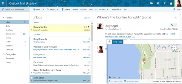
- Pins and Flags: Keep essential emails at the top of your inbox with Pins and mark others for follow-up with Flags. Pins are now folder specific, great for anyone who uses folders to organize their email. Quickly find and manage your flagged items with inbox filters or the new Task module, accessible from the app launcher.
- Add-ins: Announced earlier this month at Build, add-ins appear while you're reading or composing a message and are designed to help you complete the task at hand. In addition to the Bing Maps, My Templates and Suggested Meetings add-ins that are built-into Outlook.com, we’re excited to have third-party add-ins on the way from Uber, Boomerang and PayPal. Watch for more partner announcements soon.
- Simplified sharing from OneDrive: Sharing files through the cloud is the best way to keep everyone on the same page, but uploading a file and setting permissions can add a lot of extra steps. Now it’s easy, just attach the file to your draft message -- drag and drop or with the file picker -- and with one click you can convert it to a shared OneDrive link.
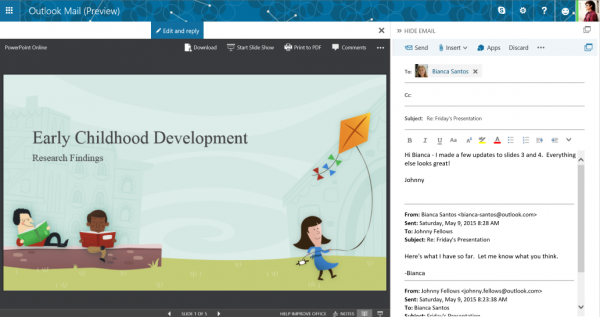
- Side-by-side views: Open an attachment and see it side-by-side with the email. You can view or edit Word, PowerPoint and Excel documents while simultaneously replying to the original message. Best of all, any changes you make to the file are automatically saved and attached to your response when you hit send -- no need to download, edit, save and re-attach the revised file. Side-by-side view works great with photos too.

The side-by-side view, as seen above, is probably my favorite new feature. From a productivity standpoint, this should pay dividends.
Besides new features, existing ones are being improved too. Most notably is an enhanced Skype experience. The communication tool is a very important puzzle piece in Microsoft's rebirth, and the company is smart to focus on it.

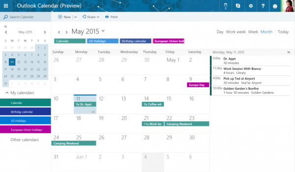
Of course, Outlook.com is not just about email and communication, but organization too. Yes, the calendar is an integral part of the experience. The Outlook Team explains, "with new features and improved navigation, you can easily manage shared calendars, quickly find events by searching for the name, invitees, location or description and stay on top of the dates that matter to you with over 100 country and religious calendars".
Unfortunately, not all is roses. While many people, including myself, had hoped for an ad-free experience, this will not be happening. While advertisements may take away from the overall aesthetic, it does keep the service free.
Most importantly, however, is that Microsoft is continuing its trend of listening to customer feedback. You see, the company has partnered with a third-party company, called "UserVoice" to collect and track feedback and suggestions.
While cool, and appreciated, I would prefer to see Microsoft conduct this data collection and analysis in-house. I mean heck, it is a big company; I would hope they have such a team on campus. While there is nothing wrong with using a third-party, there is always the risk of customers entering sensitive information in the open text box.
Are you excited for the new Outlook.com? Tell me in the comments.
Photo Credit: 60416644/Shutterstock
