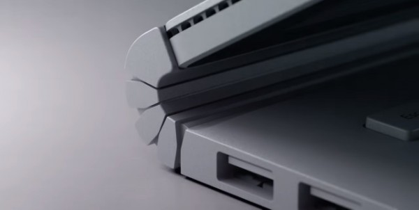
The Surface Book hinge is not a good look

The newly-announced Surface Book feels like it's something I should love. I'm a big Surface Pro fan and I still use my first gen Pro as my daily driver. But there's just something about the Surface Book that grates. The price is not in any way attractive, but there's something else that's rather ugly: the hinge.
The Surface Book's hinge is something that Microsoft seems quite pleased with. Proud of, even. Microsoft calls it a 'dynamic fulcrum hinge', but it looks like a cross between a caterpillar track and a rubberized bendy drinking straw. For what is described as a 'meticulously crafted' device and 'the ultimate laptop', it's not a good look -- and it could be a serious problem.
In many ways, it completely ruins the look of an otherwise very attractive piece of hardware. The pleasing, MacBook Pro-like lines are spoiled by the 'innovative' hinge -- pictured above. Take a look at the opening shot of Microsoft's promotional video introducing the Surface Book and you'll be able to see what I mean:
https://youtu.be/XVfOe5mFbAE
The design of the hinge presents a few problems. Firstly, unlike a more traditional hinge, it does not fold a full 180 degrees. This in turn means that the screen of the laptop does not make full contact with the keyboard when closed. There is a gap between the two layers at the hinge end. A gap into which all manner of crap can slip. Dirt, dust, pieces of paper, things that could scratch the screen. You get the idea. And that's on top of the fact that it just looks... weird.
Flip the screen around and reconnect to the keyboard to use in Clipboard mode. With the keyboard folded up against the back of the display, the gap that the hinge creates will make the Surface Book awkward to use on a flat surface. Put it on a table and it's going to tilt to the left or right.
I have no doubt that the design is very clever -- but that doesn’t mean that it's fit for purpose. The zipper-teeth/concertina mechanism means that there are a number of narrow channels on the top and bottom of the hinge that expand and contract as the hinge opens and closes. It's hard to imagine that these grooves won't attract unknown quantities of muck and grime, further ruining the look of the Surface Book.
It's something of a shame. Surface Book is a nice idea, a great extension of the Surface Pro, but the price and puzzling hinge are likely to work against it.
