Review: Adobe CS3 a Worthy Successor
Adobe’s Creative Suite has reached its third iteration, and CS3 brings with it quite a few changes - some minor and some remarkable. This review will cover the new editions of both Photoshop and Illustrator, the two programs I use the most frequently.
I (Karl Kwasny) am the lead designer for BetaNews (new site is coming soon!) and primarily an illustrator by trade, so I hope that my somewhat unconventional perspective (that is to say, I am not a photographer) might give a fresh angle to the reviews already out there.
I realize this review comes a few months after Adobe CS3 was released to the public, but I felt I needed the opportunity to test how the new features performed on various real-world projects before being able to give my honest opinion. I do quite a bit of work for fashion companies, editorial work for magazines, posters for events and various other print and screen-based work, so Adobe programs are where I spend a good portion of my life.
For me and every person whose occupation involves illustration or design, each update to Adobe software is a pretty major event. Before I get into the nitty-gritty details, I want to mention that straight away after installing, I was positively surprised by CS3. Contrary to what I was anticipating, it’s quite a drastic leap from CS2; most noticeably the modifications to the way the workspace is presented.
PHOTOSHOP CS3
Photoshop CS3 is offered in both "Standard" and "Extended” editions. For my purposes, the features exclusive to the extended edition are entirely useless. This includes tools for video and film production, scientific applications and 3D support. I’m sure the features themselves are quite useful to those for whom they are intended, but I can’t really make use of them. The Standard edition is probably the best bet for most creative professionals.
There are vast improvements in performance, from what I can tell. The software runs much faster during startup and editing, and the programs feel as though they integrate with each other far better than previous versions did.
It’s now possible to have Photoshop, Illustrator and Indesign open at once and not suffer a massive CPU-hemorrhage. It should be noted at this stage that I use a Dell notebook, so my comments on performance will be relevant only to Windows users. From what I’ve read, there are big performance improvements for Intel-based Macs, too, but I have not experienced them first-hand. Also, Adobe Bridge (which I found to be extremely unstable in CS and CS2) seems to be a lot less prone to crashing now.
Interface Changes
CS3 has brought with it massive changes in the palette management system and the workspace in general (View a Screenshot). Personally, I think they are extremely useful and save a huge amount of screen space, especially if you work on a notebook without access to an additional screen. I previously had a separate monitor set up specifically to be a "palette space" so that I could open all the palettes that I needed and still be able to actually see what I was working on. No longer must I do this! It’s really such an ingenious improvement that I am surprised it wasn’t thought of a while back.
Palettes are now accessed through dock bars. You click on a palette icon and the palette appears. This is far more efficient than having everything open at once. Of course, there is still the option of having palettes permanently open, or having everything open at once if you like it that way, but it’s great to have this feature for laptops. Another space-saving change is the new toolbar, which is now one column wide by default instead of two. Again, it’s possible to change it back to the old two-column version, but it’s probably better this way for most.
There are various other, more subtle interface changes throughout Photoshop CS3 as well, such as the addition of the bridge-launching button and the workspace menu to the option bar, and likely quite a few other little modifications that I haven’t stumbled across yet.
Another visual change I feel is important to mention is that the program identities have been streamlined and simplified. The program icons are now colored squares with table-of-elements style abbreviations to describe which program the icon refers to. At first, when I saw the blue "Ps" icon in the CS3 beta, I thought it was some kind of work-in-progress icon or an elaborate joke, but it's not. In practice, it's actually a lot easier at a glance to identify which program is which in comparison to the old style rainbow Rorschach-test icons, which, annoyingly, changed with each release.
Quick Selection Tool
Another new addition to Photoshop CS3 is the quick selection tool. This tool is essentially a combination of the magic wand tool and a brush. You brush around the area you want to select and the tool guesses where you want the selection to be.
I’ve read reviews praising this new tool, but to me it really doesn’t seem to do a very good job. For high contrast illustration linework, the magic wand tool copes just fine if the image's resolution is high enough, and the extract tool still seems to be the best way to deep etch objects or people out of photos, especially when it comes to tricky areas such as hair.
For photos, the new quick selection tool seems to be a half-way house between the magic wand and extract tools, but it is still quite clumsy and requires the same amount of manual editing afterwards in order to produce a perfect result. In the photo below, I’ve tried to trace around the subjects' contours, but as you can see, the quick selection tool didn’t do a particularly great job.

New Curves Dialog
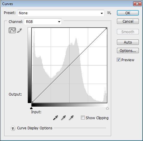
CS3 brings with it some handy changes to the curves dialog box, an extremely important tool for making tonal corrections. Essentially, it functions the same as in previous versions, but now includes a few new features that make it easier to use.

A histogram is displayed behind the curve which makes it easier to see what you're doing, and black and white sliders (like in the levels dialog) are included below. It's possible now to modify ink percentages instead of brightness, and display a consistent baseline for reference. There is a new presets feature also, so it's possible to save certain curve adjustments and apply them to other images. It's also possible now to modify the algorithm which controls how tones are re-mapped, which makes it possible to do a lot of fine-tuning.
Brightness and Contrast
Up until this point, I (and many others) have avoided the brightness and contrast tool due to the fact that it had a tendency to do a far worse job than curves or levels. That is to say, it didn't preserve the black and white points in the image.
This has been remedied in CS3, and the new brightness and contrast tool will preserve the black point and shadow tones in an image, whilst changing the white point in order to brighten or darken it. This will be extremely useful for those new to Photoshop, because the brightness and contrast tool is logically the first place to look if you want to adjust the brightness and contrast.

Refine Edge
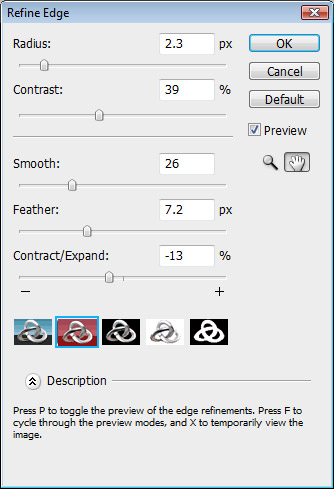
A handy little new feature for fine-tuning the edges of selections is the Refine Edge dialog. It's kind of a compilation of a bunch of useful selection modifications that would have previously been done separately and in a variety of mask modes. Having them grouped together on the same dialog like this is a great idea and will save a lot of time.

Black and White Conversion
Sometimes, doing a straight conversion from color to black and white can leave an image looking a bit flat. Adobe has added a new black and white conversion tool to CS3 that allows you to achieve better result by picking which colours to darken or lighten during the conversion process. (View a Screenshot)
I discovered that this tool is also perfect for completely removing blue construction lines from a pencil illustration – it's also possible to do this with the old hue/saturation dialog or with channels, but neither of those methods works as well as the new black and white conversion tool. You can get rid of the blues contained in the blue pencil and boost the remaining colours to produce a perfect result.

Clone Tool Additions
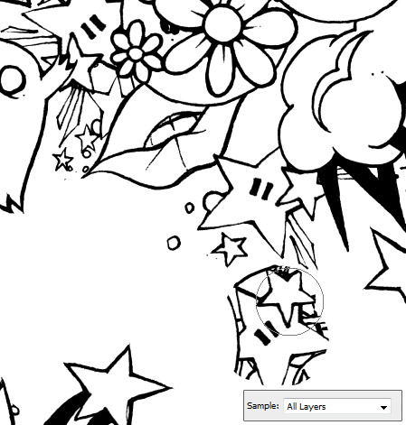
The clone tool is perhaps one of the most important tools for touching up photos. A new addition to it in CS3 is the ability to adjust which layers are sampled when cloning, and also whether or not to sample adjustment layers.

New Blending Modes
There seem to be two new layer blending modes: "lighter color" and "darker color." As far as I can tell, these modes essentially leave the layer as-is, but makes either the darker or lighter tones transparent depending on which of the two modes is selected. It's always nice to have new blending modes to play with, and I’m sure these ones will come in handy. (View a Screenshot)
Smart Filters
In CS2, Adobe introduced Smart Objects, a new layer format which enabled non-destructive transformations. Now, there are Smart Filters - filters which can be edited at any time and do not destroy the layer they’re applied to. (View a Screenshot)
One benefit of the inclusion of smart filters is the fact that it will remove the need to have a bunch of invisible layers hidden away, needlessly increasing the file size, in case you need to revert to a previous version for whatever reason. It’s possible also to adjust the opacity of a smart filter by clicking on the slider icon to the right.
Summary
Ultimately, Photoshop CS3 is a very worthy successor to CS2 and it's definitely worth the upgrade if you're a heavy user. Each new feature will prove to be useful in one way or another (with the exception of those included in the Extended version, many of which will only be applicable for a small number of people). The Smart Filters are really going to save a lot of time and space in the long run. I personally find the changes to the interface very helpful, and the package as a whole feels far more streamlined and integrated than previous versions.
