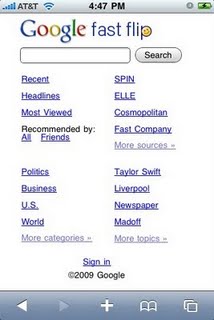
A look at Google Fast Flip for iPhone and Android
Call me crazy, but aren't Web apps just a kind of reversion back to the "Mobile Web" that was so furiously chastised when the full Web browsing experience came to smartphones?
I understand that our modern Web Apps are being rendered by a "desktop browser" engine, and not some junky WAP browser circa 2002, but I can't help but feel that an "application" designed specifically for a mobile phone's browser is the same thing as a Web site stripped down to mobile phone size and speed.
Google debuted the Fast Flip lab last night, and thus far, it has been received with moderate acclaim. The improved ad coverage and revenue sharing with publishers has been widely cited as a step forward for the increasingly crowded and unprofitable online news publishing business.
But what is Fast Flip for mobile devices and why should you care about it?
Well, it's another news aggregator like Google News. But it takes the top 30 headlining stories in each news category (World, US, Entertainment, Sports, etc.), and arranges them as if you were reading a magazine with one story per page.
Unlike the standard version, the main mobile page shows no headlines, and just lists categories. Frankly, it looks terrible, and the text is too small by default. When I was testing it last night, I'd go to look at "Sci/Tech" headlines, and keep accidentally hitting "Entertainment," only to have to look at TMZ or something equally inane for a second, and then hit "back."
 There's also a search field which lets you look for subjects of interest to you by keyword. One cool thing is that the search field has a built-in X button, so you can erase former searches or typos with a single button smash. That will come in pretty handy when trying to type in a proper name and your device auto-completes the text as something completely different. My buddy from high school yesterday was trying to type in Swiss tennis player "Roger Federer" and it kept auto-correcting it to "Roger Desertes."
I don't know when "Desertes" became something people really need to type either...but I blame them for Federer's loss at the US Open.
Once you're in your chosen category, it's pretty cool. You swipe your finger from right to left to flip to the next page overview. If the article looks interesting to you, you tap on it and an abstract pops up which asks if you want to view the full article, zoom in, or close the abstract. If you hit "view full article," it has to open a new browser tab, which got somewhat tiresome on a 2G connection. Wi-Fi and 3G connections were acceptable, however.
 You're also given the option to "like" a story. Fast Flip then adds a smiley face to the upper right hand corner, and logs the story into a profile for use in future suggestions -- sort of like when you give certain songs the thumbs up in Pandora and then you hear them 900 times a day. If you're logged into your Gmail/Google account, you can also tap Email, and it'll send a screenshot of the article to whatever e-mail address you entered.
Taking a hearty cue from Twitter, Fast Flip also has a trending topics category based on most commonly searched terms. Just as you'd expect, the usual depressing news topics are the most popular. People today are searching for health insurance, bankruptcy, jobs, 9/11, cancer, abortion, Yankees, and Sarah Palin.
But the point here, albeit a rather blunt one, is this: Web apps like Fast Flip, no matter how good, lack the hard key action of dedicated applications. All your controls are situated within the browser window, and if I hit Menu -- which is typically the master control switch for Android apps -- I just get the browser's controls, nothing specifically tailored to Google Fast Flip, or any Web app, for that matter.
Web apps like this still feel like a hollow shell to me.
