A pre-Mobile World Congress look at the best handset keyboards
I only briefly touched on this point in my first article about the Apple tablet, but I'm a firm supporter of device manufacturers that install QWERTY keyboards whenever they can. In fact, it is the single reason I have avoided the iPhone, and no amount of soft key practice has made me comfortable with it as an efficient method of text entry.
Even though the HTC HD2 is a spectacular piece of hardware, I am not likely to give it much consideration because it has no keyboard. In talking with Microsoft's Greg Sullivan of Windows Phone about the HD2, he told me that getting used to soft keys requires you to reach a point of abandonment, where you just accept mistakes and roll with them.
Unfortunately, a huge part of my career is editing other people's spelling, punctuation, and grammar, and I have never been able to reach that point.
So, what follows is a review of the most current keyboard-equipped smartphones so we may be ready to welcome a whole new batch from the Mobile World Congress next month.
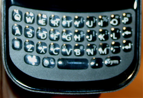
Palm Pre Plus · When the Palm Pre came out, I read a lot of complaints about the keyboard. Since it's recessed, the user's thumbs have a tendency to move inward toward each other. Little has changed between generations of the Pre, and the recessed chiclet keyboard still feels just a tiny bit cramped. In testing it this week, my typing was quite accurate, thanks to the distinct feel and spacing of the keys; but because I'm more acquainted with horizontal keyboard layouts, my speed was considerably low.
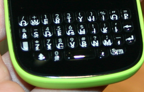
Palm Pixi Plus · Even though the keyboard of the Pixi is nearly identical to the Pre's in most respects, there is one major difference: The rows of keys are straight across, and not "smiling." The effect this has on typing is noticeable. My speed and accuracy were significantly better on the Pixi than on the Pre, and were just about on par with the BlackBerry Curve. The Pixi has definitely become a much more desirable device with the Plus version, and should be seriously considered by users who send more than 5,000 texts a month.
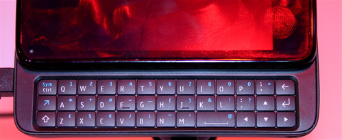
Nokia N900 · The N900 and the Droid are similar in shape and design, with great interfaces, but weak keyboards. The N900's keys touch together, and the spacebar is not mounted in the center of the bottom row. Placing it in the lower right hand corner really effects your flow of text entry, and you have to make an effort to re-learn how you type. To me, this seems like a terrible design decision to have made on a phone that is otherwise quite desirable.

Motorola Droid · A lot of people speak ill of the keyboard on the Droid, and for the most part, their criticisms are justified. The keyboard on the Droid is a membrane...meaning it's a perfect grid and all the keys touch together, with little tactile distinction between them. Part of the reason you get a keyboard phone is for that feeling of the individual keys. But with a keyboard like this, you might as well just have left it all touch, since there are very few physical cues to tell you what you're hitting. While I wouldn't say the keyboard ruined the Droid, it is definitely the weaker half of this slider phone.
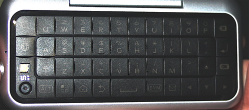
Motorola Backflip · Motorola's new and strange Android device prominently features the keyboard on the back of the chassis when the clamshell is closed. While this calls for a more rugged design and incorporation of the camera into the keyboard layout, Motorola has actually pulled off a decent keyboard. Though it has a similar smooth feel to the Droid, where the keys are easy to miss when you're not paying attention, the individual keys are quite big. Along with the unique flipping action and the back trackpad, the keys of the Backflip would take some adjustment for me to get accustomed to.
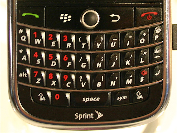
BlackBerry Tour · If you have a preference for chiclet-style keys, this is not the BlackBerry you should be using, which is somewhat of a shame because the Tour is otherwise a very desirable world-ready handset. As you can see, the keys are sloped at opposing angles on the right and left side of the phone. In theory, it's sound, but in actual execution, it's somewhat poor, and ruins the single-thumb typing experience that BlackBerry is so famously capable of.
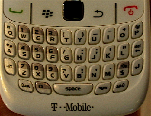
BlackBerry Curve 8500 · I chose this particular Curve model because RIM bills it as having an "Impressive Typing Experience," but in truth, it's quite the same as all the other Curve models. Fear not, this is a good thing because the Curve makes for very easy and accurate typing with either one or two thumbs. I'm not a Curve owner, but testing it made me understand why so many thousands have picked up the device.
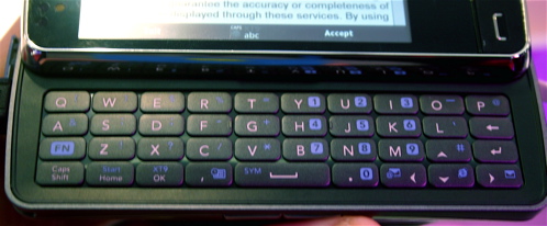
LG Expo · This keyboard took me totally by surprise, and has tentatively received my "best of" ranking. The Expo is a Snapdragon-powered, Windows Mobile 6.5 enterprise powerhouse. Because it's got the highly unusual pico projector attachment, it's easy to overlook something as simple as the keyboard. However, if you take time to test it out, you find it's quick, perfectly sized, and responsive. The only problem I had was that it doesn't feel as solidly manufactured as the chiclet keys of Palm's devices or the pyramid-shaped Blackberry keys, and the far left row "Q, A, Fn" also felt flimsier than the right on two separate units that I tested.
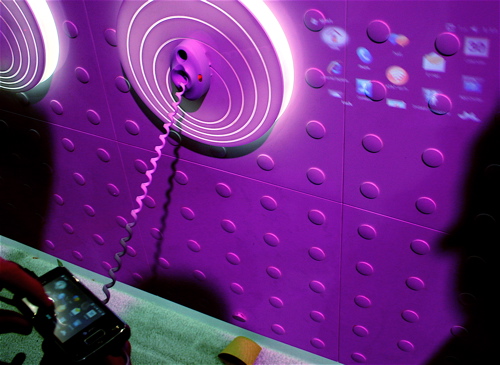
Even though the LG Expo runs the dreaded Windows Mobile 6.5 with the additional confusion of LG's S-Class UI on the front end, and may seem especially gimmicky with its pico projector and thumbprint security scanner, it is an extremely solid device for text entry and one enterprise users should consider.
