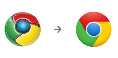
Do you like Google's new Chrome logo?

I can't say that I like the old one. But the new? You simply have to share what you think about it. One of the things the social web is good for is telling vendors where to put their new logos. Many an online social mob has forced vendors to give up a new logo or other branding change. Remember last year's online revolt against the new Gap logo?
So what's your reaction to the new Chrome logo (OK, Google calls it an icon)? Does it appeal to you? Please answer in comments, or email joewilcox at gmail dot com.
"Since Chrome is all about making your web experience as easy and clutter-free as possible, we refreshed the Chrome icon to better represent these sentiments," Steve Rura, Google Designer, writes in a blog post. "A simpler icon embodies the Chrome spirit -- to make the web quicker, lighter, and easier for all."
I will say that Chrome 10, which Google released about two weeks ago is mighty fast. But to my eye, the logo's clean look doesn't fit the browser.
"Redesigning the icon was very much a group effort," Rura continues. "Collectively, we explored many variations, tried the icon in several different contexts, and refined the details as we moved along. It was important to maintain consistency across all media, so we kept print, web, and other possible formats in mind. Once we arrived at a good place, we finished up the icon by resizing, pixel-pushing and getting everything out the door."
Design by committee sometimes leads to the mediocre. It often depends on how big is the committee. That said, I'm not panning the new logo; so far I'm just ambivalent about it. The other feels more three dimensional, which seems more in tune with what a web browser should offer. The new one is more 2-D, flatter.
So what's your reaction? Should Google keep the new Chrome logo, keep the old one or go back to the drawing board. Again, please answer in comments, or email joewilcox at gmail dot com -- or take the online poll.
