Windows 8 Consumer Preview first-impressions review
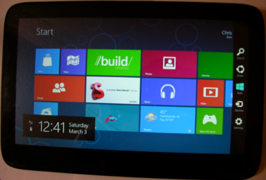
 Lots of people are talking about Windows 8's new Metro UI, following last week's release of the Consumer Preview. Metro has a great deal of potential, but compared to the desktop motif it still needs some tweaking before many Windows users will appreciate it.
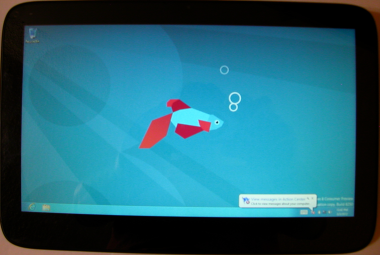
Like many other enthusiasts or developers, I downloaded Windows 8 Consumer Preview last week. I have the luxury of running the operating system on a tablet, opening up the full range of capabilities.
Easy Installation
I installed the 32-bit Windows 8 Consumer Preview on my new ExoPC Tablet PC, which has a good size SSD (64 GB). So I could create a dual-boot system, with the original Windows 7 and then 20 GB for Windows 8. The dual booting worked much better with the Consumer Preview than it did with the Developer Preview released last September.
I had downloaded the 32-bit ISO and burned it to a DVD and then booted from the disc using an external optical drive. Installation went well. I then installed some of the Windows 7 drivers (e.g. video) to Windows 8.
ExoPC is a good test computer, because it is a tablet, has a good size screen -- 11.6 inches with 1366 x 768 resolution -- and roomy SSD. The Atom CPU is no powerhouse and neither is the graphic processor. That's another reason it's a good test PC -- to see how well Windows 8 runs on a slower computer. Many of the current Windows tablets don't have the required 1366 x 768 screen to get all of the Windows 8 features (e.g. snap), so the ExoPC makes up for a slow CPU with its better screen resolution.
Shopping Windows Store
Compared to the Developer Preview, Windows 8 CP delights by providing an app store. I installed games, weather and news apps and even a cookbook, among others. As expected, multitasking downloads deliver -- I could easily download multiple apps at the same time and then later come back to track how they progressed.
Still, the Windows Store app needs a few improvements. There is no obvious indication of each app's download size. It is important for users to have an idea of how large apps are, so they can be prepared for the amount of time downloads will take. Not only should each app have its size indicated, but also the Windows Store should test the speed of one's Internet connection and estimate the time needed to download an app, and indicate this before a user installs it.
The Charms menu, as well as the Windows Store, should have some kind of real-time data about the current amount of drive space being used. When I started downloading a bunch of new apps from Windows Store, I found myself wondering "am I installing too many apps" and had to switch back to the desktop, run Windows Explorer to check the drive to see how much space I was using and how much was free.
I also would like to see a verify step, just in case one accidently taps the install button. It's strange to click the install and immediately Windows 8 starts downloading the app. I felt a little out of control when I clicked the Install button. Sure, you can cancel once it starts, but verification of such an important step isn't too much to ask for.
App Confusion
Windows Store should provide more information about the minimum requirements for applications, akin to the what you find on boxed software. This is a real issue, because a number of games I installed simply did not run on my tablet, likely because the graphics hardware is quite minimal and the app knows it cannot run. When starting these apps, the game flashed by and then in a few seconds the screen switched back to Metro. There was no warning like "this game cannot run on your hardware" or anything else. This kind of behavior is simply unacceptable, especially if users pay for the app. Users need to know what to expect even before installing a new app.
 I had read somewhere that Consumer Preview lets users close Metro apps (Developer version could not), but I could not figure out how to do it. Many features in Metro require some learning, particularly for those people like me who are long used to the desktop motif. Windows should be designed to be more intuitive so new users -- many of them old hands -- don't have to read a book to figure out how to do common tasks.
One big thing I haven't figured out how to do yet is how to uninstall a Metro app. Maybe it is there, and I just couldn't find it; the process isn't intuitive or easy to find. If the ability to uninstall an app is not there yet, then that would be even worse. I can install a new app with one click (or touch), but it is obviously a lot more complex to uninstall an application.
Windows tablets, especially the x86 ones, are not the same thing as a smartphone or Android tablet. You don't see people installing the likes of, say, Adobe Photoshop or Microsoft Office on such devices. Windows 8 users need to be able to track how much drive space is being used so they can determine whether to install or uninstall applications to free up space. Windows Tablet PC's will likely come with SDDs, like my ExpoPC, in the 64 GB to 256 GB range, so drive space may be a premium. Tracking the amount of drive space being used and how large new apps are before downloading, along with easily uninstalling a Metro application, are must-haves.
Motion Sickness!
Especially on a tablet computer with touch, you quickly find yourself suffering motion sickness from all the sliding to the left or right. The majority of Metro, from the Start Screen to how apps display large amounts of data, use a sliding screen to scroll through the data.
Now a few items on the Start Screen may not be too bad, but what about the numbers power users might demand? On my Windows XP computer I have possibly a few hundred items on the Programs menu and the idea of doing a slide to the left or right every time I need to look for something can cause real sense of motion sickness. Now if a lot of the Metro apps I install do the same thing, then it can become a real problem.
Desktop applications have for years used different ways to handle large amounts of data, from Tabs to select different groups of data or a Listview to display large tables. Scrolling up and down doesn't cause the nausea -- that sense of motion sickness -- moving left or right does. The amount of data displayed and the speed of the scroll is critical.
Desktop apps use a scrollbar with fine-tuned scrolling (or better yet a scroll button on a mouse) so users can move as fast or slow as they like. With a touchscreen on a tablet, the swipe gesture does not control the speed of scrolling as well so you tend to end up with a very fast movement of data and if it is graphics like the Start Menu it can become a blur.
Now don't get me wrong, I like Metro, really. But the interaction with touch changes things a lot, and there needs to be better control and fine tuning of things like swiping the screen.
Wake Me When It's Interesting
Much as I like Metro, the apps are boring. Really! Everything tends to be so flat, and there are no controls like on the desktop any more. I have seen more interesting user interfaces on some desktop apps, even ones designed years ago for earlier versions of Windows. Sure, you can get a rich experience when it comes to graphics, but you can do the same with the desktop if you want to. I am a software developer myself and amazingly I have found that you can do a lot of exciting things with a desktop application.
One programmer whose abilities I appreciate designed a really nice skin engine that can make desktop applications have a beautiful 3D look by skinning all of the controls and forms of the application.
Yet Metro is suppose to be the more rich environment and I keep finding it a bit boring, flat and uninspiring. Maybe it's the apps we have right now and better ones will come along that will excite me.
Actually, I've lots more to say about Metro, so much BetaNews editors decided to pull my Metro musings from this review and run a separate commentary. So, please, watch for it.
Photo Credits: Chris Boss
 Chris Boss is an advanced Windows API programmer and developer of 10 year-old EZGUI, which is now version 5. He owns The Computer Workshop, which opened for businesses in the late 1980s. He originally developed custom software for local businesses. Now he develops programming tools for use with the PowerBasic compiler.
