Galaxy Nexus HSPA+ with Jelly Bean review
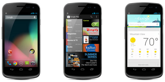
BetaNews certainly loves the Samsung Galaxy Nexus. Joe Wilcox uses one, Tim Conneally uses one, now I use one. I wanted a smartphone that could easily deal with day-to-day tasks, had decent enough battery life that could get me through the day, had good build quality, and most importantly, received timely software updates.
As some of you may have already read, my Galaxy Nexus came with Android 4.0 Ice Cream Sandwich, but I managed to update it to Android 4.1.1 Jelly Bean. I wanted to experience it without the placebo effect induced by claims of a faster interface. So how does it stand up to my four criteria?
Build
The Galaxy Nexus is made of plastic and the screen is protected by a special scratch-resistant glass. It’s not Corning Gorilla Glass, but it’s pretty good at keeping the glass scratch-free. It’s pretty good but not perfect. In direct sunlight after just a week of use, I can see two minor hairline scratches that are not visible in normal light. I’m thinking of getting a protective film for the display.
At low brightness, the display appears to be grainy, which has been a known problem since its introduction. It’s not as noticeable at half brightness, and it’s invisible at full brightness, but it’s a problem nonetheless. It’s not the best Super AMOLED display on the market, that’s for sure as the Galaxy S III display runs circles around it from my experience. The display is good but not great.
With a flimsy-feeling plastic back and a decent overall feel in the hand, I can't complain too much. I do hope the next Nexus smartphone has a better build quality, though.
Battery Life
The 1750mAh battery one doesn’t occupy too much space and keeps the phone's thickness low enough to not bother me when keeping it in my pocket. I’m still debating whether I should get the extended Samsung battery with 2000mAh (2100mAh for the Verizon Galaxy Nexus) since the battery life is not exceptional and it still has the NFC antenna built-in like the normal battery has. With moderate use I can get more than 24 hours of battery life, but when really going for it, I can’t get more than 12 hours of usage, at which point it asks me to connect it to a charger.
The 5 Megapixel Camera is…
The 5MP camera in itself isn’t spectacular, managing to deliver decent photos but not spectacular ones. The video quality (1080p maximum) is better than the still camera in my opinion, producing good videos as long as there’s enough light and there’s a steady hand. The camera interface is typically stock Android with not many options available. Samsung for instance is much better at offering a proper camera interface, but for someone that’s not particularly interested in taking artistic photos it will do just fine. The 1.3MP front facing camera can record 720p video but I wouldn’t hold my breath as it’s not meant to be anything but a front facing camera that manages to take OK pictures for one, but it’s not as good as the back facing camera. If I wanted to get a better camera I would have looked at the Samsung Galaxy S III or HTC One X.
Mmmm…Jelly Bean
Jelly Bean. Android 4.1.1 Jelly Bean is what I wanted to run on my Nexus, and it’s Google’s latest operating system running the show from the backstage. The first thing that’s noticeable is a different boot animation, which now looks like a colored (blue, red, green and yellow) "X" when starting the phone which takes around 25 seconds from the time the Google logo is displayed.
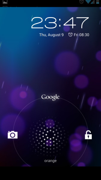 The boot screen shows the hour in the top right corner and under it the time for the next alarm if set. The nice thing about Jelly Bean is that the notification window can be triggered by swiping at the boot screen. The phone can be unlocked by swiping left, but swiping up takes it directly to Google Now (more on that later) and swiping left triggers the camera.
Unlocking the phone does indeed reveal a fast interface that doesn’t show the hardware’s age (TI OMAP 1.2GHz CPU + PowerVR SGX540 GPU is nothing spectacular compared to the hardware inside a HTC One X or Samsung Galaxy S III, be it the International or LTE model) and shows that Project Butter is indeed as expected. It’s fluid enough throughout the interface, though I think it could be a tiny bit faster when opening the menu but other than that it doesn’t show any lag. With better hardware (like a Snapdragon S4 CPU and Adreno 225GPU like in the LTE Galaxy S III and HTC One X) it would be even faster than on the Galaxy Nexus and I can only assume that Jelly Bean will shine just as well on today’s flagships from Samsung and HTC.
At the top of the home screen reigns the Google search bar, which can’t be removed or moved. I’ve added the weather widget which usually displays the right weather, but at the moment it’s taking the weather information from the wrong weather station (I know this because it’s the temperature from the weather station on top of a nearby mountain and it’s not 7 degrees Celsius outside, in August). I assume the calibration can be better as sometimes when moving around in the city is shows the right one. When I’m in my home town it shows the correct temperature (the one in the city).
The power control widget allows controlling the Wi-Fi, Bluetooth, GPS, Sync and Brightness. The one thing that I wish it would have is a button to disable and enable cellular data. I have to go through Settings to control it (can be triggered from the notification window) and it’s cumbersome at times since I don’t always need it.
 I expected to get a battery percentage indicator with Jelly Bean, but Google wrongfully deemed it unnecessary. It’s not easy to grasp the battery level from a battery icon, so I downloaded a battery app from Google Play which allowed me to add a battery widget on one of the screens.
Like I’ve said, the notification window allows going directly to the Settings, but it also has a button to dismiss all notifications at once, without swiping left or right on each one. Some notifications can be made bigger by swiping with two fingers towards the opposite corners of the notification.
I’ve also added a Gmail widget to help me visualize the newest emails that I receive on my Gmail account. I can confirm that enabling two-step activation on Gmail isn’t a problem on Android. All that has to be done is remove all permissions for the Android device and generate a new password for it and everything works normally. The Gmail app is very important to me since I don’t use any other email account with the Galaxy Nexus. It’s as good as I want it to be: I can send emails from all the connected email accounts I have added, attaching files is not a problem. I particularly enjoy the "Mark Read" button, as I don’t want to read all emails that I receive, like for instance YouTube upload notifications.
As far as accounts go, as long as an app requires one it shows in Settings > Accounts. You can control sync via the Google account (from Reader to Chrome, Drive and Google+ if it’s on the phone it can be sync’d), but other application’s accounts such as Facebook, Yahoo (I use it as an IM messenger account), Twitter, Firefox (Sync), LinkedIn, Skype and Email show up as well (from what I have installed, of course).
The Messaging app is like expected and the keyboard is great for me, but I have a problem with the dictionary: it doesn’t support that many languages and it’s particularly a problem since it allows me to select my native language, but the dictionary doesn’t exist. I wish Google would address this problem in a future update or add more languages to the supported list.
One app that I used to like more on iOS is calculator which is only a basic one on Jelly Bean and when viewing it in landscape mode doesn’t show a scientific calculator as I expected, like iOS does. I’m sure there are better calculator apps, but I wanted a better one since I need it every day at times (and no, Google Voice Search can’t help me much).
Google Now... It answers
Since I mentioned Google Voice Search, let me tell you about Google Now. Google Now is a Jelly Bean highlight and I had high expectations. Well, let me tell you that it’s a great app to have, a standout feature on the Galaxy Nexus and Android 4.1.1 Jelly Bean. Not only is it helpful if you’re lazy and want to dial a phone number from Google Now instead of manually dialing, but it helps with finding relevant information.
 I have to point out something here: if I say “dial 333” instead of dialing 333 it sometimes misdials even if it shows that I said “dial 333” and instead it dials “00033300” or something similar. If I say “call 333” it does just that. This is a minor issue, but it’s an issue nonetheless and it’s directly related to Google Web History. When I had it off, it would dial correctly in the first case, but after turning it on it misdialed. Google should look into it, as it shouldn’t happen.
I was looking for a Vodafone shop the other day, to see if they had any protective film, and since I was in a new town I wanted to find one as easy as I could. I opened Google Now, said "Vodafone shop" and it showed me the map with its location. I opened the map app directly from Google Now, pressed "Get Directions" and via GPS I got turn by turn navigation. On the other hand, when using voice search for "Orange shop" it’s very bad at recognizing "shop." It shows "sauce" or "show up" most of the time when it clearly isn’t a problem for my Vodafone search.
I expected to get it right the first time, but it takes a few tries and a precise pronunciation sometimes whereas in other occasions it gets it right without much effort on my part (English is not my first language, but my pronunciation is pretty good, hence my expectations). When I asked for a phone shop nearby it showed me three results, all being "Orange" shops, so it works but it has a problem recognizing specific questions from my perspective.
 I assume the problem is related to using Google Search and localized search results, as when searching for "local BMW dealership" it shows search results from BMW UK, BMW USA, but nothing local (Romania). If it works for a carrier’s shop why doesn’t it work for a car dealership? I suppose this is a regional issue and it works better in other places.
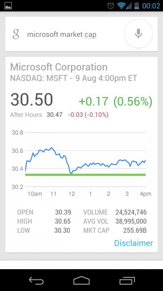
On the other hand, when asking simple questions like "What’s 25+25?" the female voice speaks the answer and shows a card as well. Same goes for questions like "How tall is Barack Obama," "How tall is Mt. Everest," or "what is market cap for Google." When asking for specifics like market cap it speaks the correct answer telling the value from Google Finance and the same goes for stock prices. If you want to know how rich someone is, just ask and it will show you.
The best part about Google Now must be the cards that automatically show up. Let’s say you went to a new town: it will show you transit info, automatically show the weather, directions back home if you want to. If you searched for a flight travel number, it will show updates if there are any. It also works for sports news (after you’ve searched for sports info) and it will display them as a card when new info is available. There’s other tricks as well like nearby places; you could automatically check in to a place you visit for instance.
The Browser(s)
The default Android browser works just fine and it allows for tabbed navigation. It’s very fast and a very good browser overall. But I’m using Chrome as my browser of choice because it syncs (through the Google account) with Google Chrome on my laptop. It looks great, it’s fast and it’s better than the default Android browser. I particularly like how tabs can be closed by swiping and at the same time the nice effect when closing them.
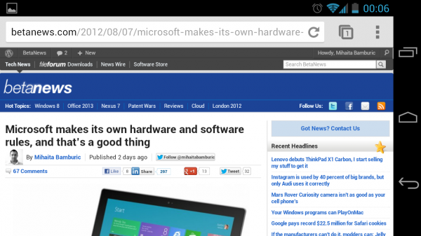
Request desktop site is a simple and effective way to go straight to the desktop version of the website, which from my opinion is a better choice for a modern browser like Google Chrome, running on a phone with a 4.65-inch display. I’m on a 50 Mbps Internet connection at home and it loads very fast on Wi-Fi and decent enough on the HSPA carrier connection.
There’s one minor issue I have with it: it doesn’t sync with the search engines list from the desktop version and it only shows searches with Google, Yahoo and Bing. Other than that, no complaints.
 Show me the way, GPS Navigation
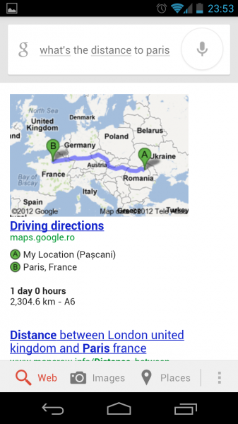
Since I mentioned it earlier I have to mention that Android navigation is top-notch and both Google Maps and Navigation are great apps. I especially like that Google Now makes use of navigation and it’s easy and particularly useful to bring up either of the two apps on its own. You can ask to navigate or ask to show directions, which is how it should work. I’m particularly impressed with how Google Now integrates with both apps and what’s most important is that it actually works and it’s not a gimmick.
I used Navigation while driving a car and it was accurate in showing me the way to my destination. Turn-by-turn navigation is simply outstanding when driving and I could see it replacing a dedicated GPS navigation unit. The only problem is getting a car-dock, as the battery can’t last for more than a few hours and I wouldn’t want to run out of battery from excessive GPS use.
What else?
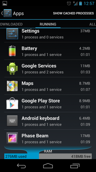
In Settings > Apps, all running applications are displayed along with free and used RAM, but there’s something else that I appreciate: notifications for individual applications can be disabled. If I don’t want constant new email notifications I can disable them. This also goes for Facebook, Google+ or Twitter notifications. It’s a nice feature to have, especially when using some apps that you just want to "silent" forever.
A selling point is integration with Google services, such as Google Drive, making backup of music and photos a breeze, but also making available documents that I have on Google Drive whenever I need one. Basically, Google makes integration with its services, such as Google+, Drive, YouTube, Talk, Play Music as easy as possible and I wish other companies like Microsoft to develop Android apps, like Sky Drive for Android (which I use on my laptop, but Microsoft doesn’t directly offer it for Android). The Calendar app is syncing with Google Calendar, which is great if I have something added online and I want to have it on my phone as well. I had a calendar installed and it picked it up with no problem.
Another thing that I've come to appreciate is the notification LED. None of my previous phones had one and I would usually forget to check my phone for new messages, missed calls, etc. It's something so simple, yet a very smart way to make me check my phone. There are apps on Google Play that allow customizing the notification LED, but I didn't bother as I know I've missed something when it blinks. The little things...
Why the Nexus?
After I reviewed the Samsung Galaxy S III, I was left cold by the shiny plastic case that’s really slippery at times, which is problematic when taking it out of the pocket. And let’s not forget the high price. I’m on prepaid so I pay full price for my phones, and the Galaxy S III would run me around $650 (cheapest I could find, but locally it goes for $700+ usually) for the better looking, in my opinion, Pebble Blue version.
Though the HTC One X looks incredibly good in white, and has one of the two best displays available on smartphones, it left me with the feeling of unfinished software, designed to look pretty at the cost of smoothness in use, and adding the multitasking issue (non-HTC programs are suspended a-la iOS), and also the fact that HTC voids the warranty if it’s rooted is alienating as well.
That left me with the one I wanted because of relatively timely updates, better build quality than the Galaxy S III and of course it’s the cheapest of the bunch. I paid around $460 for the unlocked HSPA+ Galaxy Nexus (available on Google Play for $349) when I got it a week ago. So is it as good right now as it was back when it was launched, last year?
The Whole is Greater than the Sum of its Parts
The Galaxy Nexus best represents the intended Android experience, whether it gets minor updates or major ones like Jelly Bean, it’s the right choice for someone who wants the latest and greatest in terms of software and most importantly a stock, non-convoluted Android smartphone. It’s a modding-friendly device, which it’s also important to me and others like me, because I plan on experimenting with custom ROMs like CyanogenMod 10, and the Galaxy Nexus is officially supported by the developers behind CyanogenMod or AOKP.
Plenty of apps are great when taking them one by one, but it’s the overall software package wrapped in a sturdy shell that I like the most. The Galaxy Nexus is the most well-rounded Android smartphone on the market today, and it shines by keeping it just like Google wanted to.
Until there's a new Nexus smartphone in town, this is my favorite one.
