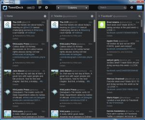
TweetDeck 2.0.1 makeover mimics Twitter website
 Twitter may be accessible through a website, but many users turn to a dedicated app to keep abreast of what the people they follow have to say and to share their thoughts with followers. One of the most popular Twitter clients, TweetDeck, has received a major upgrade that brings a redesigned interface, choice of new themes and much more.
The most noticeable change in this latest release is the new look, which is more in keeping with the Twitter website and other official Twitter apps. Anyone using the service can enjoy a more uniform experience moving between platforms as things now look much more similar whether the web is used or an app for iOS, Android, Mac or PC. There has been a great focus on usability, and screen elements have been improved o make them easier to read.
This means that tweets have a much cleaner, less cluttered look to them and there are also new customization options. The original dark theme is still available and this has been joined by a new light one. It is also possible to change the color of the app with the theme selector, and something that will be welcomed by many people is the new ability to change the size of fonts -- although this is limited to three pre-defined settings.
While the visual changes are the biggest and most apparent updates, there have also been a number of known bug addressed such as issues with Growl notifications. There have been sensible changes such as the removal of tweets from all columns when the tweeter us blocked, unfollowed or reported. $Tags now appears as links and popup windows are now open to repositioning.
You can find out more and download a free copy of the app by paying a visit to the TweetDeck review page.
