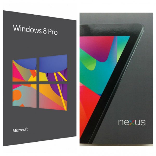
Windows 8-Nexus 7 packaging separated at birth

What the frak? Did Microsoft hire the same artist for Windows 8 packaging that Google used for Nexus 7? Because I am absolutely struck by similar color choices and graphic fluidity. You wouldn't confuse the boxes on a store shelf, because the products would be nowhere near one another. But one wonders if Google tapped a new trend in graphic box design, and Microsoft just copied along.
Before posting, and as sanity check, I asked colleague Tim Conneally about the boxes. "The similarity is kind of shocking", he responded. "That gunmetal grey color was nowhere to be seen in tech two years ago".
But the similarity only starts with these boxes. Microsoft has five different Windows 8 box designs, and color choices for three remind of the default background Google uses for Android 4.1.
Is this just concidence, case of Microsoft copying Google or me making something of nothing?
