Microsoft Surface makes a good first impression

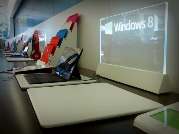
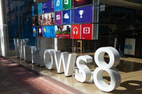
This afternoon I got my first look at Microsoft's Windows RT tablet at the company store here in San Diego. I wanted to drop by for two weeks, but simply couldn't make time. Today, my daughter needed a ride to Fashion Valley Mall; she's got a new job there. That gave me 90 minutes free time for Microsoft Store -- oh, and four doors down Apple, too.
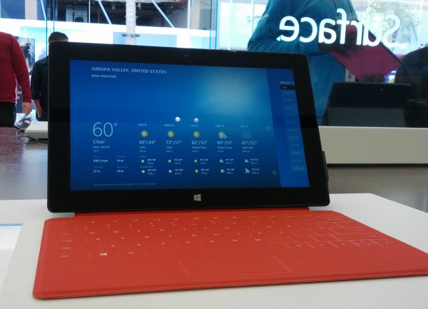
I am pleasantly surprised by my initial reaction, which quite simply is "wow". This starkly contrasts with my negative response to iPad mini. (But the Apple Store jaunt to see the tablet can wait a few paragraphs.) Surface's display is bright, clean, clear and crisp. Font rendering is superb, particularly given resolution is only 1366 by 768. The tablet is fast and touch-response exact and fluid. Presentation of default apps, such as MSN and weather, pop. They look exceptionally good, and Microsoft serves up lots of rich touchy, feely additional content throughout. Presentation gets A-plus.
Beneath the Surface
The overall experience is scarily immersive. Microsoft shames Android tablets and iPad. I can't emphasize what this means for Surface but will try.
In January 2010, days before iPad's announcement, I posted "The world doesn't need an Apple tablet, or any other". Five months later, came confessional: "I was wrong about Apple iPad". As explained then:
iPad offers fresh functionality: Immersion. I find there are fewer reading distractions, and content is better presented than on a laptop and browser. I'm more focused and retain more of what I read...Apple's tablet is a sit down and focus device, as much because of size and shape as screen and user interface. The totality -- physical design and software benefits -- is immersion.
There's an intimacy using iPad that is unlike most other devices, because you become part of the user interface. Human beings are tool users who experience and manipulate the world through five senses. iPad appeals to the eyes through design, whether it’s the software GUI or hardware appearance. But the eyes are passive instruments. Hands and fingers are more important because they are active -- they’re how people tactilely manipulate the world around them.
How important is touch? Watch how people will shop this holiday season, like others. First they look at an item for sale, then then they touch. People examine objects they desire as much with their hands as their eyes.
Touch and the way iPad is held in the hands creates intimacy and pulls the user in. But the immersive experience isn't pervasive. iOS UI is a backdrop for hanging things. It lacks vitality. Life. Immersion is more about select apps, particularly those that present content, such as ebooks and magazines. Touch interaction with iOS is actually quite limited. By contrast, Windows RT, at least as implemented on Surface, is a living thing. Immersive touch is everywhere. I was so drawn in, so immersed, the noisy store simply disappeared. Surface drew me below the surface into another place of focused interaction. The experience is simply breathtaking and makes the iOS user interface feel ancient.

Microsoft's Modern UI is a marvel, at least as served on Surface. Content pops from tiles, inviting the user to touch. Scrolling, which is required nearly everywhere, brings fingers to the screen. As I've said before here and elsewhere: The best user interface is you, and you are more part of Surface than iPad. Of course, apps and web pages need to support the UI, and interacting with them I suddenly see why Microsoft puts so much emphasis on HTML 5. Some websites seem hardly separate from the Modern UI they present so well. If I recall, CNET and Engadget pop off the screen, as does MSN.
Surface Tension
But like the classic, Robert Louis Stevenson horror story, Surface is split personality. The fluid, touchy Modern UI is Dr. Jekyll, while the legacy Desktop motif is Mr. Hyde. Microsoft Word pulled me back to the Desktop, and what a jarring jolt from immersive Modern UI. There's something dreamlike about using the true touch tile interface. Going to the desktop is like suddenly waking from a colorful dream to stark reality -- a ghetto room of dull greys and barren walls.
That Microsoft includes the Desktop at all shows something's not right. I can understand the legacy motif on Surface Pro, running Windows 8. That Microsoft managers felt compelled to include the Desktop demonstrates lack of confidence about apps selection or users' willingness to fully embrace Modern UI. Backward compatibility isn't necessary here, and it burdens the user experience.
Something else needs be said about my first impression. In store, Microsoft presents a handy, info card with pricing alongside the tablet: $499 (32GB); $599 (32GB with keyboard cover); $699 (64GB with keyboard cover). I occasionally glanced at the prices while using the tablet and must say the cost didn't feel expensive at all. There's value for the price, just from touch and sight. The tablet looks and feels good and even a bargain for what Microsoft charges. Then there is the tantalizing keyboard cover, which is unlike anything sold with Android tablets or iPad.

However, I had a somewhat disappointing reaction to the physical keyboard, which didn't respond well enough to my touch. Letters kept missing from words. I later asked a sales associate if the keyboards on display models might be a bit worn from use. Perhaps, he said. More likely, a few tries are necessary to get the feel of touch. He emphasized that under normal conditions, meaning outside of a noisy retail shop, the user hears a physical click, which greatly helps typing and getting the pressure right.
iPad mini Sinks
After about 30 minutes with Surface, I left for Apple Store to check out iPad mini for the first time. During Apple's launch event, company execs praised the 7.9-inch tablet's comfortable one-handed use. I disagree. iPad mini feels too big in the hand. The dimensions are all wrong for me. This thing looks like an oversized Samsung Galaxy Note, and the screen gives overly-wide impression in portrait orientation.
Simply stated: iPad mini looks fat from the front. I also find the screen to be way too reflective -- much more so than Surface -- and the screen resolution and font rendering to be unremarkable.
I can't resist commenting about Apple's feud with another popular tech company. Google Maps is gone from iOS, as widely reported. But so is YouTube, although the video app can be downloaded from App Store. But not on the iPad minis I saw on display today. Instead there was vTube, which when launched prompts for YouTube login info.
There's more to be said about iPad mini or Surface that only ongoing use can reveal -- to get below the, ah, surface. I don't have review units of either, so for now offer my first impression. Don't underestimate the importance. How products show matters much for generating sales. First impression often makes or breaks the sale. Surface shows very well, but you can't see it everywhere. The tablet is only available from Microsoft.
Photo Credits: Joe Wilcox