Flickr gets a redesign, gives users 1TB of storage for free

Flickr is the service Yahoo forgot about between its latest Mail and homepage redesigns. It's boring, outdated, bland, ugly and uninviting and these are just a couple of the words that cross my mind right now. Thankfully, Flickr wants to change all that with the latest revamped version, announced late-yesterday. You know, maybe the cool kids will want to hang out again.
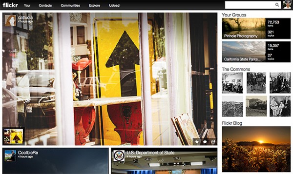
The biggest change comes from the new website, which drops the old design. It's now fresh, simple and modern and gives the cloud service character. Big photos in the stream, menu bar on top and the usual suspects on the right -- Explore, Flickr Blog and a list of people you may (want to) know -- dominate the uncluttered experience. Friends get a similarly-styled profile page which emphasizes shared content.
The other biggest change is that users now get 1 TB of cloud storage, for free, in order to upload content with "no limited pixels, no cramped formats, no memories that fall flat". That is a nice feature considering that modern mobile devices and dedicated cameras churn out pretty large photos compared to the days of old.
Flickr, however, does not allow users to upload 1080p videos longer than three minutes. That is a pretty annoying limitation which may keep some folks away. After all, what good is 1 TB of free storage if users can't fill it up with content?
To complete its renaissance, Flickr also announced a new Android app which comes with a redesigned interface. It is available to download from Google Play.
